
A homepage is like the front door to a busy shop. If people can’t tell what you sell, who it’s for, and where to go next, they leave.
A strong ecommerce homepage layout doesn’t try to say everything. Instead, it guides the first click, reduces doubt, and stays fast on mobile. This playbook breaks the homepage into proven modules, how to build each one, and the common mistakes that quietly kill conversion rate.
What converts on a 2026 e-commerce homepage (before you touch the layout)
In 2026, your homepage has to work on a phone first. Desktop still matters, but mobile visitors decide fast, and they do it with one thumb. That means clear hierarchy, large tap targets, and obvious search.
Speed is part of persuasion now. If your hero shifts after load, users feel friction even if they can’t name it. Treat Core Web Vitals as conversion hygiene: keep LCP quick, avoid CLS layout jumps, and reduce input delay (INP) by trimming heavy scripts and third-party tags.
Search also moved up the priority list. For many stores, it’s the highest intent action on the homepage. If you want a good baseline, compare your decisions to e-commerce homepage best practices and then adapt to your catalog and traffic sources.
Privacy expectations increased too. Consent UI should be clear, honest, and not block the path. If the banner covers your CTA or search, your layout is working against you.
A homepage should answer three things fast: “Is this for me?”, “Can I find what I want?”, and “Is it safe to buy here?”
For broader layout foundations, keep a short reference list of e-commerce design best practices for CRO so your homepage matches the rest of your storefront.
A simple homepage wireframe you can copy (module order)
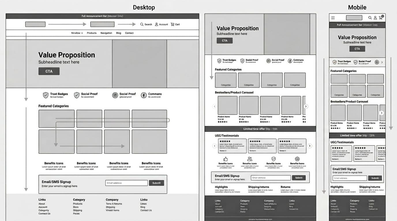
Use this order as your default. Then swap modules in and out based on season and inventory.
- Announcement bar and header (search, account, cart)
- Primary navigation
- Hero (value prop + CTA)
- Trust strip (shipping, returns, payment, reviews)
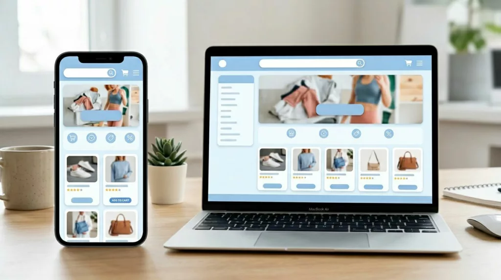
- Featured categories (often a bento-style grid)
- Bestsellers or recommendations (with ratings)
- Offer strip (limited-time, bundles, free shipping threshold)
- UGC/testimonials
- Benefits icons (why buy from you)
- Email/SMS signup
- FAQ/policies highlights
- Footer utility links
Keep your “above the fold” tight: header, hero, and one trust cue. Everything else should earn its spot by moving shoppers to a category, product, or search.
Module playbook for a conversion-focused homepage
1) Announcement bar + header (with search, account, cart)
What it is: The top utility area that anchors navigation and key actions.
Why it converts: It reduces uncertainty and gives returning shoppers fast access.
Placement: Sticky is fine, but keep height modest on mobile.
Content must include: Clear search field, visible cart, and a simple promo or shipping promise.
Common pitfalls: Too tall on mobile; hiding search behind an icon; promo text that changes too often.
2) Primary navigation (simple labels, predictable grouping)
What it is: Your category map, not a brand slogan list.
Why it converts: Fewer wrong clicks means more product views and less bounce.
Placement: Under the header, with a compact mobile menu.
Content must include: Plain category names, a “Shop all” path, and seasonal links only when relevant.
Common pitfalls: Clever names that don’t match intent; overstuffed menus; inconsistent labels vs. collection pages.
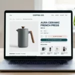
3) Hero banner (value prop + one primary CTA)
What it is: The main above-the-fold story and next step.
Why it converts: It aligns the visitor’s goal with a single action.
Placement: Immediately after the header.
Content must include: One-line value prop, one supporting proof point, and one CTA (Shop bestsellers, Shop men’s, Take the quiz).
Common pitfalls: Rotating slides; vague copy; multiple equal CTAs that split attention.
4) Trust strip (fast reassurance without a wall of badges)
What it is: A compact block that answers “Is this legit?”
Why it converts: It removes hesitation before the first click into products.
Placement: Right under the hero, or beside it on desktop.
Content must include: Shipping window, returns promise, secure payment, and a reviews cue (rating + count).
Common pitfalls: Unverifiable badge clutter; tiny text; hiding returns details until checkout.
5) Featured categories grid (bento-style works well)
What it is: A scannable set of category tiles that show range.
Why it converts: It helps shoppers self-select quickly, especially new visitors.
Placement: High on the page, right after trust cues.
Content must include: 6 to 10 categories, clear labels, consistent imagery style, and tap-friendly tiles.
Common pitfalls: Too many options at once; unlabeled lifestyle images; category tiles that lead to thin or out-of-stock pages.
6) Bestsellers + ratings (and light personalization)
What it is: A product module that proves demand and offers a shortcut to “safe picks.”
Why it converts: Social proof and reduced choice anxiety increase clicks to PDPs.
Placement: Mid-page, after categories.
Content must include: 6 to 12 items, star rating + count, price, and one quick tag (Bestseller, New, Low stock).
Common pitfalls: Showing items with weak inventory; no ratings displayed; personalization that overrides merchandising rules.
7) Offer strip (promotion with guardrails)
What it is: A narrow module for urgency or a threshold incentive.
Why it converts: It gives a reason to act now without taking over the page.
Placement: After bestsellers or before signup.
Content must include: One offer, a deadline or rule if real, and a CTA that lands on the relevant collection.
Common pitfalls: Fake countdowns; stacking offers; sending users to the homepage again.
8) UGC/testimonials + email/SMS capture (keep it earned)
What it is: Real-world proof paired with a low-friction way to stay in touch.
Why it converts: UGC builds confidence, while signup captures value from non-buyers.
Placement: Lower mid-page, once shoppers have seen products.
Content must include: 3 to 6 UGC cards with context (product, use case), then a short signup promise (early access, restock alerts).
Common pitfalls: Generic quotes; asking for phone too early; consent language that’s hidden or unclear.
If your mobile experience relies on sticky actions later in the funnel, align your homepage tap targets with the same approach you use on product pages, including patterns like mobile add-to-cart button design patterns.
What to avoid, then prioritize and iterate
These homepage mistakes show up everywhere because they “look nice,” but they cost money:
- Auto-rotating carousels that hide the best message and reduce control
- Banner-heavy pages with no clear path to categories or bestsellers
- Tiny search (or search behind an icon) when your catalog is broad
- Slow hero media that hurts LCP and causes layout shifts (CLS)
- Aggressive popups that fire before users see products
- Dark-pattern consent UI that erodes trust and raises bounce
For prioritization, use impact vs. effort. Here’s a simple framework you can use in planning:
| Quadrant | What to do | Examples |
|---|---|---|
| High impact, low effort | Ship first | Search prominence, hero copy/CTA, trust strip, category tiles |
| High impact, high effort | Plan next | Personalization rules, major navigation changes, performance refactor |
| Low impact, low effort | Fill gaps | FAQ/policy highlights, footer cleanup, minor merchandising tags |
| Low impact, high effort | Skip | Complex animations, fancy interactions that slow pages |
Before you launch, run this quick checklist:
- Test the homepage on a real phone, one-handed, on cellular data
- Confirm search is visible and usable without extra taps
- Validate CLS (no jumping) when images and fonts load
- Check consent banner doesn’t cover hero CTA or search
- Click every module and confirm landing pages match the promise
Then, keep improving with an ongoing loop:
- Review homepage click maps monthly (hero, categories, search usage)
- Rotate merchandising based on inventory and margin, not guesses
- Audit top site searches and add synonyms or category links
- A/B test one module at a time (hero, trust, bestsellers order)
- Watch performance after app installs, pixels, and personalization scripts
Conclusion
Your homepage shouldn’t be a slideshow of announcements. It should be a clear path from first glance to first click, with speed and trust built in. Start with the modules that reduce confusion, then test the ones that add motivation. When the ecommerce homepage layout stays simple and fast, conversion rate tends to follow.