
Your ecommerce homepage layout has one job for your online store: help a new visitor understand what you sell, why they should trust you, and what to do next. That sounds simple until you look at your analytics and realize most people bounce before they even see what’s above the fold, let alone your best products.
In 2026, a strong homepage is less about flashy design and more about removing friction to improve user experience. Speed, clarity, and proof do the heavy lifting, especially on mobile.
Below is a practical blueprint you can copy, tweak, and test, with wireframe examples to make the structure easy to visualize.
The 2026 rules behind a high-converting homepage
Start by designing for reality, not for internal opinions. Recent benchmarks still put global online store conversion rates around 1.9% to 3%, with desktop typically converting higher than mobile, even though mobile drives most visits. That means you rarely need a “clever” homepage for your online store. You need one that helps shoppers decide faster.
Three patterns keep showing up in stores that improve:
First, speed is a feature. When pages feel heavy, shoppers hesitate. Keep the initial view light: fewer scripts, fewer sliders, fewer surprises. Page load speed also ties into sustainability and cost, since lighter pages often load faster and burn less bandwidth. If you want a practical angle on reducing page weight without gutting your branding, see these sustainable ecommerce design practices.
Second, UGC and reviews belong on the homepage. Product pages still matter most, but the homepage is where visitors decide if your brand is “real.” Add social proof early, then repeat it near key decision points.
Third, search and site navigation matter more than ever. Shoppers arrive with intent, not curiosity. Make it easy to jump straight to a category or a best-seller. If you want extra context on modern patterns, Luigi’s Box has a solid breakdown of e-commerce homepage best practices for 2026.
With those rules enhancing user experience in mind, here’s the layout blueprint.
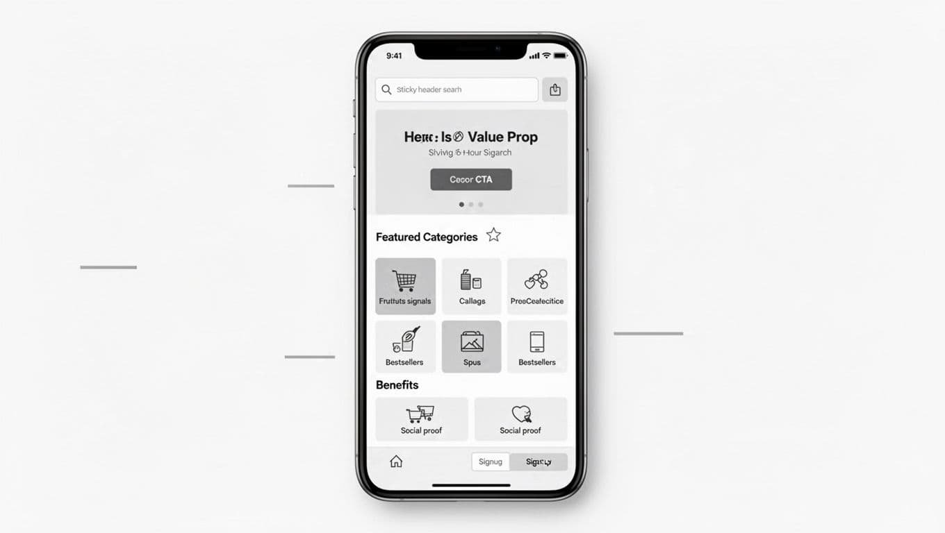
Desktop ecommerce homepage layout, section by section
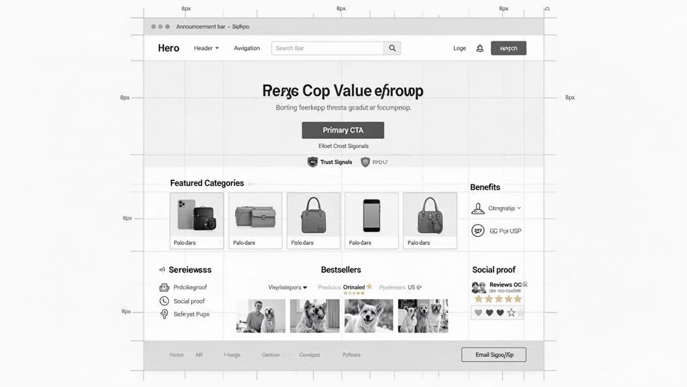
Think of your online store homepage like a retail store entrance. The first 5 seconds should answer: “What is this, who is it for, and where do I go?” This sets up effective site navigation from the start.
1) Announcement bar (optional, but controlled)
Use it for one message only: shipping threshold, limited drop, or returns promise. Don’t rotate messages. Motion steals attention from your call to action.
2) Header: logo, navigation bar, search, and cart
Your header is not decoration, it’s a tool for site navigation. In 2026, most stores benefit from a visible search bar on desktop (not just an icon), because visitors use internal search as a shortcut to confidence.
Also, design it to work without a mouse. Keyboard users should be able to reach the search bar, menu, and cart in a clean tab order. If your focus states are faint or missing, fix that first. This guide on keyboard navigation essentials for UX explains what to check.
3) Hero section: value prop + one primary CTA
The hero section isn’t where you “tell your story.” It’s where you earn the next click toward the checkout process.
A strong hero section includes:
- A plain-language headline (what you sell and the outcome).
- A supporting line that reduces doubt (shipping time, fit help, guarantee).
- One primary call to action (Shop best-sellers, Shop by category, Take the quiz).
Avoid homepage carousels. If you have three messages, you need a better hierarchy, not a slider.
4) Trust signals (right under the hero)
Add 3 to 5 short proof points: review average, number of customers, press mentions, security and payments, or “Ships in 24 hours.” Place them close to the call to action so they do their job.
5) Featured categories (scannable, not clever)
Use clear labels and predictable groupings of product categories. If you sell more than a handful of items, product categories beat “curated collections” for first-time visitors. Structure your product categories to guide site navigation and support a smooth checkout process.
6) Best-sellers grid (the conversion engine)
For many DTC brands, best-sellers are the homepage. Show a tight grid of featured products, not your full catalog. Include price, star rating, and a quick signal like “Most gifted” or “For sensitive skin.”
7) Benefits row and social proof blocks
Add a benefits row (shipping, returns, guarantee) and then customer reviews. Repeat proof near the point where a visitor might leave. ConvertCart’s overview of pillars of a high-converting ecommerce homepage aligns with this same idea: structure beats decoration.
8) UGC gallery, email/SMS capture, footer
UGC helps shoppers imagine ownership. Keep it clickable and shoppable if possible, but don’t let it slow the page.
For email and SMS, offer a real reason to subscribe (early access, fit help, reorder reminders), not “10% off” by default. End with a footer that answers boring questions well: shipping, returns, contact, policies, site security, and footer links.
Mobile-first stacking that keeps shopping within thumb reach
Mobile gets most ecommerce traffic, so adopt a mobile-first design where your mobile layout can’t be a “shrunk desktop.” It needs its own priorities.
Keep the navigation bar sticky, but keep it small. A sticky row that includes search and cart usually beats a huge logo area. Then, make sure the first screen shows (1) what you sell, and (2) a next step to enhance the browsing experience.
On mobile, reduce the number of “decision blocks” before products appear. A common fix is moving best-sellers higher than brand storytelling. Shoppers can learn about you after they see something worth buying.
Also, in your responsive design, watch tap targets and spacing. If filters, menus, or accordions feel fiddly, people bail. Test with your own thumb, on an older phone, on cellular data. That simple habit catches more user experience issues than most audits.
Finally, avoid heavy media at the top to protect page load speed. A big autoplay video can look nice and still lose sales if it delays interaction.
Hero and trust modules you can swap based on shopper intent
Three hero patterns to test (product-led, category-led, quiz-led)
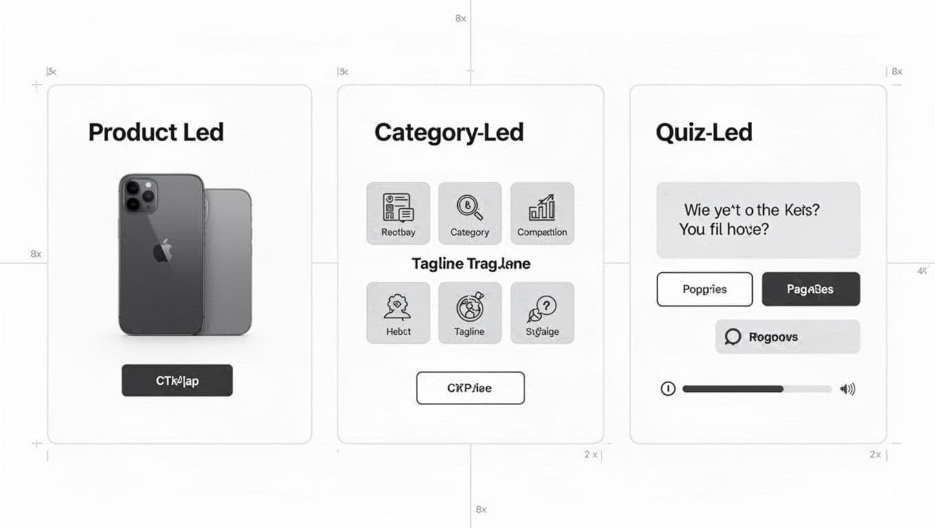
Choose your hero section pattern based on how people shop:
Product-led hero, featuring large product images, works when you have a clear flagship item. Drive straight to the best-seller PDP or product listing pages for a tight collection with compelling product images.
Category-led hero fits larger catalogs and serves as an entry point to category pages. It reduces “Where do I start?” anxiety on expansive category pages.
Quiz-led hero helps when selection feels confusing (shade matching, supplements, skincare routines). It trades speed for guidance with personalized recommendations, so keep the quiz short and show the payoff of personalized recommendations early.
Reusable trust mini-modules (drop them anywhere)
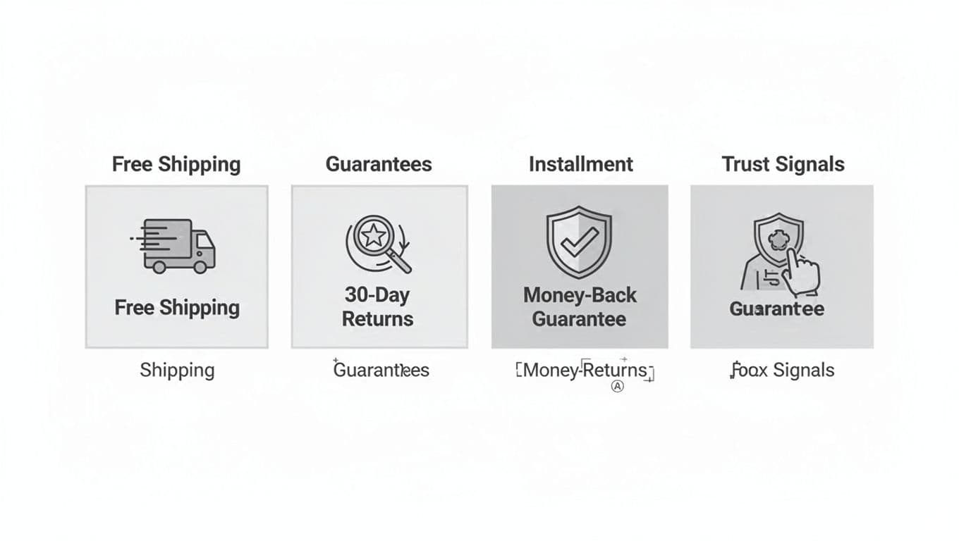
These small blocks calm the “what if” thoughts that stop a purchase. Put them under the hero, near best-sellers on product listing pages, and again near signup. Keep the copy specific (timeframes for shipping and returns, conditions, and how refunds work). Vague promises don’t reduce risk.
Conclusion: build a homepage that earns the next click
A converting homepage for your online store in 2026 doesn’t try to do everything. It prioritizes clarity, proof, and fast paths to products for an optimal user experience, especially on mobile. Start with the blueprint above, then A/B test your hero type and the order of categories vs best-sellers. Small layout changes can boost conversion rates and move a lot of revenue because they enhance the browsing experience by changing what shoppers notice first.
If your homepage had to convince a stranger in 10 seconds, what would you change first? Put that answer at the top, then measure the result.