
If your online store almost works with a keyboard and a screen reader, lacking full digital accessibility, you’re risking ADA compliance violations and in the danger zone. Shoppers can browse, then hit a dead end on a variant picker, a cart update, or a promo popup.
This ecommerce accessibility checklist focuses on fast, high-impact fixes for 2026 that also boost search engine optimization. It sticks to the flows that make money: product pages, cart, checkout, and modals.
For background on why keyboard paths matter so much in UX, see keyboard-friendly UX design.
WCAG 2.2 in 2026: the rules that break checkout first
Ecommerce Accessibility Checklist for Effective Compliance
WCAG 2.2 is the current W3C recommendation, building on the WCAG 2.1 Level AA baseline, and it adds new success criteria that hit e-commerce patterns hard (mobile targets, dragging, focus visibility). Failing to address these risks accessibility lawsuits. Start with the official summary, What’s New in WCAG 2.2.
Here’s the fastest way to triage before you change code:
- Automated testing tools scan (10 minutes): run Axe, WAVE, or Lighthouse on a PDP, cart, and checkout. Automated tools won’t catch everything, but they find missing names, low contrast, and form label gaps fast.
- Keyboard-only manual testing (15 minutes): Tab, Shift+Tab, Enter, Space, arrow keys. Verify skip navigation links and try the whole purchase without a mouse.
- Screen reader spot-check (15 minutes): NVDA (Windows) or VoiceOver (macOS/iOS) as assistive technology. Don’t try to “test everything.” Verify names, roles, state changes, and error handling.
Biggest time-saver: fix your components (modal, dropdown, stepper) once, then reuse them everywhere.
Now, move page by page.
Product pages: fix variants, galleries, and price badges
Embracing inclusive design for product page layouts ensures everyone can shop effectively. Focus on these fixes for variants, galleries, and price badges.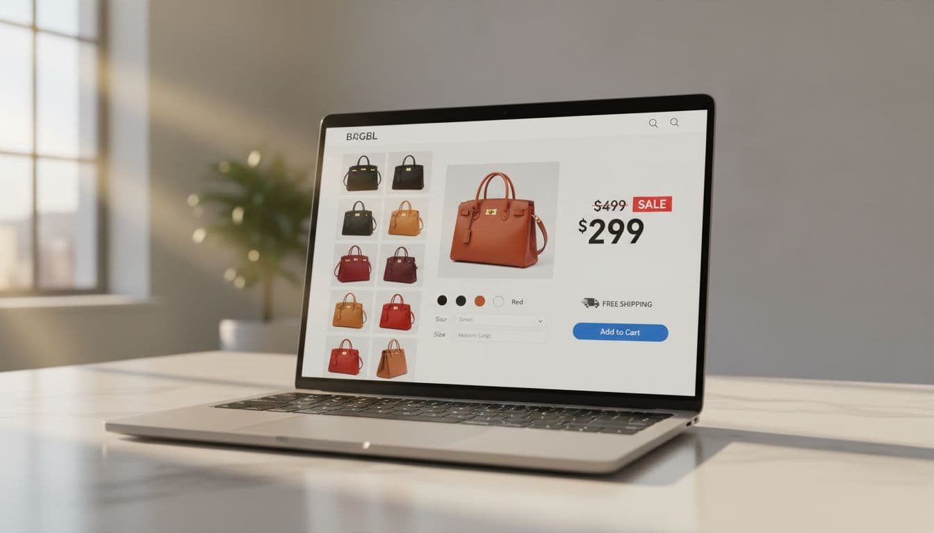
Variant selectors need real names, not vibes
What to check: Size, color, and material controls must have a programmatic label and a visible label. Swatches that are only color blocks often read as “button” with no name.
Why it fails users: Users relying on screen readers can’t tell options apart, and voice control users can’t target “Blue, size M” if the UI has no text label.
How to fix (patterns that ship fast):
- Prefer native controls: a
<select>with a<label for="size">Size</label>, or radio inputs grouped in<fieldset>with a<legend>Size</legend>. - If you must use custom swatches, each option needs an accessible name: use a real
<button type="button">and setaria-pressed="true|false"for single-select toggles, plus ARIA labels likearia-label="Color: Navy". - For image swatches, keep the name in text somewhere. A safe pattern is
aria-labelledbypointing to hidden text, for examplearia-labelledby="color-label navy-name".
How to test:
- Keyboard: Tab into the group, change selection with arrow keys (radios) or Enter/Space (buttons). Focus must stay visible.
- Screen reader: On NVDA, use Tab and arrow keys. Confirm it announces “Size, radio button, Medium, selected.”
- Automated: Axe should stop flagging “buttons must have discernible text” and “form elements must have labels.”
Image galleries must support keyboard, not just swipe
What to check: Thumbnail strip, next/prev arrows, zoom, and any “drag to rotate” features.
Why it fails users: Many galleries trap keyboard users in a thumbnail list, or they require drag gestures for key actions on product images.
How to fix:
- Make thumbnails real buttons for accessible navigation of product images. Avoid clickable
<div>elements. - Use clear labels:
aria-label="View image 3 of 7"on thumbnails, andaria-label="Next image"on arrows. - Track the active thumbnail with
aria-current="true"oraria-selected="true"(depending on your pattern). - Don’t require dragging. Provide click targets for rotate or compare. WCAG 2.2’s Dragging Movements criterion pushes you toward “buttons also work.”
How to test:
- Keyboard: Tab to the gallery controls, then use Enter on thumbnails and next/prev. You should never need a mouse.
- Screen reader: Verify the active image change is understandable (title or descriptive alt text updates).
- Automated: You’ll still need manual testing here, automated tools rarely validate gallery behavior well.
Price, discount badges, and swatches need contrast (including non-text contrast)
What to check: Sale price vs. regular price, “20% OFF” pills, focus outlines, and swatch borders.
Why it fails users: Low vision users can’t read light-gray prices, and thin outlines disappear on mobile in bright light. Also, color-only sale cues (“red means sale”) don’t communicate meaning.
How to fix:
- Meet the required color contrast ratio (commonly 4.5:1 for normal text). Don’t let “secondary” price text drop below.
- Meet non-text contrast for UI parts people must see, like focus indicators and input borders, which supports mobile accessibility for users on the go.
- Add a second signal for sale beyond color, for example “Sale” text, an icon, or “Sale price” label near the number.
For practical design-side fixes, use color contrast best practices.
How to test:
- Keyboard: Tab through PDP controls and confirm the focus indicators are obvious on every element.
- Screen reader: Verify “Sale price” is spoken as part of the price region.
- Automated: WAVE and Axe catch many contrast issues, but re-check key badges manually because gradients often fool scanners.
Cart and checkout: fix disabled buttons, errors, and cart updates
### Disabled buttons vs. aria-disabled (and touch target size)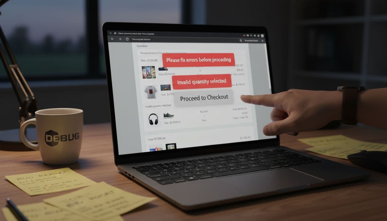
What to check: “Checkout” button states in the checkout process, “Apply coupon,” plus/minus steppers, and tiny trash icons.
Why it fails users: A visually disabled button that is still clickable confuses everyone. On mobile, small icons miss taps and fail WCAG 2.2 Target Size (Minimum).
How to fix:
- For native buttons, use the real attribute:
<button disabled>Checkout</button>. Browsers and assistive tech handle it correctly. - If you’re using a custom element, set
aria-disabled="true", add ARIA labels as needed, and block activation in JS. If you don’t want it focusable, also settabindex="-1"while disabled. - Increase hit area without changing the icon size. CSS like
min-width: 24px; min-height: 24px; padding: 8px;usually gets you there. Provide text alternatives for trash icons and steppers viaaria-labelor visible text.
How to test:
- Keyboard: Tab to the control. A disabled native button should be skipped. A custom disabled control should not activate with Enter/Space.
- Screen reader: Confirm it announces “dimmed” or “unavailable” (wording varies).
- Automated: Axe can flag invalid
aria-disabledusage and missing button names.
Error identification and suggestions in checkout (the conversion killer)
What to check: Required form fields, invalid formats, address validation, payment errors, and inline hints.
Why it fails users: If an error only shows red text, many users won’t notice. If focus stays on the “Place order” button, keyboard users may not find the first error. Poor error handling tanks conversion rates.
How to fix (fast, reliable):
- Add a persistent error message near the form field, and connect it with
aria-describedby="email-hint email-error". - Set
aria-invalid="true"when invalid. - Provide a top-of-form error summary that links to each invalid field (anchor links are fine).
- Write suggestions, not blame. “ZIP must be 5 digits” beats “Invalid input.”
- Use
autocompletetokens where you can, and keep input types honest (type="email",inputmode="numeric").
How to test:
- Keyboard: Submit an empty form during the checkout process, then confirm focus moves to the error summary or the first invalid field.
- Screen reader: Listen for the error text right after the label when focusing the field.
- Automated: Tools catch missing labels and some aria-describedby issues, but only manual testing proves the flow.
Announce cart updates without spamming users
What to check: Quantity changes, coupon applied, shipping estimate updated, “Item removed,” and mini-cart drawers.
Why it fails users: If the total changes silently, screen readers users may think nothing happened. On the other hand, announcing every small change can be noisy.
How to fix:
- Add a live region for “cart status” messages:
role="status" aria-live="polite" aria-atomic="true". - For blocking errors (coupon failed), use
role="alert"so it’s announced right away. - When removing an item, move focus somewhere predictable (next item’s name, or the cart heading). Don’t dump focus at the top of the page.
A good overview of common store failures is Common ecommerce accessibility issues (and how to fix them).
How to test:
- Keyboard: Change quantity, then Tab forward. Focus should not jump unexpectedly.
- Screen reader: Confirm you hear “Quantity updated, total $84.00” once.
- Automated: Automated tools won’t validate announcements well. Use them to catch structural issues, then spot-check live updates manually.
Popups and promo modals: fix focus traps without trapping shoppers
### Focus trapping, Escape, and return focus (the modal must behave)
What to check: Newsletter popup, size guide modal, cart drawer, and cookie banner dialogs.
Why it fails users: Focus often escapes into the page behind the modal, disrupting keyboard navigation. Some modals also start focused behind a sticky header, obscuring focus indicators so users “lose” the highlight.
How to fix:
- Use native
<dialog>when possible. If not, userole="dialog"andaria-modal="true". - Move focus into the modal on open (close button or heading with proper heading structure), and restore focus to the trigger on close. A simple pattern is: store
document.activeElementbefore opening, then call.focus()on it after closing. - Support Escape to close (except when it would cause data loss, then confirm), supporting smooth keyboard navigation.
- Keep focused elements visible. Sticky headers and cookie bars often cover focus. The W3C explainer on Focus Not Obscured is a useful reference when you debug “focus is there, but I can’t see it.”
How to test:
- Keyboard: Open modal, Tab through every interactive element, Shift+Tab back, press Escape, confirm focus returns to the opener.
- Screen reader: Confirm it announces a dialog, then reads the title.
- Automated: Axe will flag missing dialog names and focusable background content in many cases, but still do the manual loop test.
For platform-focused guidance, teams often start with a practical list like Shopify accessibility checklist, then adapt the same patterns to Magento, WooCommerce, and custom stacks to meet Americans with Disabilities Act requirements for promotional popups.
Paste-ready acceptance criteria for tickets (fast QA)
These criteria ensure ADA compliance as the core goal while broadening scope to align with regulations like the European Accessibility Act, delivering an accessible online store.
- All interactive elements use native controls (
<button>,<a>,<input>) or expose equivalent role, name, and state. - Variant controls have a visible label and a programmatic label (label/legend or ARIA).
- Gallery thumbnails and product imagery include descriptive alt text; next/prev controls are keyboard operable, and don’t require dragging.
- Sale badges, prices, focus rings, and input borders meet contrast needs, including non-text contrast.
- Touch targets for key actions are at least 24 by 24 CSS pixels (or have equivalent spacing).
- Any multimedia content on the store, such as videos, includes captions.
- Checkout errors: each invalid field sets
aria-invalid, includes a linked message, and provides a fix suggestion. - Cart updates announce key changes via
role="status"(polite), and errors viarole="alert". - Modals: focus moves in on open, stays inside, closes with Escape, and returns to the trigger.
- Keyboard-only purchase path delivers a seamless user experience end-to-end on desktop and mobile emulation.
Conclusion
Accessibility fixes move faster when you treat them like checkout bugs, because that’s what they are. Follow this ecommerce accessibility checklist: start with product pages, cart, checkout, then clean up every popup. When your online store is keyboard-usable and screen reader-friendly, it boosts user experience through digital accessibility and lets more people, including those covered by the Americans with Disabilities Act, buy without friction. For broader UX planning that pairs well with accessibility work, reference 7 powerful e-commerce UX tips.