
If your store’s checkout only works with a mouse, it’s like building a shop with a door that only opens for some people. You’ll see spikes in cart abandonment and drops in conversion rates, and you’ll never spot that in analytics as “accessibility.”
In 2026, ecommerce accessibility is less about nice-to-have polish and more about protecting revenue. Product pages, carts, and checkout are where small barriers turn into abandoned sessions.
This guide focuses on WCAG 2.2, with practical checks your team can test today for an accessible checkout process, fixes engineers can ship quickly, and acceptance criteria QA can verify.
Why ecommerce accessibility got more urgent in 2026
WCAG 2.2 Level AA is the current recommendation for ADA compliance for e-commerce, and it builds on 2.1 instead of replacing it. That means past work still counts, but you have new expectations around focus, touch targets, dragging, and common checkout friction. Keep the spec handy for edge cases, see the official WCAG 2.2 guidelines.
Enforcement pressure also rose, driven by digital accessibility lawsuits under ADA Title III. In the US, private ecommerce still doesn’t have one single “named” technical standard in law, but WCAG AA remains the yardstick in digital accessibility lawsuits under ADA Title III. Meanwhile, EU requirements became real business constraints after 2025 under the European Accessibility Act for stores selling into the region (many teams align to WCAG through EN 301 549). For a plain-language snapshot of 2026 expectations around ADA compliance for e-commerce, review WCAG and ADA compliance requirements and this February 2026 ecommerce accessibility guide.
What changed day-to-day for ecommerce teams?
- Focus indicators for keyboard navigation can’t be hidden behind sticky headers, cookie banners, chat widgets, or mini-carts (WCAG 2.2 adds Focus Not Obscured 2.4.11 at AA).
- Touch targets must be easier to hit (Target Size 2.5.8 at AA), which hits quantity steppers and tiny “remove” icons.
- Drag actions need alternatives (Dragging Movements 2.5.7 at AA), which hits image zoom, sliders, and “swipe to remove.”
- Checkout forms must reduce friction (Redundant Entry 3.3.7 and Accessible Authentication 3.3.8 at A), which affects address steps and one-time codes.
A quick gut-check: if a keyboard user can’t always see where they are, your flow isn’t “mostly accessible.” It’s broken at the point of use.
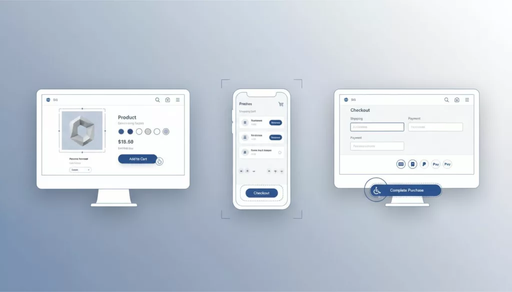
WCAG 2.2 checklist by journey step (product page, cart, checkout)
Product detail pages (PDP): variants, galleries, and “Add to cart”
Common failure patterns: Custom “dropdowns” for size or color that are really div menus, image zoom that traps focus, and buttons that screen readers announce as “button” with no name. Product images often lack proper alternative text, and low color contrast ratios on price text are still everywhere. (If you need a quick baseline, start with these ecommerce color contrast best practices.) Building on strong product listing pages sets the stage for smooth product detail pages.
What to test: Navigate the product detail pages using Tab and Shift+Tab only; operate variant selection with keyboard navigation alone; confirm focus isn’t covered by sticky UI; zoom images without drag-only controls; run a screen reader through the variant and add-to-cart controls. Ensure galleries include descriptive alternative text for all images.
How to fix (fast): Prefer native elements with semantic HTML structure. A real <select> for variants beats a fragile custom widget. If you must use a custom combobox, you still need a correct accessible name and state, for example aria-label="Size" plus aria-expanded="false" on the trigger, and a predictable focus order (WCAG 2.1.1, 2.4.3, 4.1.2). For image zoom, add buttons like button aria-label="Zoom in" and button aria-label="Zoom out" so zoom isn’t drag-only (2.5.7). Maintain proper color contrast ratios on all text elements, including prices. When the user adds an item, announce it with a live region, for example div role="status" aria-live="polite" that updates to “Added to cart.”
Also, don’t remove focus outlines or focus indicators. Instead, style them: :focus-visible { outline: 3px solid #0A66FF; outline-offset: 2px; }. Then verify the outline stays visible even near sticky headers (2.4.11), aligning with WCAG 2.2 Level AA. For broader UX alignment, this research-backed ecommerce UX best practices guide pairs well with accessibility work because it targets the same friction points.
QA acceptance criteria:
- Users can select any variant and activate “Add to cart” using keyboard navigation only (no traps).
- Every interactive control has a clear accessible name (screen reader doesn’t announce “unlabeled button”).
- Focus remains visible and not covered by sticky UI, including after opening galleries or panels.
Cart and mini-cart: shopping cart accessibility, focus, updates, and tiny controls
Common failure patterns: Mini-cart drawers that open without moving focus, quantity steppers that are too small on mobile and violate target size minimum, and “Remove” icons that have no text label. Another classic: cart totals update visually but are silent to assistive tech, hurting shopping cart accessibility.
What to test: Add an item, open the mini-cart, adjust quantity, apply a promo code, and remove an item using only a keyboard. Then repeat on mobile with large text and zoom.
How to fix (fast): Treat mini-cart drawers as dialogs. When it opens, move focus to a heading or first control, and trap focus inside until close. Mark it up like role="dialog" aria-modal="true" aria-labelledby="cart-title", and return focus to the triggering button on close (2.4.3). For cart updates, announce changes with ARIA live regions, for example “Quantity updated, total $84.00.” Make icon buttons explicit, such as button aria-label="Remove item".
Target size minimum matters now more than ever. If your quantity stepper is hard to hit, increase hit area to at least 24 by 24 CSS pixels (2.5.8), even if the icon stays small. For deeper keyboard patterns, this guide on keyboard navigation in web design helps teams standardize expectations across components.
QA acceptance criteria:
- Opening the mini-cart moves focus into it, and closing returns focus to the opener.
- Quantity, remove, and promo actions are operable by keyboard and have names.
- Cart updates (errors and totals) are announced to screen readers with screen reader compatibility.
Checkout: accessible checkout process, labels, errors, authentication, and payment steps
Common failure patterns: Placeholder-only labels, error messages that appear at the top with no field connection, address “validation” that clears user input, and 3DS payment iframes that confuse focus order. CAPTCHA and one-time passcodes often fail Accessible Authentication (3.3.8), undermining the accessible checkout process.
What to test: Complete checkout without a mouse; submit with empty required fields; trigger invalid postal code and card errors; use autofill; complete any OTP or 3DS step; verify timeouts and session expiration warnings.
How to fix (fast): Every input needs proper form labels and instructions, not just placeholder text. Use label for="email" with input id="email" autocomplete="email". When errors happen, identify them per field: set aria-invalid="true" and connect a message via aria-describedby="email-error" for error message accessibility. Write error text that explains recovery, like “Card number needs 16 digits.” (WCAG 3.3.1 and 3.3.3.) Ensure form labels and instructions follow semantic HTML structure.
Reduce redundant entry across steps (3.3.7). If shipping and billing match, don’t force retyping. Offer a checkbox that copies values, and keep it keyboard-friendly. For authentication, avoid puzzle CAPTCHAs as the only option. Support alternatives, such as email link verification, passkeys, or “send code by SMS or email,” without memory tests or image challenges (3.3.8).
Finally, watch focus around embedded payment fields and accessible payment gateways. If 3DS opens a modal or iframe, set a clear title and move focus into the frame. When it finishes, return focus to a confirmation heading. Also prevent auto-advancing focus while typing unless users expect it (auto-jump can violate predictable focus behavior and focus order). Perform a manual accessibility audit to confirm screen reader compatibility throughout the accessible checkout process.
QA acceptance criteria:
- Each field has a programmatic label and expected autocomplete tokens.
- Errors are tied to the correct field, announced, and include a clear fix with error message accessibility.
- Payment modals and iframes have logical focus entry and exit, with no keyboard traps.
Common ecommerce issues mapped to WCAG 2.2 Level AA checklist (quick reference)
Use this WCAG 2.2 checklist table to triage frequent failures in interactive components that break revenue flows, ensuring ADA compliance for e-commerce and an accessible checkout process.
| Frequent issue | Where it shows up | WCAG 2.2 checklist criteria | Suggested remediation |
|---|---|---|---|
| Variant selector as custom dropdown | PDP | 2.1.1, 2.4.3, 4.1.2 | Prefer <select>, or correct ARIA combobox for screen reader compatibility |
| Image zoom needs drag | PDP | 2.5.7, 2.1.1 | Add zoom buttons, ensure alternative text, keep keyboard support |
| Promo code field unlabeled | Cart/Checkout | 1.3.1, 3.3.2, 4.1.2 | Use real label, add helper text |
| Address validation wipes input | Checkout | 3.3.1, 3.3.3 | Keep user data, highlight fixes inline |
| 3DS in iframe traps focus | Checkout | 2.1.2, 2.4.3, 2.4.11 | Move focus intentionally, return on close |
| CAPTCHA is only gate | Checkout/Login | 3.3.8 | Offer non-CAPTCHA option, support passkeys/links |
| Modal blocks focus indicator | Cart/Checkout | 2.4.11, 2.4.7 | Ensure focus not covered, style :focus-visible |
| Auto-advancing focus in OTP | Checkout | 3.2.1, 2.4.3 | Don’t steal focus, allow paste, clear labels |
| Session timeout with no warning | Checkout | 2.2.1 | Warn before expiry, extend time easily |
| Tiny “remove” or stepper buttons | Cart | 2.5.8, 2.4.7 | Increase hit area for mobile commerce accessibility, keep visible focus |
If you’re building plugins or extensions, WooCommerce’s accessibility best practices for developers is a helpful sanity check for patterns that scale across themes.
Conclusion
In 2026, ADA compliance for e-commerce is a competitive advantage that pays off twice. First, it reduces legal and brand risk. Second, an accessible checkout process boosts conversion rates and cuts cart abandonment right where customers pay.
Start with the money pages, PDP, cart, checkout. Prioritize shopping cart accessibility and test with keyboard navigation first, then screen readers, then mobile commerce accessibility touch targets. Complement manual checks with automated testing tools. If you fix focus visibility, form recovery, and control names, you’ll further reduce cart abandonment and feel the difference in support tickets and conversions.