

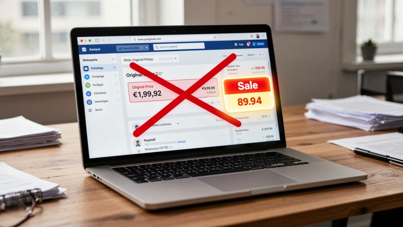
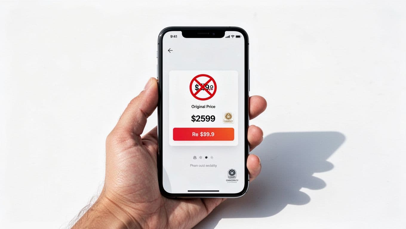
A crossed-out price can lift clicks in seconds, or kill trust even faster.
Shoppers know when a deal looks staged. If the old price feels inflated, unlabeled, or louder than the live price, your compare at price ux starts creating doubt instead of momentum. In 2026, that doubt can also bring legal and compliance risk.
The fix is not flashy. Show a real reference price, explain what it means, and make the savings easy to believe.
Why fake-looking compare-at prices backfire
Compare-at pricing works when it lowers mental effort. It fails when shoppers have to decode it.
If a product shows “$99” next to a giant crossed-out “$299,” most buyers won’t think, “Great deal.” They’ll think, “Says who?” That pause is expensive. It slows the click, weakens trust, and makes the whole page feel salesy.
There’s also a real policy issue here. The FTC is putting more weight on upfront, truthful pricing, and state rules can be stricter. As this 2025 legal overview explains, comparison pricing carries risk when the reference price is not a real former price, or when the label hides what that price represents. In California, older former prices may need a date disclosure.
So the rule is simple. If your team can’t prove the crossed-out price, don’t show it.
What credible compare-at price UX looks like
Good compare-at price UX makes the current price clear first. The reference price supports the story, it doesn’t dominate it.
That means three things. First, label the reference. “Was,” “MSRP,” and “market price” do different jobs, so don’t swap them around. Second, show honest savings, either in dollars or percent, but only when the math is clean. Third, pair the price with proof or reassurance, such as a shipping estimate, return policy, or a note like “lowest price in the last 30 days.”
This kind of microcopy sounds clear, not defensive:
- “Was $49 on our site last month”
- “MSRP $59”
- “Save $10 today”
- “Lowest price in the last 30 days”
Each line tells the shopper what the anchor means. That matters more than visual drama.
Also, keep the pricing story consistent across the journey. If the PDP shows a discount, but shipping stays vague until checkout, the offer loses force. That’s why shipping calculator UX best practices matter alongside price presentation. The same goes for variants. When color or size changes, the compare-at price should update too.
If the reference price needs an explanation, it needs a label.
Good and bad patterns, side by side
Many teams still repeat the product page discount mistakes documented in Baymard’s research on price discount displays. The difference between a credible pattern and a fake-looking one is usually small, but shoppers notice it fast.
Here’s a quick side-by-side view:
| Element | Good pattern | Bad pattern |
|---|---|---|
| Reference label | “Was $49” or “MSRP $59” | Bare crossed-out number |
| Savings message | “Save $10” | “70% OFF” with unclear math |
| Visual weight | Current price is largest | Old price is larger than live price |
| Proof point | “Lowest price last 30 days” | Countdown timer plus no proof |
The takeaway is straightforward. Clear context beats louder design.
Bad UI often relies on visual manipulation. Think oversized red strike-throughs, flashing sale badges, fake urgency, or five promo chips stacked around one price. Good UI stays calm. It uses contrast with restraint, keeps the sale price primary, and explains the anchor in one short line.
If you want to use market reference pricing, name it honestly. “Compared with select retailers” is fine if you can defend the sample and refresh it often. If the number is MSRP, say MSRP. If it’s your former site price, say that. Don’t label all three as “regular price.”
A/B tests that raise conversion without bending trust
The best tests improve clarity, not pressure.
Start with label tests. “Was” often outperforms a naked strike-through because it reduces guesswork. Next, test dollar savings against percent savings. For lower-priced items, percent can feel bigger. For higher-priced items, dollar-off often lands better because it feels concrete. Then test a proof point, such as “lowest price last 30 days,” against a plain price stack.
Keep the styling test small. Try a muted compare-at price versus a bright red one. Test whether showing the savings line under the current price helps more than putting it in a badge. Also test consistency, because a believable discount on the PDP can still fall apart in cart if other charges feel hidden. Calm promo patterns, like these ethical free shipping threshold designs, are a good model.
Watch more than conversion rate. Track add-to-cart, checkout start, price-related support contacts, returns, and complaint themes. If conversion rises but “Is this sale real?” tickets also rise, the test didn’t win.
Never test fake anchors, fake timers, or reference prices your merch team can’t back up.
Compare at price ux works when it removes doubt, not when it manufactures excitement. Real reference pricing, clear labels, quiet styling, and proof will usually beat louder discount theater.
Before your next promo goes live, audit one PDP, one collection card, and one cart state. If the price still looks honest without the badge, you’re close.