

A shopper can forgive one extra tap. They rarely forgive a long, error-prone address form in the e-commerce checkout.
For many stores, the shipping step is where momentum fades, especially on mobile. Good address autocomplete UX cuts typing, lowers mistakes, and helps buyers keep moving toward payment.
The goal is simple, less effort at the point where patience is thinnest. Start by fixing the friction inside the checkout form itself.
Key Takeaways
- Address autocomplete cuts checkout friction by reducing typing, errors, and decision points, especially on mobile where thumbs rule and patience runs thin.
- Design for speed and choice: Use a single field with real-time suggestions biased by IP location, short lists with large tap targets, and always keep manual entry open for edge cases like rural routes or PO boxes.
- Prioritize accessibility and accuracy with keyboard navigation, screen reader support, API validation like Google Places, editable fields post-selection, and visual aids like minimaps.
- Measure real impact through checkout completion, address error rates, completion time, and shipping-step abandonment, segmented by device and user type to catch hidden issues.
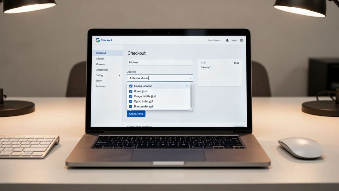
Why the address field stalls checkout
Checkout friction often looks small until it stacks up. A shopper starts typing a street name, switches keyboards for a ZIP code, guesses the right state format, then hits input errors after submit. That feels less like buying and more like filling out tax paperwork.

Common friction points show up fast. Apartment or suite fields appear too late. Postal code rules reject valid formats. The form clears after one bad entry. On phones, the suggestion list sits under the keyboard or gets cut off by a sticky footer.
These problems hurt more in guest checkout, because first-time buyers have no stored data to rescue them. Fixes like these boost conversion rates for new visitors. If you’re also working through broader mobile checkout issues, these guest checkout UX patterns for mobile friction reduction pair well with address improvements.
Every extra decision in the address form is another chance for a ready buyer to stop.
Address autocomplete UX helps because it removes repeat work. Instead of typing every line, shoppers confirm a likely match. That shift matters. People are faster at choosing than composing, and they trust forms more when the system seems to understand what they mean.
Still, autocomplete won’t fix everything. If shipping costs appear late, or the guest path is hard to find, form abandonment will stay high. Neglecting these fields harms the user experience. The address field is one leak in the bucket, but it’s often a large one.
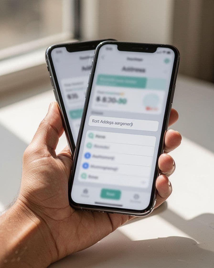
Design address autocomplete UX for thumbs first
On a phone, autocomplete, known as type-ahead search, should feel like a shortcut, not a trap. The best pattern starts with one clear address field, then shows a short list of likely matches close to the input. Large tap targets matter here, because thumb slips are common when buyers are rushing.
A few design choices do most of the work:
- Trigger real-time suggestions early enough to help, but not after the first character, using location data from the IP address for location biasing.
- Keep the list short and place it directly under the active field.
- Reveal apartment, suite, or unit after the main address is selected.
- Leave a clear manual address entry path for shoppers who need it.
That last point matters more than many teams expect. New builds, rural routes, PO boxes, and international formats don’t always match neatly. If autocomplete becomes the only path, it stops being helpful.
Mobile usability also means respecting other shortcuts. Browser autofill, saved addresses, and wallet flows should coexist with autocomplete, not compete with it. Don’t auto-select the first suggestion when the field loses focus. Let the shopper choose. Also, keep the chosen address editable without forcing a full reset.
Good address autocomplete UX reduces effort, but it shouldn’t feel magical or opaque. Show enough location detail in each suggestion to help buyers distinguish between similar streets. If someone picks the wrong match, correction should take one tap, not a full restart.
Protect accessibility, accuracy, and measurement
Fast checkout still needs to work for everyone. That means your autocomplete must support keyboards, screen readers, zoomed layouts, and slower devices. A dropdown that only works for mouse users may look polished in QA and still fail real customers.
Keep focus states visible. Announce suggestions clearly for assistive tech. Let users move through options with the keyboard and exit the list without getting trapped. Most of all, keep manual entry available at all times to reduce keystrokes while assistance never becomes a gate.
Accuracy also needs product thinking, not blind trust in the data source. Test apartment-heavy cities, rural areas, international address formats, and addresses with accented characters. Enable address validation through API integration like Google Places API for standardized address data and fuzzy matching on low-confidence results. Let shoppers edit address components such as house numbers, units, or business names after selection. If the system has low confidence, ask for confirmation instead of forcing a mismatch, and include a minimap to visually confirm the shipping address. Pair this with shipping transparency to reduce abandonment, because a perfect address won’t save a checkout form that still surprises buyers on cost.
These four metrics will tell you if the UX is helping or only looking faster, with a focus on the shipping address:
| Metric | What to measure | Why it matters |
|---|---|---|
| Checkout completion rate | Sessions that start the address step and reach purchase | Shows whether faster entry turns into more orders |
| Address error rate | Validation failures, field corrections, and bad matches in address components | Exposes hidden friction and data quality issues |
| Time to complete | Median time from first address input to shipping method selection | Reveals speed gains, especially for mobile usability |
| Shipping-step abandonment | Exits after shipping address entry begins but before payment | Shows where shoppers still lose momentum |
Suggestion acceptance rate is useful too, but it isn’t the main goal. A high acceptance rate can hide bad outcomes if people still abandon later. Review results by device, country, and new versus returning shoppers. Also watch support tickets and delivery issues, because bad address validation UX can move problems downstream.
The address field shouldn’t feel like a quiz. When address autocomplete UX is fast, forgiving, and accessible, shoppers finish checkout more often because the user experience stops fighting them.
Audit the shipping step on a phone, with a keyboard, and with a screen reader. The fix may be smaller than a redesign, but the lift can show up where it counts, in completion, errors, and abandonment.
Frequently Asked Questions
Why does address autocomplete matter more on mobile?
Mobile checkouts amplify small frictions like keyboard switches and tiny tap targets, turning address entry into a momentum killer. Autocomplete shortcuts this with thumb-friendly lists right under the input, cutting time and errors for rushed shoppers. It pairs best with guest flows where no saved data exists.
Should autocomplete be the only address entry option?
No, always include a clear manual entry path for new builds, international formats, or PO boxes that don’t match databases. Forcing autocomplete frustrates edge cases and erodes trust. Good UX lets shoppers pick the fastest route without traps.
How do you ensure address autocomplete is accessible?
Support keyboard navigation, visible focus states, and screen reader announcements for suggestions without trapping users in the list. Test on zoomed views and slower devices, keeping manual entry available. This ensures everyone completes checkout without barriers.
What metrics prove autocomplete UX is working?
Track checkout completion rate, address error rate, time to shipping selection, and step abandonment, broken by device and user type. High suggestion acceptance is secondary—focus on orders and reduced support tickets. Pair with delivery success to spot downstream issues.
Which APIs work best for address validation?
Google Places API excels for standardized data, fuzzy matching, and location biasing, handling apartments, accents, and rural areas well. Enable post-selection edits and low-confidence confirmations. Test against real customer addresses in your markets for accuracy.