Product Comparison UX: How to Design “Compare” Tables People Actually Use
A comparison table should feel like a helpful salesperson aiding decision making, not a math test. Yet many “compare” tables...
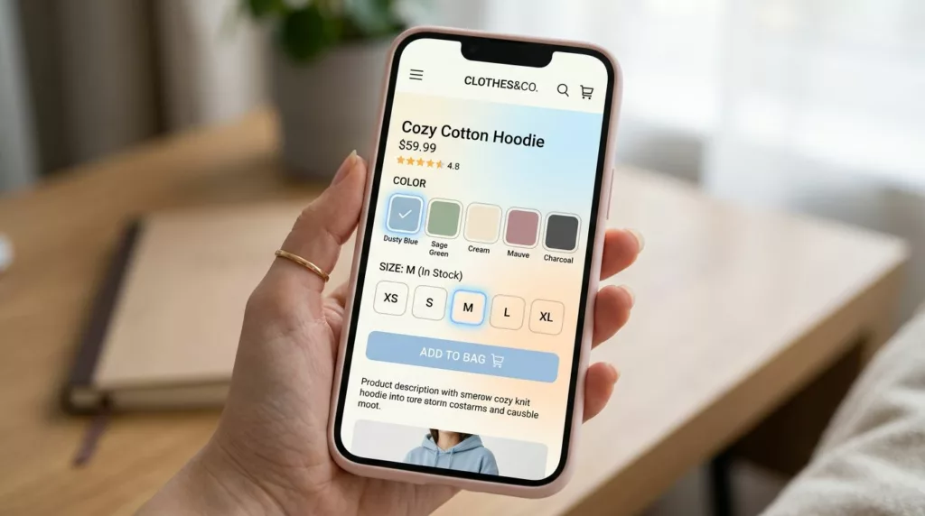
Variant Picker UX Patterns That Reduce Option Confusion On Mobile
Picking a size and color on a phone should feel like ordering coffee: quick, familiar, and hard to mess up....
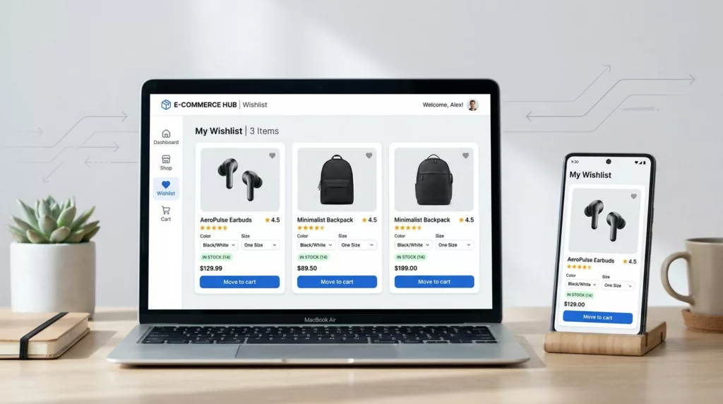
Wishlist UX Patterns That Increase Return Visits and AOV
A wishlist is more than a “save for later” button. It’s a shopper’s external memory, and it’s often where purchase...

Thank You Page UX Playbook for More Upsells and Fewer Tickets
Most teams treat the thank you page like a receipt. Customers treat it like a front desk. Right after purchase,...
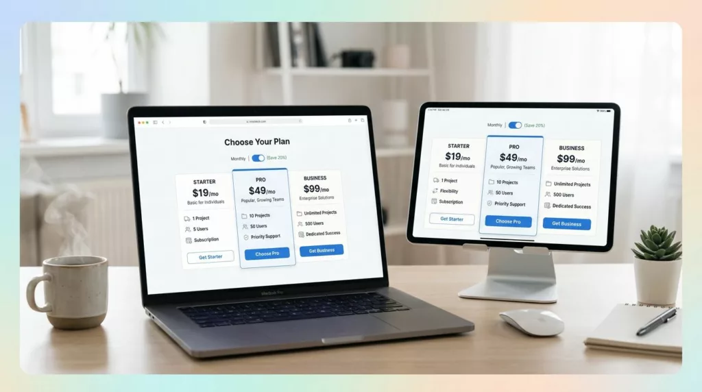
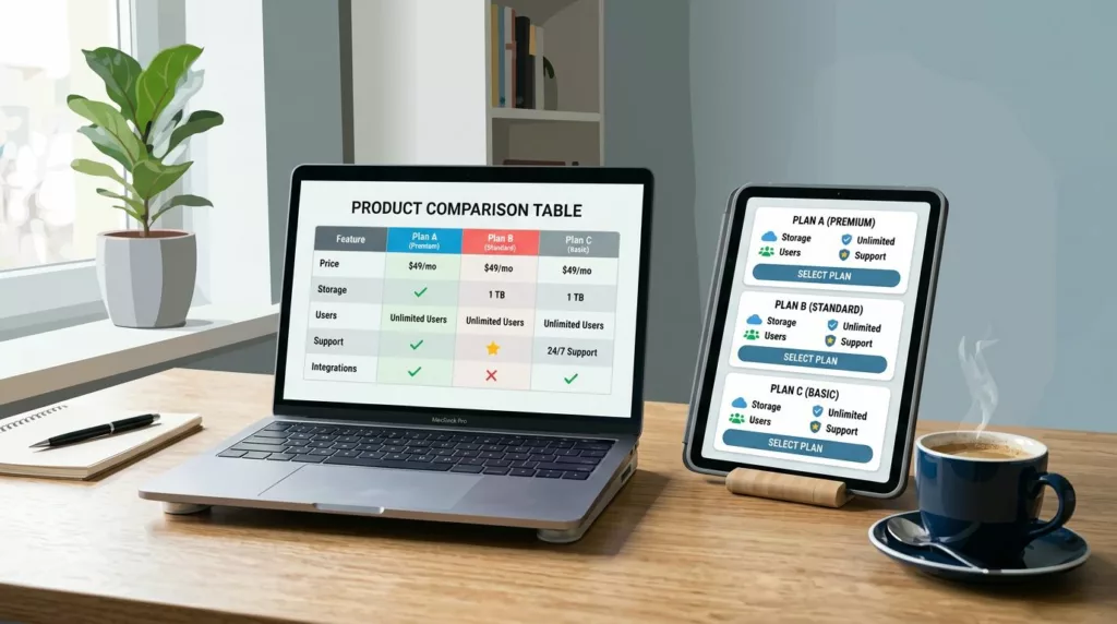
Pricing Page Design for DTC Subscriptions: Clarity, Anchoring, and Comparison Tables
If your best customers subscribe, why does your pricing page feel like a math test? Brands often seek landing page...
Unconventional Navigation Patterns: Key Benefits for E-commerce UX in 2026
In 2026, most shoppers start on a phone, scroll fast, and bounce even faster when they can’t find what they...
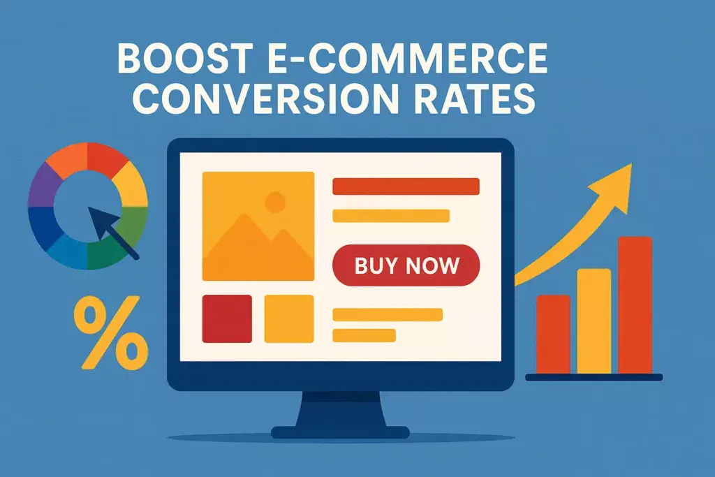
Enhancing E-Commerce Success: Color Schemes That Drive Conversion Rates
I. Introduction to Color Psychology in E-commerce Boost e-commerce conversion rates by understanding the strategic role of color psychology in...
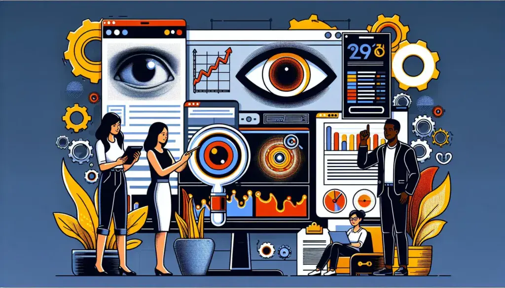
Unlocking User Engagement: A Comprehensive Guide to Eye-Tracking Technology in Web Design
I. Introduction to Eye-Tracking Technology A. Definition of Eye-Tracking Technology Eye-tracking technology encompasses various methods and devices that monitor and...
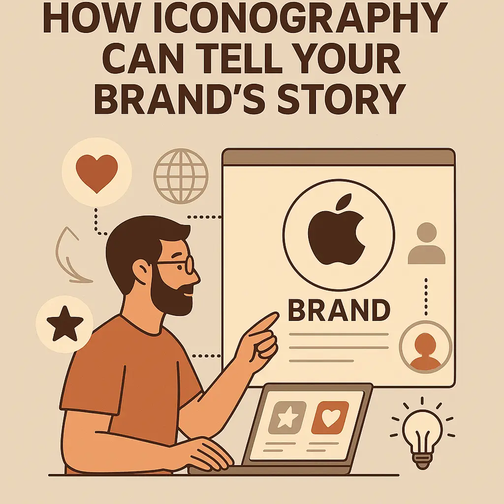
How Iconography Can Tell Your Brand’s Story
How iconography can tell your brand’s story begins with understanding that icons are more than just decorative visuals. Iconography creates...
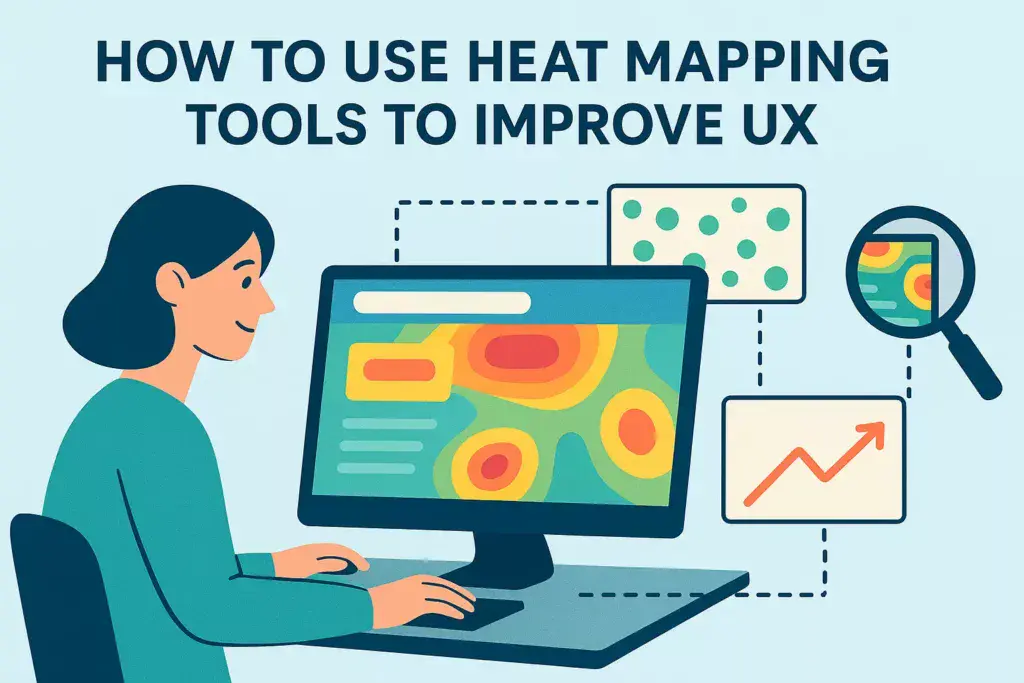
How To Use Heat Mapping Tools To Improve UX
The Benefits of Using Heat Mapping Tools for UX Design Heat mapping tools have become an essential part of user...