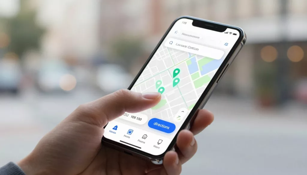
Store Locator UX That Drives More Visits and Local Orders
A shopper who wants your nearest store isn’t browsing, they’re deciding. If your store locator UX is slow, vague, or...
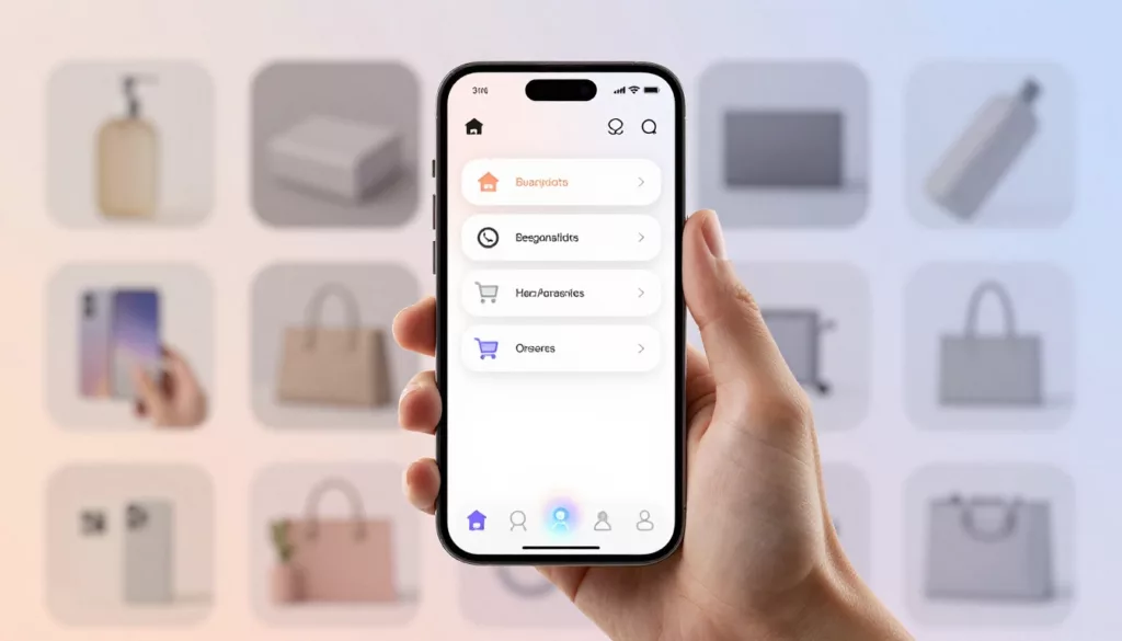
Mobile Bottom Navigation UX for Ecommerce Stores in 2026
On a phone, every extra reach, tap, and pause costs money. That’s why mobile bottom navigation has become one of...
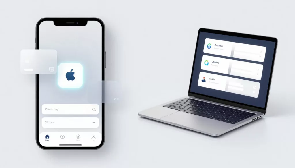
One-Page Vs Multi-Step Checkout for Ecommerce in 2026
Your checkout is like a cashier line. If it looks slow or confusing, shoppers leave before they pay. In 2026,...

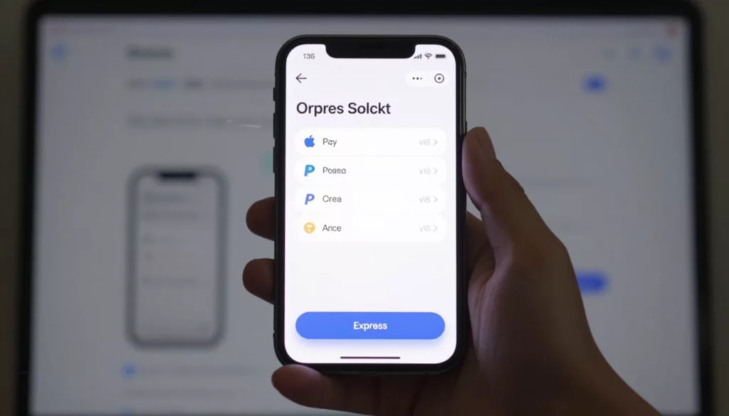
Express Checkout UX That Lifts Mobile Checkout Completion
On mobile, checkout is a thumb test. Every extra field, scroll, and second of doubt cuts intent. Strong express checkout...
Express Checkout UX That Lifts Mobile Completion
On mobile, checkout is a thumb test. If the fastest path is hard to spot, the sale slips away. Good...
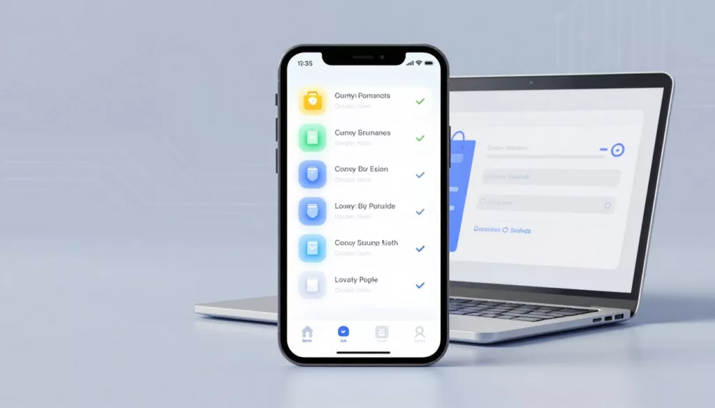
Loyalty Program UX That Drives Signups and Repeat Orders
Most loyalty pages ask for commitment before they explain the deal. That’s backwards. A strong loyalty page feels less like...
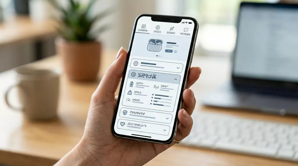
PDP Tabs vs Accordions UX for Mobile Product Pages
On a phone, every product page choice feels bigger. Space is tight, attention is short, and the wrong content pattern...
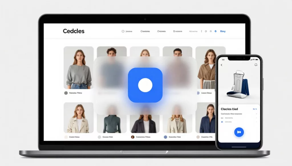
Quick View Modal UX Patterns That Increase Product Adds
Shoppers use product listing pages like a shelf scan in a store, fast, selective, and impatient. A quick view can...
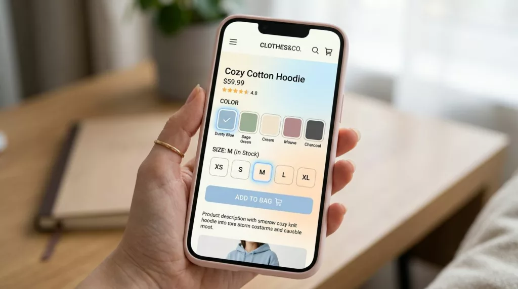
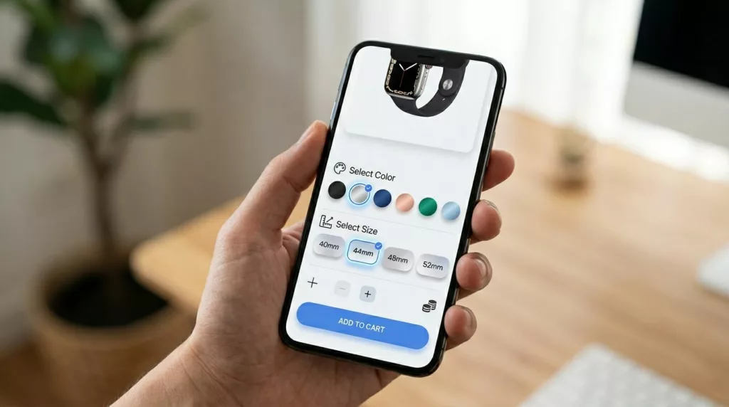
Variant Picker UX Patterns That Reduce Option Confusion On Mobile
Picking a size and color on a phone should feel like ordering coffee: quick, familiar, and hard to mess up....
Product Variant UX For Mobile: Size And Color Pickers That Prevent Add-To-Cart Errors
If a shopper wants a medium in blue, your UI shouldn’t make them “solve” it. On mobile, variant selection is...