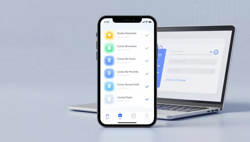
Loyalty Program UX That Drives Signups and Repeat Orders
Most loyalty pages ask for commitment before they explain the deal. That’s backwards. A strong loyalty page feels less like...
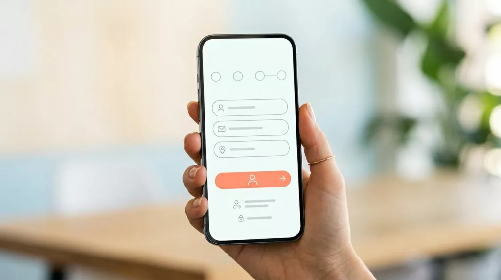
Guest Checkout UX Patterns That Reduce Mobile Checkout Friction
On a phone, checkout fails for small reasons. A hidden guest option, a long form, one bad error message, and...

Guest Checkout UX Patterns That Cut Friction and Lift Conversion
Checkout is the toll booth at the end of the buying trip. If the gate sticks, revenue backs up fast....
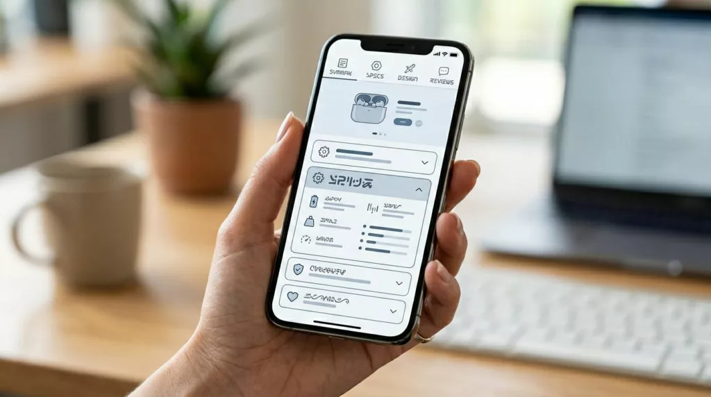
PDP Tabs vs Accordions UX for Mobile Product Pages
On a phone, every product page choice feels bigger. Space is tight, attention is short, and the wrong content pattern...

Email Capture Without Annoying Popups: First Visit, Exit Intent, and Mobile Patterns
Nobody visits your site hoping to be greeted by a modal. They came for a product, an answer, or a...
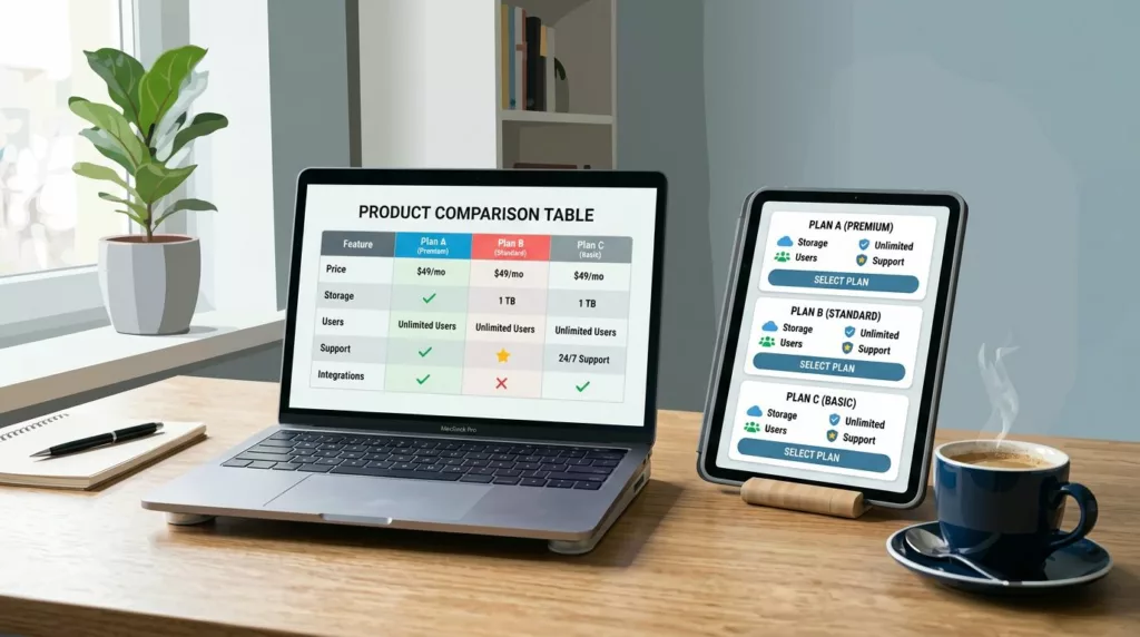
Product Comparison UX: How to Design “Compare” Tables People Actually Use
A comparison table should feel like a helpful salesperson aiding decision making, not a math test. Yet many “compare” tables...
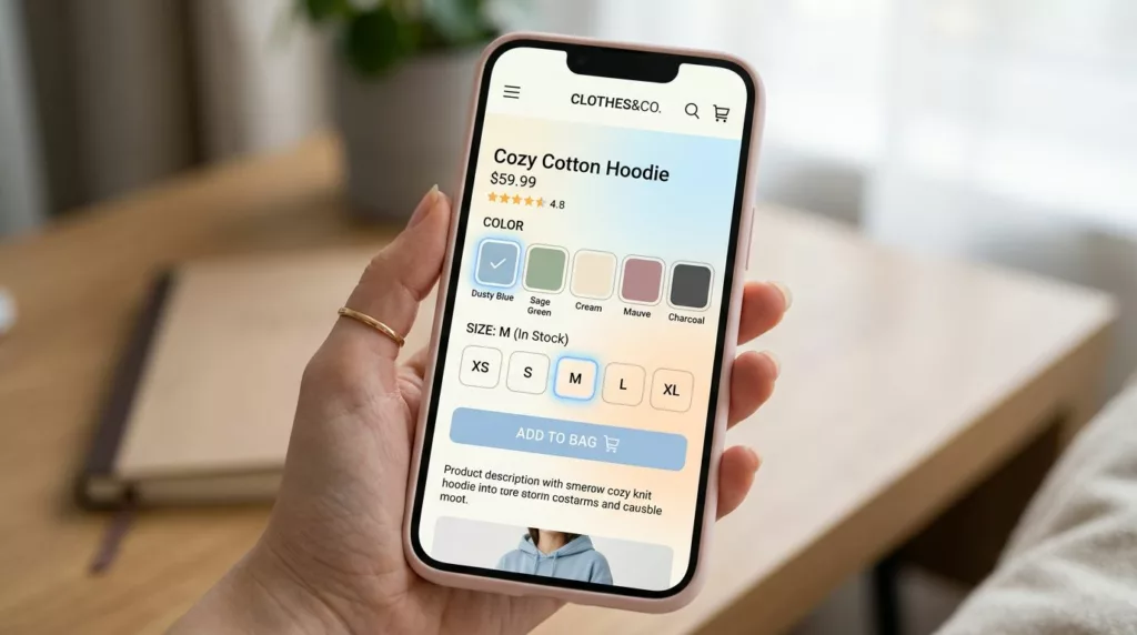
Variant Picker UX Patterns That Reduce Option Confusion On Mobile
Picking a size and color on a phone should feel like ordering coffee: quick, familiar, and hard to mess up....
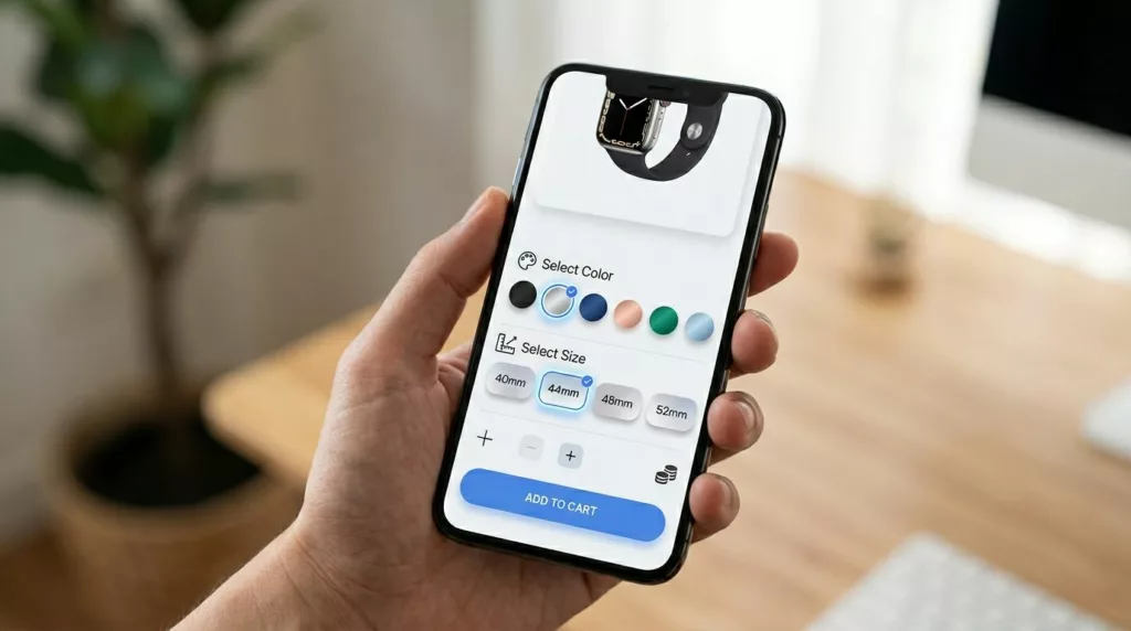
Product Variant UX For Mobile: Size And Color Pickers That Prevent Add-To-Cart Errors
If a shopper wants a medium in blue, your UI shouldn’t make them “solve” it. On mobile, variant selection is...
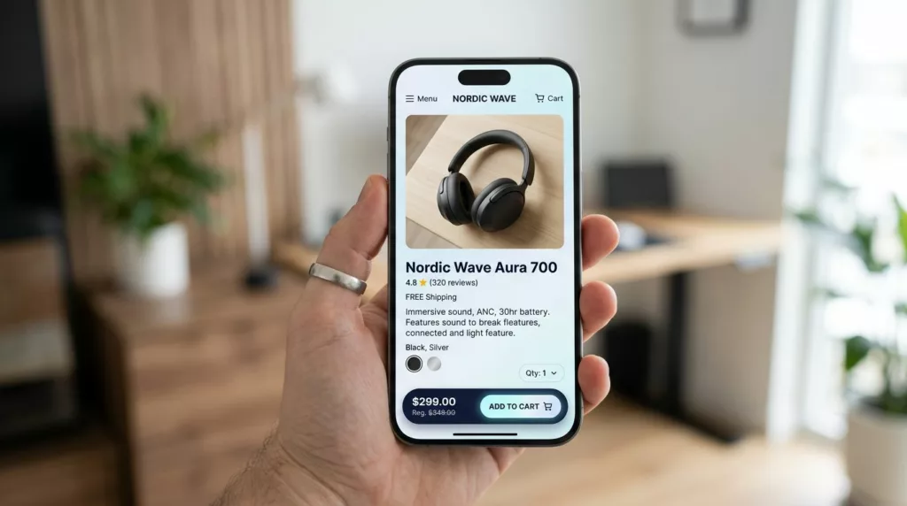
PDP Sticky Add to Cart Bar That Works on Mobile (2026)
On mobile, a product page (PDP) in an online store is a long hallway. Shoppers walk past photos, reviews, and...
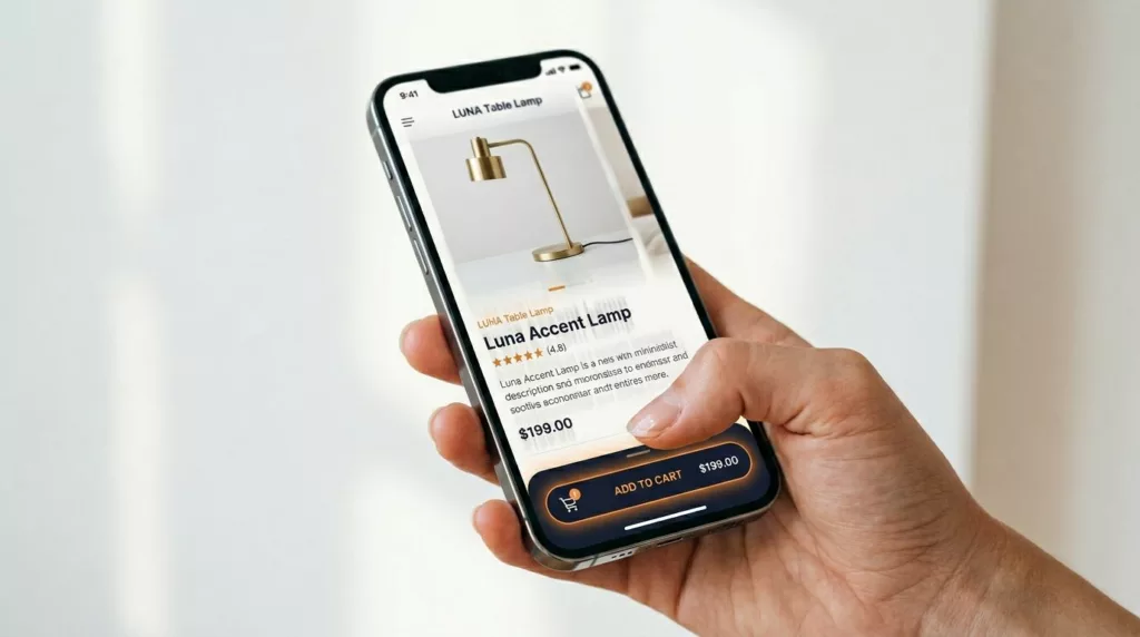
Sticky Add to Cart Bars That Lift Mobile Conversions (2026 Guide)
Mobile shoppers in your online store are ready to buy, but the small screens of mobile devices fight them. Your...