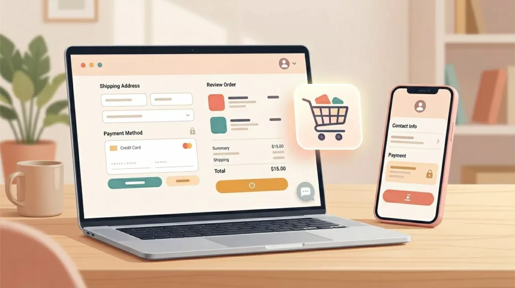
Microcopy for E-commerce UX: 100 Button, Error, and Shipping Lines You Can Copy and Tweak
Ever watched a shopper hesitate at checkout like they’re standing at a locked door, key in hand? That door is...
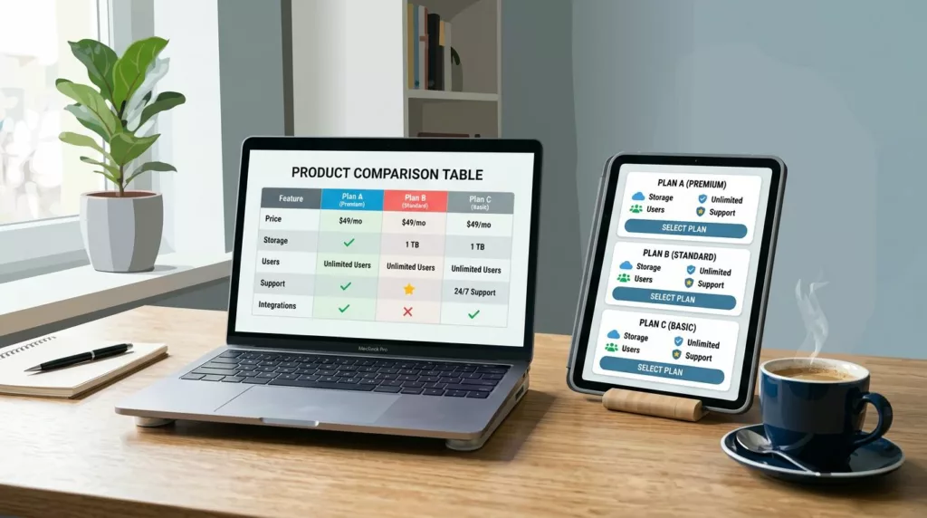
Product Comparison UX: How to Design “Compare” Tables People Actually Use
A comparison table should feel like a helpful salesperson aiding decision making, not a math test. Yet many “compare” tables...
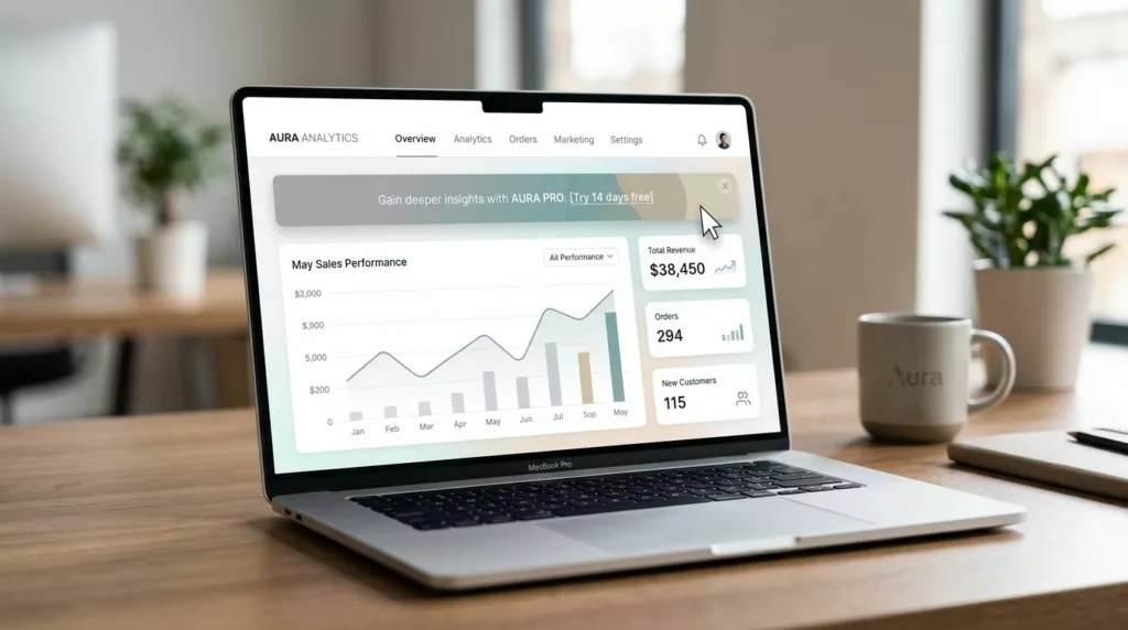
Discount Banner Design: On-Site Promo Banner UX That Boosts Clicks Without Banner Blindness
Most on-site promo banners fail for a simple reason: they look like banners. Users learn the pattern, filter it out,...
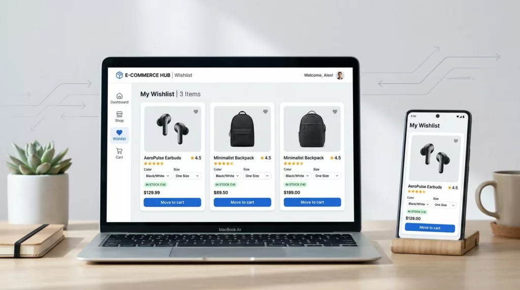
Wishlist UX Patterns That Increase Return Visits and AOV
A wishlist is more than a “save for later” button. It’s a shopper’s external memory, and it’s often where purchase...
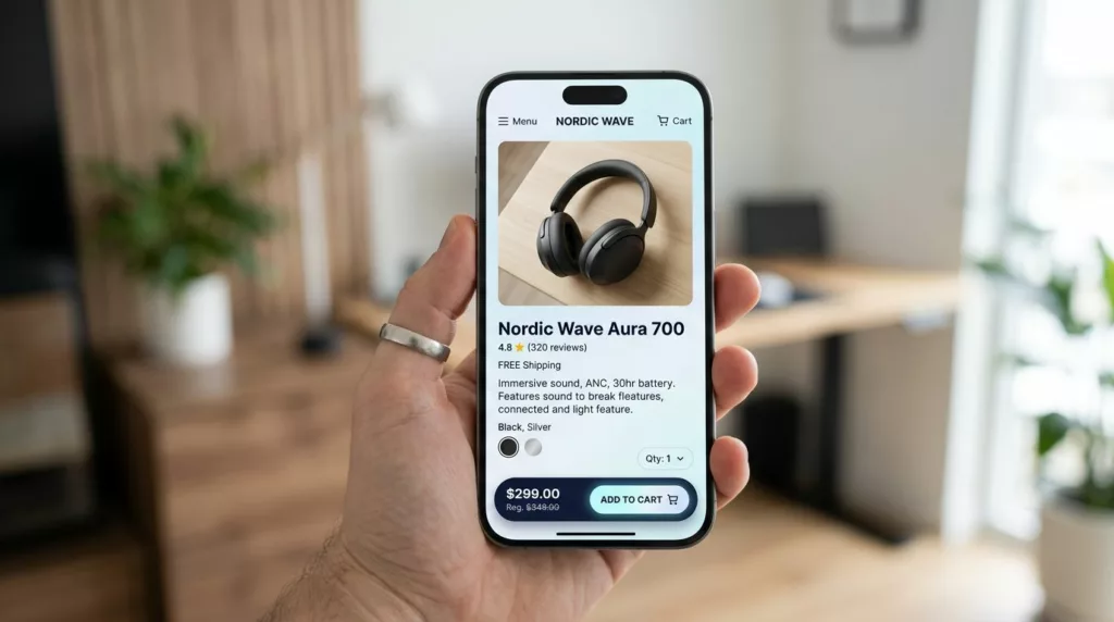
PDP Sticky Add to Cart Bar That Works on Mobile (2026)
On mobile, a product page (PDP) in an online store is a long hallway. Shoppers walk past photos, reviews, and...
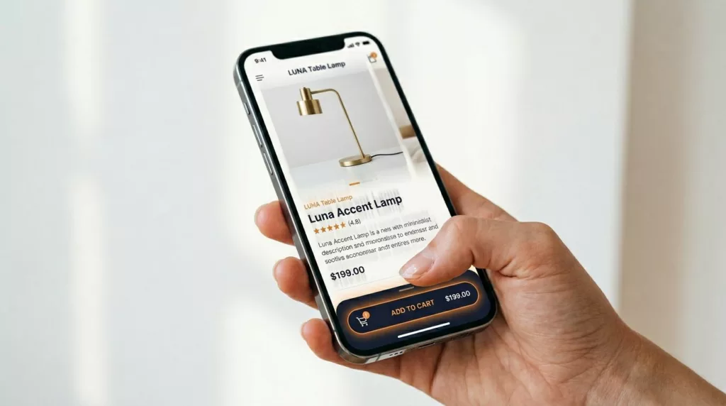
Sticky Add to Cart Bars That Lift Mobile Conversions (2026 Guide)
Mobile shoppers in your online store are ready to buy, but the small screens of mobile devices fight them. Your...

Thank You Page UX Playbook for More Upsells and Fewer Tickets
Most teams treat the thank you page like a receipt. Customers treat it like a front desk. Right after purchase,...
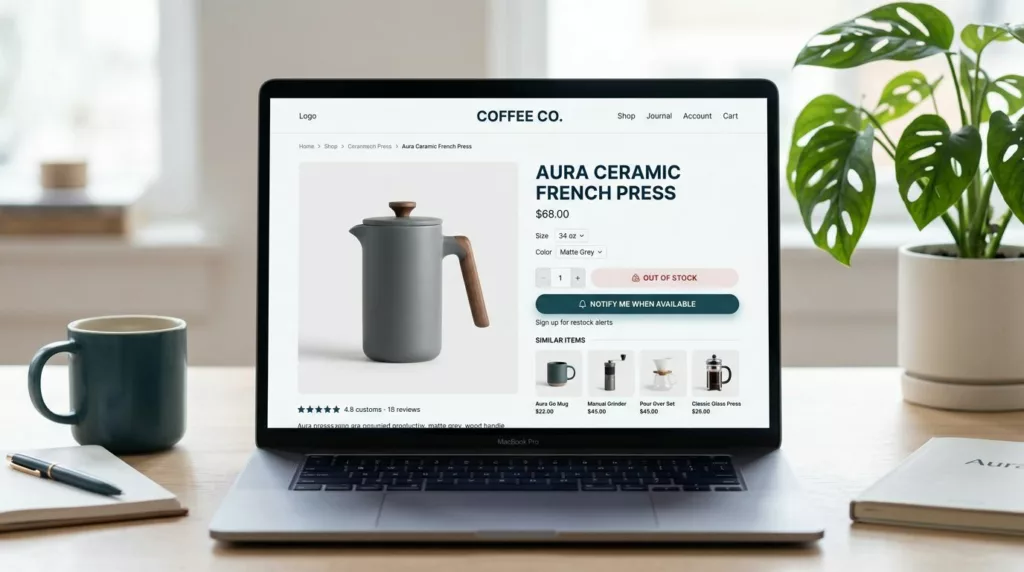
Out-Of-Stock Product Page UX That Saves The Sale
Nothing kills shopping momentum like clicking “Add to cart” and hitting a wall. An out-of-stock moment feels like showing up...
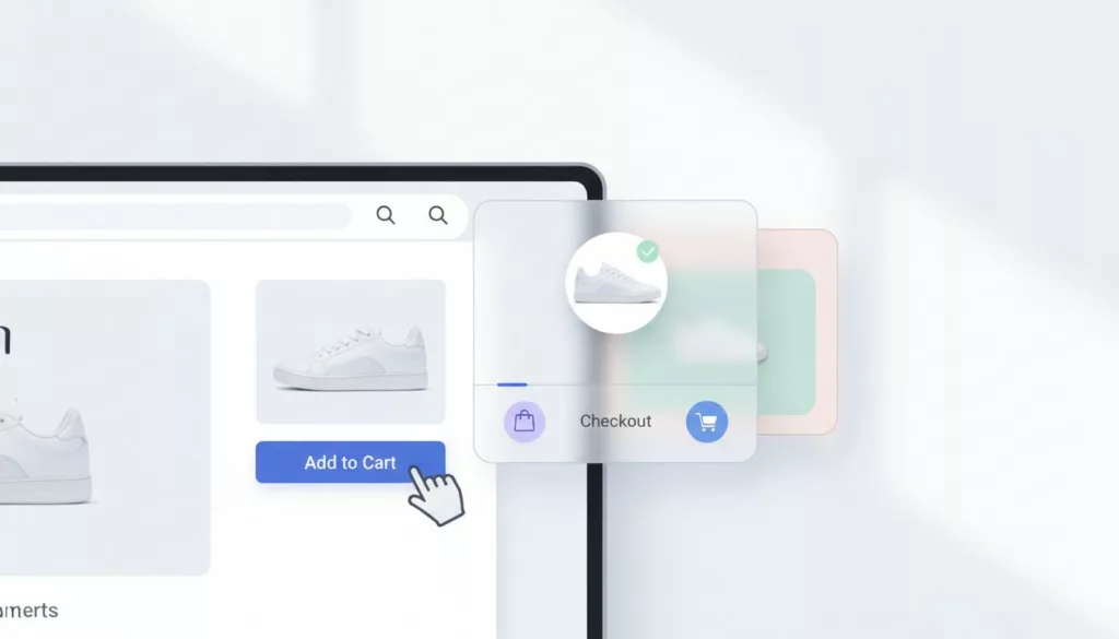
Cart Drawer UX Patterns That Increase Add-to-Cart Follow-Through
Ever watch a shopper add an item to the cart drawer, then nothing happens? They keep scrolling, open a new...

Add-to-Cart Button Design Patterns That Improve Mobile Conversions
On mobile, the add to cart button is less like a button and more like a doorway to higher mobile...