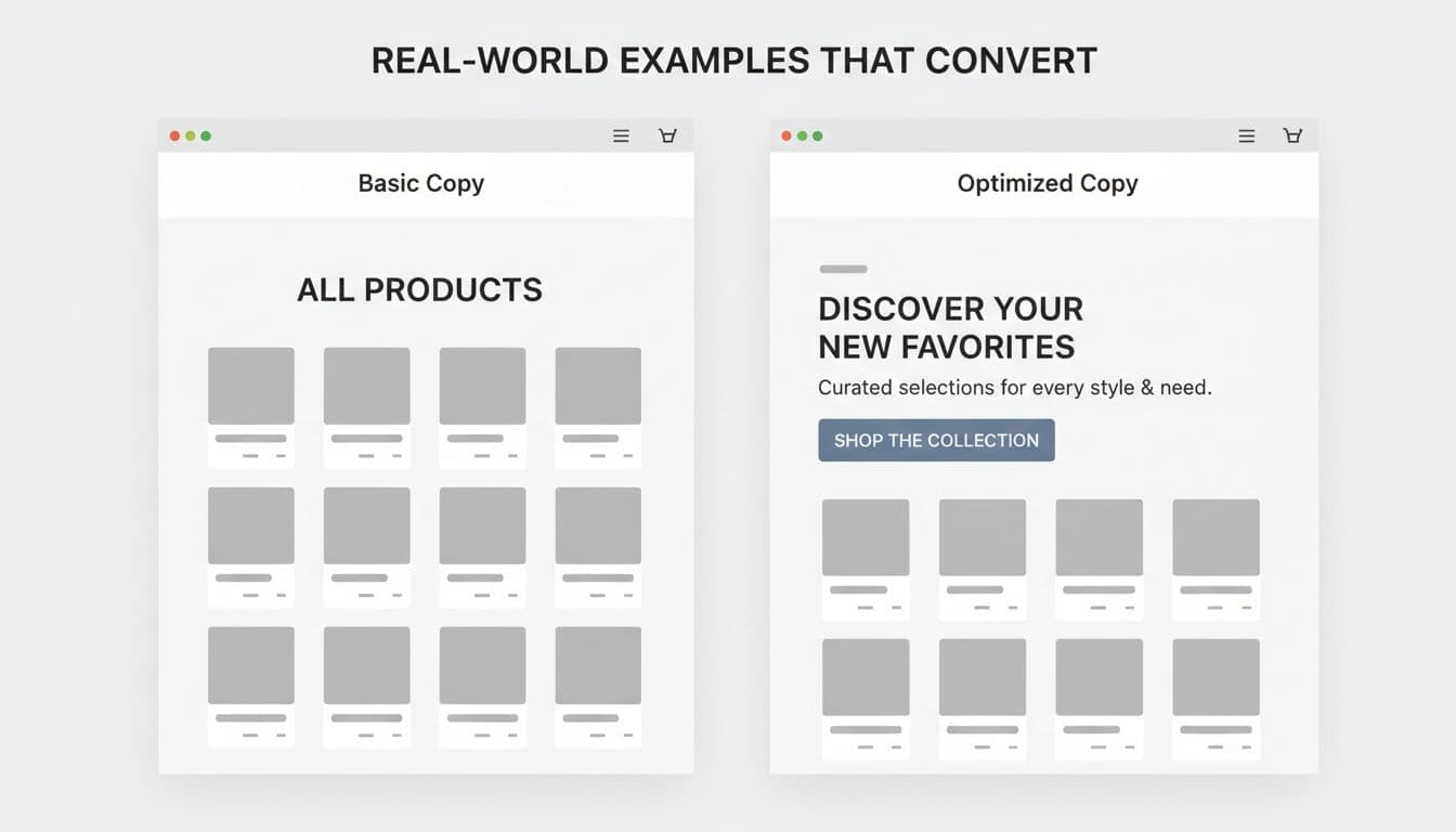
Most collection pages look like empty shelving, a title, a grid, and not much else. That leaves Google with thin context and shoppers with extra work.
Good Shopify collection page copy fixes both problems. It tells search engines what the page is about, then helps visitors sort, compare, and buy faster. Below, you’ll find practical templates for above-the-fold and below-the-fold copy, plus keyword placement and internal linking tips that still make sense in 2026.
Why collection pages need more than a title and a grid
Collection pages often rank for high-intent searches, not product pages. Someone searching “women’s linen dresses” usually wants options, not one SKU. That’s why category copy matters.
Current advice from Obsess AI’s Shopify collection page SEO guide and iakoe’s collections SEO recommendations points to the same pattern: use a clear H1, add helpful copy, and match the page to buying intent.
Still, text alone won’t carry a weak page. Navigation, crawl paths, and load behavior matter too. If you’re changing how shoppers move through large grids, this SEO guide for collection page navigation is worth a read.
Use this simple page map as a starting point:
| Page area | Main job | Ideal length | What to include |
|---|---|---|---|
| Above the fold | Confirm relevance fast | 20 to 40 words | H1, benefit line, light trust cue |
| Near filters or first row | Reduce friction | 10 to 25 words | Shipping, sorting, or stock cue |
| Below the grid | Add depth | 100 to 200 words | Materials, fit, use cases, related links |
The takeaway is simple: keep the top tight, then place richer copy lower on the page.
Strong collection copy does three jobs fast: name the category, help the shopper choose, and add context that search engines can read.
Above-the-fold Shopify collection page copy templates
Your top section has one job first, clarity. Within a few seconds, shoppers should know they’re in the right place.
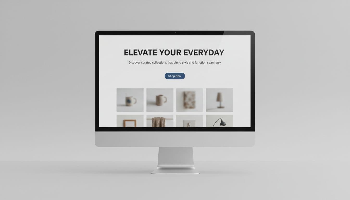
Keep the H1 exact and plain. Then use one short line to add value, not to repeat the same phrase. If the page already says “Women’s Linen Dresses,” the next line should talk about comfort, fit, season, or occasion.
Template for broad category pages
Template:
H1: [Exact collection name]
Support line: [Main benefit] for [use case or audience]
CTA: [Optional action]
Example:
H1: Women’s Linen Dresses
Support line: Breathable, easy-fit styles for warm days, travel, and everyday wear.
CTA: Shop best sellers
Template for problem-solution collections
Template:
H1: [Exact collection name]
Support line: [Product type] built for [problem] with [key feature]
CTA: [Filter-first action]
Example:
H1: Waterproof Hiking Boots
Support line: Grip-focused boots for wet trails, cold mornings, and long weekend walks.
CTA: Browse by size
Template for seasonal or promo-led collections
Template:
H1: [Exact collection name]
Support line: [Seasonal angle or offer] plus [proof or shipping cue]
CTA: [Shop now or view new arrivals]
Example:
H1: Spring Running Jackets
Support line: Light layers for cool starts, sudden rain, and easy packability. Free shipping over $75.
CTA: View new arrivals
A simple formula works well here: exact category name + real benefit + next step. Anything longer usually gets in the way.
Below-the-fold templates, keyword placement, and internal links
Lower-page copy gives you room to explain the range without pushing products too far down. In most stores, 100 to 200 words is enough.
Here’s a clean template that works on most categories:
Template:
Start with one sentence that restates the collection and who it’s for.
Add two or three sentences on features, style options, materials, or use cases.
Finish with a sentence that helps shoppers browse, compare, or move to related pages.
Example:
Men’s trail running shoes are built for runners who need grip, support, and comfort off-road. This collection includes lightweight pairs for dry paths, cushioned options for long miles, and waterproof styles for wet weather. Use the filters to shop by terrain, drop, brand, and price, then compare top-rated pairs before you buy.
That’s enough context to help rankings, while still reading like sales copy.
For keyword placement, keep it natural. Put the main phrase in the H1, URL handle, meta title, first paragraph, and one image alt if it truly fits. After that, switch to plain language variations. Repeating the same term six times makes the page sound robotic.
Internal links matter here too. Link from blog posts, buying guides, gift guides, and fit pages into the collection with descriptive anchor text. On the collection page itself, link to subcollections or closely related categories, not a giant wall of links in the footer.
Placement should be tested, not guessed. Session replays for CRO insights can show whether shoppers reach your lower copy, tap related links, or skip past it. If your theme makes text blocks hard to place, or the layout starts to feel heavy, run a Shopify theme audit checklist before adding more sections.
One last rule helps more than any formula: write the page like a good store associate would talk. Clear, brief, and helpful wins.
Make each collection page do a real selling job
A strong collection page doesn’t need a novel. It needs clarity, a little context, and copy that supports the grid instead of competing with it. Start with a clean H1, add one sharp benefit line, then place richer text lower on the page where it helps shoppers decide. When each collection does that job well, rankings and conversion rates usually move in the same direction.