
Most shoppers don’t read ecommerce return policy pages for fun. They read them to decide if they can trust you with their money.
A comprehensive return and refund policy page with a clear returns shipping policy does two jobs at once: it removes purchase anxiety, and it stops “quick questions” from turning into support threads. The best pages feel less like legal text and more like a helpful receipt, with answers you can spot in seconds.
Below is a practical layout playbook you can implement on Shopify or any DTC stack, without turning your policies into a novel.
What trust-building returns and exchanges policy pages do differently (and why tickets drop)

Photo by Namrata Singh
A “No returns, no exchanges” vibe might feel firm, but it often backfires. Customers interpret harsh or vague wording as risk, even when your policy is reasonable.
Instead, high-performing returns and shipping pages share a few design choices:
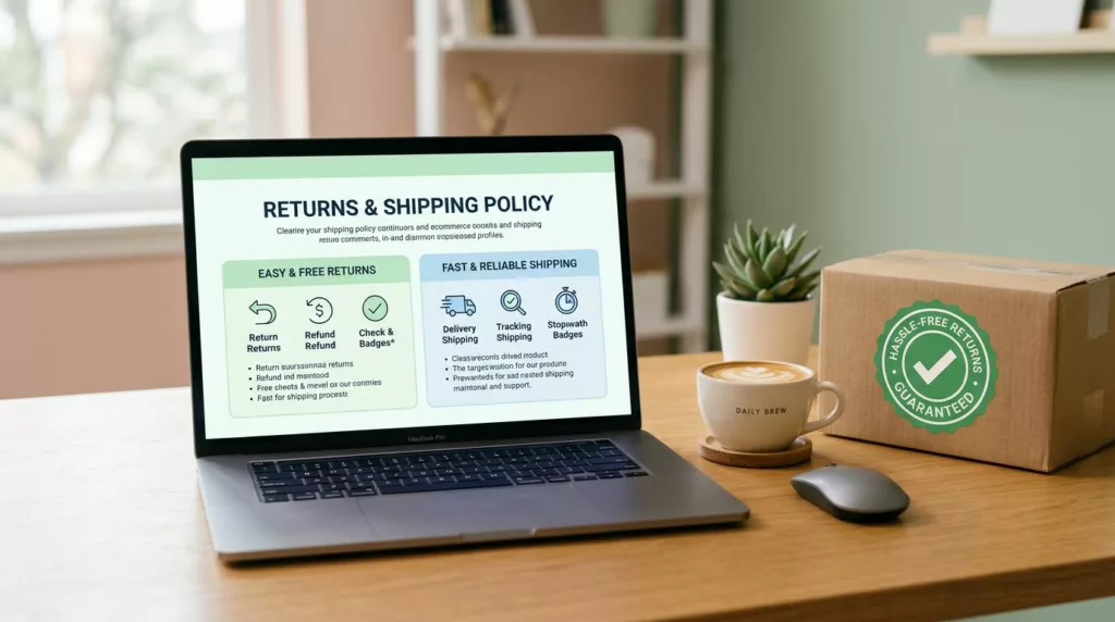
They start with a scannable summary. Put the “rules that matter” in a compact box at the top (time window, condition, return shipping charges, fees, processing time). This prevents pogo-sticking and reduces pre-purchase chat.
They separate “what” from “how.” Shoppers want eligibility first, steps second. If you lead with process details, people miss the actual rules, then ask customer service to confirm.
They use plain labels and consistent terms. Pick one term for each concept (for example, “return window” instead of switching between “within 30 days” and “30-day guarantee”). Consistency is a quiet trust signal, similar to other proven patterns in ecommerce design best practices.
They admit edge cases upfront. Final sale items, bundles, oversized packages, hazmat, international duties, and “delivered but not received” scenarios drive repeat tickets. Don’t bury them.
If you’re rebuilding your written policy language, use a structured checklist like Shopify’s “return policy template”, then design the page so people can actually find it.
If a customer can’t confirm the basics in 10 seconds, they’ll ask a human.
Wireframe layouts you can copy (returns, shipping, or a combined hub)
The goal isn’t fancy design. It’s a predictable layout that answers questions in the same order customers ask them, reinforcing your money-back guarantee.
Wireframe A: Returns page (module-by-module)
- Top summary box (above the fold): Return window, item condition, refund method, fees, processing time
- Start a return module: Primary button to begin the return process, brief “what you’ll need,” return shipping label info, link to portal
- Eligibility section: What’s returnable and non-returnable items, what isn’t, original condition and original packaging rules
- Refund timing + method: Refund timeframe, when refund starts, where it goes, gift returns
- Exchanges: How exchanges work (or don’t) per exchange policy, size swaps, one-per-order limits
- Damaged or incorrect items: Time limit to report, photo requirements, resolution options
- International returns: Availability, duties and taxes note, expected timelines
- FAQ accordion: Only the top 6 to 10 questions, no kitchen sink
- Contact module: One path, with “best for” hints (chat for quick questions, email for photos)
Return-focused UX patterns are also covered in ReturnGO’s guide on designing ecommerce for returns, which is helpful when you’re planning a portal or self-serve flow.
Wireframe B: Shipping page (module-by-module)
- Top summary box: Processing time, shipping methods and shipping costs, free-shipping threshold, cutoff time
- Delivery estimates table: Method, delivery date range, price, tracking information included
- Cutoff times + processing rules: Weekends, holidays, pre-orders, split shipments
- Address rules: Apt fields, corrections, reroutes, undeliverable packages
- P.O. boxes: What carriers work, what products can’t ship there
- Tracking expectations: When tracking appears, scan delays, partial shipments
- International shipping: Countries, duties/taxes note, delivery range
- Exceptions: Lost packages, delivery delays, “delivered” disputes, claim window
Wireframe C: Combined “Shipping + Returns” hub (best for small catalogs)
- Hero with two tiles: “Shipping” and “Returns” (with one-line summaries)
- Sticky jump links: Shipping, Returns, International, Damaged items, Tracking
- Two top summary boxes: One per topic, stacked on mobile
- Shared FAQ accordion: Only questions that truly overlap (tracking, international, fees)
Copy-and-paste microcopy for key sections
Use this table as a starting point, then confirm details with your ops team (and counsel when needed, per your terms and conditions).
| Section | Microcopy snippet |
|---|---|
| Eligibility | “Returnable items must be unused, with original packaging, proof of purchase, and sent back in sellable condition. Non-returnable items include digital products.” |
| Timeframe | “Start a return within 30 days of delivery for return authorization. After that, we can’t guarantee approval.” |
| Fees | “If a restocking fee, return shipping fee, or other charge applies, we’ll deduct it from your refund or issue store credit after inspection. Use our prepaid return label.” |
| Exchanges | “We don’t offer direct exchanges. Return the item for a refund, then place a new order.” |
| Damaged items | “Report faulty items, damaged products, or incorrect items within 48 hours of delivery. Include photos of the item and packaging.” |
| International | “International returns are accepted where available. Duties and taxes aren’t refundable.” |
| Delivery estimates | “Processing takes 1 to 2 business days, then shipping time depends on your selected method.” |
| Cutoff times | “Orders placed by 1 PM local warehouse time ship the same business day (Mon to Fri).” |
| P.O. boxes | “We ship to P.O. boxes via USPS when possible. Some oversized items can’t ship to P.O. boxes.” |
| Tracking | “Tracking updates may take up to 24 hours to appear after you get the shipping email.” |
Reduce support tickets: map top questions to specific UI elements
Support volume drops when answers live where eyes already are, not hidden in paragraphs. The fastest win is pairing each common question with a dedicated UI pattern.
This table shows what to add, and where.
| Top question customers ask | UI element that prevents customer service tickets |
|---|---|
| “How long do I have to return?” | Top summary box with “Return window” |
| “Do I pay return shipping?” | Inline fee row in summary box + short tooltip definition on prepaid return label and return shipping label |
| “When will I get my refund?” | Refund timeline mini-table (inspection, approval, bank posting) |
| “Can I exchange for a different size?” | Exchange card with a clear yes/no and the exact flow |
| “What counts as final sale?” | Eligibility bullets (store credit, shipping costs) plus a final-sale badge definition |
| “My item arrived damaged, what now?” | Damaged items callout with deadline and photo instructions |
| “Do you ship internationally?” | Country list link or international accordion with duties note |
| “When will my order arrive?” | Delivery estimates table by shipping method |
| “Do you ship to P.O. boxes?” | Address rules section with a one-line carrier rule |
| “Where is my tracking?” | Tracking expectations module and link to a strong tracking experience |
For shipping status anxiety, connect your policy page to your tracking UX. A well-designed tracking page can deflect WISMO tickets on its own, see order tracking page UX.
Gorgias also has a practical breakdown of operational improvements that pair well with better page structure, see ecommerce returns best practices.
Where to surface policy answers (so people see them before they ask)
Place links where purchase decisions happen:
- Header or footer: “Shipping” and “Returns” as separate links, not buried under “Policies”
- Product pages (PDP): A short “Shipping and returns” snippet near price or Add to cart, linking to the exact section anchors
- Cart: Delivery estimate range, free-shipping threshold progress, and a returns highlight line
- Checkout: Final reminders (return window, shipping method cutoff; link to return and refund policy), without introducing surprises
- Order confirmation email: Link to tracking, plus “Returns start here” and “Shipping FAQ” links
UX do and don’t (quick, high-impact)
- Do write for scanning: short headings, tight tables, and a top summary box.
- Do define terms inline (final sale, restocking fee, label created).
- Do show ranges for delivery dates when certainty is low.
- Don’t hide fees or exceptions below the fold.
- Don’t rely on accordions for critical rules. Put essentials in the open.
- Don’t force customers to contact support for basic eligibility answers.
Accessibility and mobile layout tips (so everyone can self-serve)
Aim for an 8th to 9th grade reading level, with short sentences and familiar words. Use real headings (H2, H3) in order, so screen readers can jump by section.
For accordions, make sure they work with keyboard focus, have clear expanded states, and don’t trap users. On mobile, stack summary boxes first, then show one primary action button for returns and exchanges (“Start a return” or “Track order”) with a large tap target.
Also keep contrast high, and never use color alone to signal “returnable” vs “not returnable.”
Final checklist + simple policy-page QA rubric
Checklist
- Summary box appears above the fold on mobile
- Delivery estimates shown as ranges, by method
- Return window and fee rules stated once, clearly
- Exchanges explained as a flow, not a promise
- Damaged/incorrect items have a deadline and inputs
- International section includes duties/taxes note
- Tracking expectations include scan-delay language
- Contact options include “best for” hints
QA rubric (score 0 to 2 each, total 10)
| Criterion | 0 | 1 | 2 |
|---|---|---|---|
| Findability | Hard to locate | In footer only | Footer + PDP/cart surfaces |
| Scannability | Long paragraphs | Some headings | Summary box + tables |
| Clarity | Vague rules | Mostly clear | No contradictions, plain language |
| Edge cases | Missing | Partial | Final sale, damaged, international covered |
| Self-service | “Contact us” heavy | Some links | Actions, anchors, tracking support |
Policies vary by region and category, so confirm requirements with counsel, and consider linking out to official consumer rights resources for the markets you sell into.
Conclusion
A returns shipping policy page is either a trust builder or a ticket generator. When the layout matches how people think, shoppers stop second-guessing and support stops repeating itself. Start with the summary box, add the right tables, and treat edge cases like first-class content. The next time someone asks, “What’s your return policy?”, your page should answer it before they hit send. Audit your return and refund policy to ensure it truly builds trust.