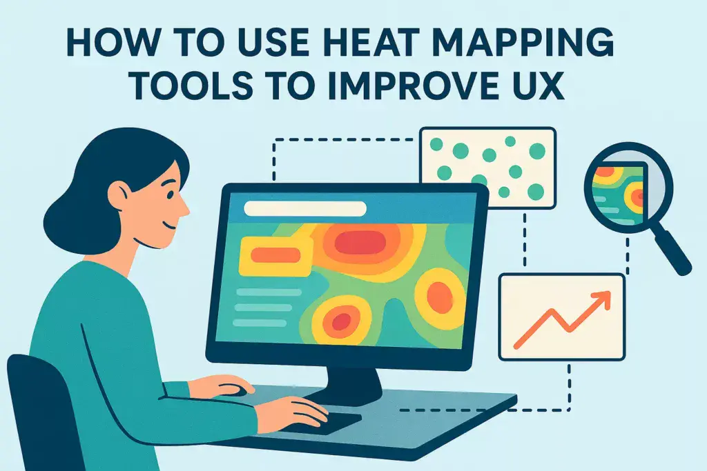

The Benefits of Using Heat Mapping Tools for UX Design
Heat mapping tools have become an essential part of user experience (UX) design in recent years. These tools provide valuable insights into how users interact with a website or application, allowing designers to make data-driven decisions to improve the overall user experience. In this article, we will explore the benefits of using heat mapping tools for UX design and how they can help create a more user-friendly and successful product.
One of the main benefits of using heat mapping tools is the ability to visualize user behavior. Heat maps use color-coding to represent the areas of a webpage or application that receive the most and least engagement from users. This allows designers to quickly identify which elements are attracting the most attention and which ones are being ignored. By understanding how users interact with a product, designers can make informed decisions on how to improve the overall design and layout.
Another advantage of heat mapping tools is the ability to track user clicks and scrolling behavior. These tools provide click maps and scroll maps, which show where users are clicking and how far they are scrolling down a page. This information is crucial in identifying any usability issues or areas of a page that may be causing confusion for users. By analyzing this data, designers can make necessary changes to improve the user experience and increase engagement.
Heat mapping tools also offer the benefit of real-time data. Unlike traditional user testing methods, which can be time-consuming and costly, heat mapping tools provide instant feedback on user behavior. This allows designers to make quick adjustments and see the impact of those changes immediately. Real-time data is especially useful for A/B testing, where designers can compare the effectiveness of different design elements and make data-driven decisions on which one to implement.
In addition to real-time data, heat mapping tools also offer historical data. This means that designers can track user behavior over time and see how it has changed. By analyzing historical data, designers can identify any trends or patterns in user behavior and make necessary adjustments to improve the overall user experience. This is particularly useful for tracking the success of design changes and understanding how they have impacted user engagement.
One of the most significant benefits of using heat mapping tools is the ability to identify and fix usability issues. By tracking user behavior, designers can pinpoint any areas of a website or application that may be causing frustration or confusion for users. This could be anything from a poorly placed button to a lengthy form that users are abandoning. By addressing these issues, designers can create a more user-friendly product that will ultimately lead to higher engagement and conversions.
Finally, heat mapping tools offer the benefit of cost-effectiveness. As mentioned earlier, traditional user testing methods can be time-consuming and expensive. Heat mapping tools, on the other hand, provide valuable insights at a fraction of the cost. This makes them accessible to businesses of all sizes, allowing even small startups to improve their UX design and create a successful product.
In conclusion, heat mapping tools offer numerous benefits for UX design. From visualizing user behavior to identifying and fixing usability issues, these tools provide valuable insights that can greatly improve the overall user experience. With real-time and historical data, designers can make data-driven decisions to create a more user-friendly and successful product. As technology continues to advance, heat mapping tools will undoubtedly play a crucial role in the future of UX design.
Maximizing User Experience with Heat Mapping: Tips and Tricks
Heat mapping tools have become an essential part of user experience (UX) design in recent years. These tools provide valuable insights into how users interact with a website or application, allowing designers to make data-driven decisions to improve the overall user experience. In this article, we will explore the benefits of using heat mapping tools and provide tips and tricks on how to effectively use them to maximize UX.
Firstly, let’s understand what heat mapping is and how it works. Heat mapping is a data visualization technique that uses color-coding to represent the intensity of user interactions on a webpage or application. The areas with the most interactions are represented by warmer colors, while areas with fewer interactions are represented by cooler colors. This visual representation makes it easy for designers to identify patterns and areas of improvement in the user experience.
One of the main benefits of using heat mapping tools is that they provide a visual representation of user behavior. This allows designers to see which elements of a webpage or application are getting the most attention from users. By analyzing this data, designers can make informed decisions on how to improve the user experience. For example, if a particular button or link is not getting much attention, it may need to be moved to a more prominent location to increase its visibility.
Another advantage of heat mapping tools is that they provide real-time data. Unlike traditional user testing methods, which can be time-consuming and expensive, heat mapping tools provide instant feedback on how users are interacting with a website or application. This allows designers to make quick and effective changes to improve the user experience without having to wait for user feedback.
Now, let’s dive into some tips and tricks on how to use heat mapping tools effectively to maximize UX. The first tip is to use multiple heat maps. Different types of heat maps, such as click maps, scroll maps, and movement maps, provide different insights into user behavior. By using a combination of these heat maps, designers can get a comprehensive understanding of how users are interacting with a webpage or application. For example, a click map can show which elements users are clicking on, while a scroll map can show how far down the page users are scrolling.
Another tip is to compare heat maps over time. User behavior can change over time, so it’s essential to regularly analyze heat maps to identify any changes in user behavior. By comparing heat maps from different time periods, designers can see if their changes have had a positive or negative impact on the user experience. This can help them make data-driven decisions on future design changes.
It’s also crucial to consider the context when analyzing heat maps. While heat maps provide valuable insights, they do not tell the whole story. It’s essential to consider the context in which users are interacting with a website or application. For example, a high click rate on a particular button may not necessarily mean that users find it useful. It could be due to its placement or design, which may need to be improved.
Lastly, it’s essential to involve other team members in the analysis of heat maps. Different team members may have different perspectives and insights, which can lead to a more comprehensive understanding of user behavior. By involving team members from different departments, such as marketing, design, and development, designers can get a well-rounded view of the user experience and make more informed decisions.
In conclusion, heat mapping tools are a valuable resource for improving user experience. They provide visual representations of user behavior, real-time data, and insights that can help designers make data-driven decisions. By following these tips and tricks, designers can effectively use heat mapping tools to maximize UX and create a seamless and enjoyable experience for users.
Understanding User Behavior through Heat Mapping: A Guide for UX Designers
Heat mapping tools have become an essential part of the UX designer’s toolkit. These tools provide valuable insights into user behavior, allowing designers to make data-driven decisions to improve the user experience. In this article, we will explore the concept of heat mapping and how it can be used to understand user behavior and improve UX.
First, let’s define what heat mapping is. Heat mapping is a data visualization technique that uses color-coding to represent the intensity of user interactions on a website or app. The areas with the most interactions are represented by warmer colors, while areas with fewer interactions are represented by cooler colors. This visual representation allows designers to quickly identify which areas of a website or app are receiving the most attention from users.
One of the main benefits of using heat mapping tools is that they provide a visual representation of user behavior. This allows designers to see how users are interacting with their website or app, which areas are getting the most attention, and which areas are being ignored. This information is crucial in understanding how users are navigating through the interface and where they are encountering difficulties.
Heat mapping tools can also help identify patterns in user behavior. By analyzing the data collected from heat maps, designers can identify common paths that users take on their website or app. This information can be used to optimize the user flow and make it more intuitive for users to achieve their goals. For example, if a heat map shows that users are frequently clicking on a specific button, designers can make that button more prominent or move it to a more accessible location.
Another advantage of heat mapping tools is that they provide real-time data. Unlike traditional user testing methods, which can be time-consuming and expensive, heat mapping tools allow designers to gather data on user behavior in real-time. This means that designers can make changes and see the impact immediately, without having to wait for user feedback or conduct lengthy testing sessions.
Heat mapping tools also offer a more objective view of user behavior. While user feedback and opinions are valuable, they can be subjective and influenced by personal preferences. Heat mapping, on the other hand, provides concrete data on how users are interacting with a website or app. This allows designers to make informed decisions based on data rather than assumptions.
Now that we understand the benefits of heat mapping, let’s explore how to use these tools effectively. The first step is to identify the key areas of your website or app that you want to analyze. This could be a specific page, a particular feature, or the entire interface. Once you have identified the areas to be analyzed, you can start collecting data using a heat mapping tool.
There are various heat mapping tools available in the market, each with its own unique features and capabilities. Some popular options include Crazy Egg, Hotjar, and Mouseflow. These tools offer different types of heat maps, such as click maps, scroll maps, and attention maps, which provide insights into different aspects of user behavior.
Once you have collected enough data, it’s time to analyze the heat maps. Look for patterns and trends in user behavior, and identify areas that need improvement. For example, if a click map shows that users are clicking on a non-clickable element, it could indicate a design flaw that needs to be addressed.
In conclusion, heat mapping tools are a valuable resource for UX designers. They provide a visual representation of user behavior, help identify patterns, and offer real-time data to make data-driven decisions. By using heat mapping tools effectively, designers can improve the user experience and create interfaces that are intuitive and user-friendly. So, if you want to take your UX design to the next level, consider incorporating heat mapping into your design process.