
If your site looks legit but still feels risky, shoppers won’t say it out loud, they’ll just bounce, harming your website credibility and conversion rate. In 2026 that risk feeling is stronger, because AI-made content, counterfeit stores, and copycat ads are everywhere.
The fix isn’t “more trust stuff.” It’s trust signals, with social proof as a foundational element of the strategy, placed where the doubt happens: right before the click, right before the card entry, and right before the final confirmation. This guide shows practical placements and microcopy for product pages, pricing, and checkout, plus the policies that quietly do the heavy lifting.
Product page trust signals: answer “Can I believe this?” before the CTA
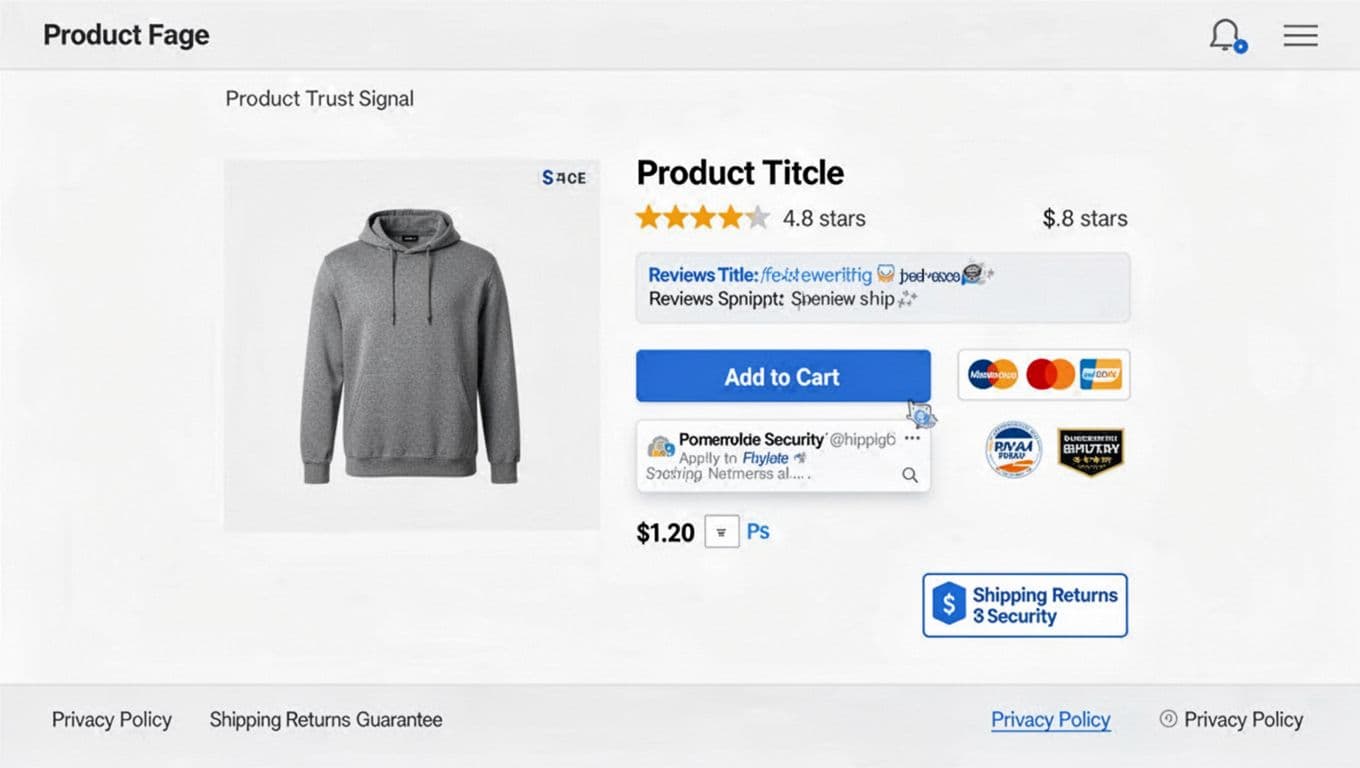
On a PDP, shoppers are doing quick math: quality risk, delivery risk, and “will support ghost me?” risk. Strategic trust signals reduce those risks in the same order they appear, while providing social proof that can increase average order value.
Place star ratings near the product title (above the fold). Don’t hide them under tabs. Use a star rating plus review count, for example, “4.8 (1,284 customer reviews)”. Make the count clickable and scroll to reviews.
Put a review snippet directly under the primary CTA. This is the “last look” zone. Use concise microcopy: “Most mentioned: comfort, true-to-size, fast shipping.” If you can, rotate it based on selected variant.
Use user-generated content where it helps decision-making, not as decoration. A small customer photo strip under the image gallery works well. Add one filter that matches your category (size, skin type, room size, use case). Keep it tight.
Make authenticity visible. In 2026, “Verified purchaser” isn’t optional. Add two small lines above the review list:
- “Verified purchases only (linked to order ID).”
- “We publish all relevant customer reviews, positive and negative.”
That second line matters because shoppers assume you’re filtering. It also aligns with the FTC’s expectations around reviews and testimonials: don’t buy fakes, don’t suppress negatives, and disclose incentives clearly (the FTC updated its Endorsement Guides in 2023 and enforcement is real). If you offer a coupon for reviews, label it: “Review collected with a sweepstakes entry.”
Badges belong near the action, in small numbers. Place 2 to 3 maximum beside the CTA or just below it (especially security badges on mobile). Typical winners:
- Payment trust: “SSL secured checkout”
- Platform trust: “Apple Pay, PayPal supported”
- Compliance or sustainability: only if you can substantiate it (and link to details)
If you’re tempted to add six icons, stop. Badge clutter reads like a pawn shop window.
Finally, put risk reversal close to price and delivery for key risk reduction. A small box near the price beats a long paragraph below. Microcopy examples:
- “30-day returns, no restocking fees”
- “2-year warranty, parts and labor”
- “Free exchanges for size issues”
For broader page-level patterns, compare your PDP layout against e-commerce design best practices.
A good trust signal isn’t a claim, it’s proof placed at the moment of doubt.
Checkout trust signals: reduce payment anxiety without slowing the page
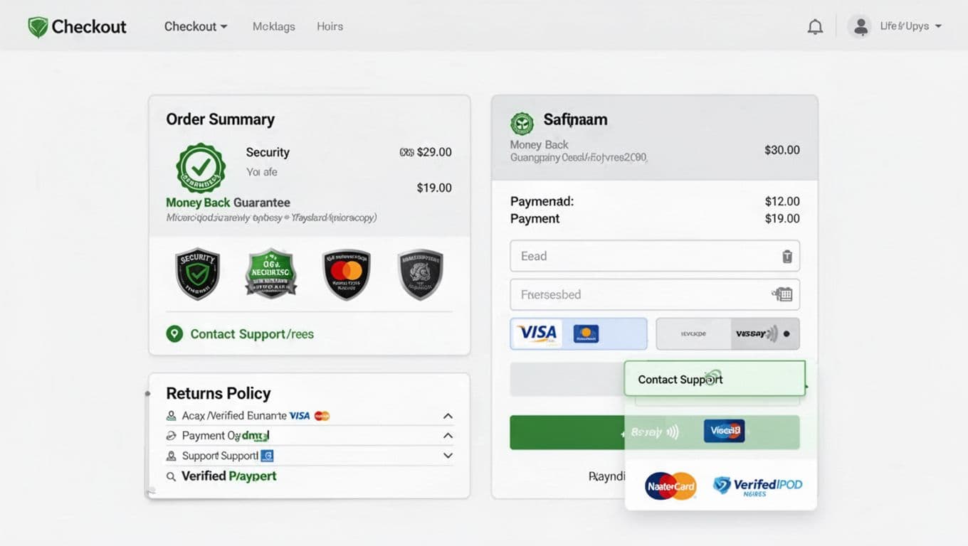
The checkout process is where trust signals either calm people down or feel like last-minute persuasion. The difference is placement and restraint.
Put security badges, payment logos, and your SSL certificate next to the payment fields, not in the footer. Shoppers look at the card area like it’s a cliff edge. Keep icons lightweight (SVG if possible) and pair them with plain text. Good microcopy:
- “Encrypted payment, we don’t store full card numbers.”
- “PCI-compliant processing via our payment provider.”
Repeat your money-back guarantee inside the order summary. This is the spot people re-check totals. One sentence is enough:
- “Protected by our 30-day money-back guarantee.” Link it to the policy, but don’t open a new tab on mobile.
Surface shipping and returns before the final step. If you hide “final sale” language until after payment, you’ll see chargebacks and angry tickets. A compact accordion works:
- “Shipping and delivery”
- “Returns and exchanges”
- “Warranty”
Add contact information where hesitation peaks. Don’t just show a chat icon. Show a real promise:
- “Support replies in under 2 hours (Mon to Fri).”
- “Text us for sizing help.”
If you have a phone number, place it here too. It’s old-school, which is why it still works.
Keep social proof subtle at checkout. One line near the top is plenty: “Trusted by 120,000 customers since 2016.” If you can’t back it up, don’t say it.
If you’re rebuilding the checkout process, see the UX patterns and benchmarks in this ecommerce checkout optimization guide for 2026. Then pressure-test your changes with usability sessions, not just A/B results. These trust signals are vital for reducing cart abandonment.
Policies, privacy, and proof pages: make them easy to find, easy to skim
Shoppers don’t read policies like novels. They scan them like warning labels. That means you need a trust stack with two layers: a short summary near the decision, and a full policy in the footer.
Privacy policy and third-party validation placement
- PDP: 1 to 2 lines near price or delivery estimate (“Secure checkout. Privacy policy details”).
- Cart: a “no surprises” block (“Your data stays private, third-party validation seals”).
- Footer: full policy with timelines, exceptions, and how data handling works.
Privacy and data-use signals in 2026 Privacy is now a trust signal, not a legal box. Use plain language and avoid dark patterns in consent flows. GDPR expectations haven’t fundamentally changed, but shoppers expect the spirit of it: clear purpose, minimal collection, and real control.
In the US, CCPA-style norms keep spreading, and California updates effective in 2026 raise the bar on opt-outs, Global Privacy Control (GPC) signals, and clearer notices (especially around sensitive data and automated decision-making). A helpful overview is this Privacy Laws 2026 compliance guide. For California-specific details, see CCPA 2026 compliance requirements.
Practical microcopy that builds trust without overpromising:
- “We use cookies for checkout, support, and measuring performance. You can opt out of targeted ads.”
- “We honor Global Privacy Control signals where required.”
Press, customer logos, and “as seen in” Place logo bars, media mentions, case studies, and these other social proof elements on the pricing page and high-intent landers, under the main headline or near plan comparisons. Add dates or links if you can. Fake logo rows are easy to spot, and they age badly.
Do and don’t pitfalls (quick filter)
- Do show fewer, stronger badges with supporting detail.
- Don’t stack “limited stock” claims you can’t verify.
- Do publish review rules and label incentives.
- Do include staff bios to humanize the site and boost website credibility.
- Don’t hide policy exceptions behind tiny links.
Accessibility and mobile realities Trust signals fail when users can’t perceive them. In effective website design, give badge icons accessible labels, keep text contrast high, and don’t rely on color alone. On mobile, use a short “Delivery, returns, warranty” accordion near the sticky CTA so it doesn’t push the button off-screen.
A/B testing trust signals without hurting speed Test placement first, not new widgets. Use feature flags, server-side experiments, and lightweight assets. Delay loading the full review widget until interaction, while keeping the rating summary visible. Watch Core Web Vitals, because a slow trust module creates distrust. If performance work is on your roadmap, pair it with sustainable e-commerce website design tips since lighter pages often convert better.
Conclusion
In 2026, trust is built in inches, not in banners. Put customer reviews where decisions happen, keep badges close to payment, and make guarantees, policies, and contact information easy to skim. Most importantly, choose trust signals you can prove, then test placement and wording without adding page weight. These tactics build immediate confidence while establishing brand awareness as the long-term goal. Optimizing these signals drives a higher conversion rate and elevates your overall website design. When shoppers feel safe, they stop searching for reasons to leave.