
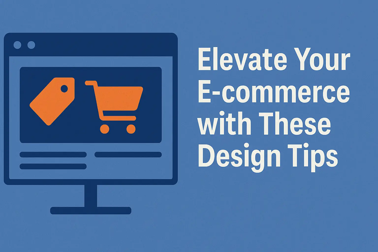


Quick wins matter. When every second counts on a first visit, adopting evidence-backed ecommerce patterns across your website can raise conversions and keep visitors exploring.
Research-backed guidelines—from large-scale UX studies used by many Fortune 500 companies—show that clear homepages, obvious search, broad product exposure, and strong imagery reduce friction and improve patience.
This intro previews practical moves: homepage clarity, navigation that guides users, search that finds products fast, concise PDPs, streamlined checkout, and faster site performance.
These aren’t vague tips. They are field-tested patterns that scale across a single page or a full website overhaul. Structure your content and visuals so people find the right product quickly and trust your brand enough to complete a purchase.
Start small. Pick one high-impact area on your site to optimize first, then build momentum with measurable gains that matter more than cosmetic flourishes.
Understand search intent to shape your best practices guide
Start by mapping why people arrive on your site and what questions they expect answered next. This simple step focuses a clear strategy for the homepage and deeper pages.
Informational intent right now means store owners want clear website patterns, reliable search behavior, and plain navigation cues. Give users quick answers with visible search and obvious links so they move from awareness to interest without friction.
Translate intent into site architecture: highlight representative items on the homepage, guide category exploration, and make each product page a focused step toward checkout. Capture lightweight signals—clicked collections or filters—and reflect them in follow-up pages.
- Label navigation plainly to reduce misclicks.
- Create content clusters (buying guides, sizing, shipping) tied to intent.
- Map the funnel—discovery to confirmation—to spot drop-off points.
- Use signals like “bestsellers” to tailor subsequent filters.
A clear strategy that aligns intent with site flow helps users and customers move faster through the shopping experience. Next, we’ll turn intent into concrete homepage, navigation, and search recommendations.
E-commerce design best practices
Large-scale user research gives teams a reliable roadmap to cut guesswork and focus on changes that move conversion. Baymard’s 71,000+ hours of testing produced 580+ actionable guidelines used by many top brands, so teams can benchmark decisions against proven results.
Research-backed guidelines from Baymard and leading brands
Use the dataset as a decision filter. Prioritize fixes tied to measurable outcomes: search relevance, working filters, clear PDP details, and checkout simplification.
Prioritizing changes that move the conversion needle
- Reduce guesswork: audit navigation, search, filters, PDPs, and forms against established guidance.
- Choose small wins first—“Load More,” obvious search, and visible shipping/returns often lift conversion faster than a full redesign.
- Prototype lightweight solutions and run quick usability tests before heavy builds.
- Track outcomes—bounce, click paths, add-to-cart, and checkout progress—to confirm impact.
- Keep content clear: labels, helper text, and microcopy cut confusion and support tickets.
Roadmap: evaluate, prioritize, prototype, test, implement, measure, then iterate—focus on the highest ROI items for steady optimization across your website and product pages.
Design a high-performing homepage that guides users
A homepage should introduce your site’s range quickly, so visitors know what you sell and where to go next.
Showcase representative product types early. Aim to surface at least 40% of your main categories so people don’t misread your offering. This reduces clicks and speeds up the path to relevant pages.
Show a broad range of products without overwhelming people
Use clear, labeled blocks that hint at depth. Keep each block scannable with a short title, a preview image, and one-line helper text about shipping or returns.
Skip auto-rotating carousels; use clear, scannable sections
Static sections win. Carousels often hide content and confuse users. Modular blocks are easier to reorder for promotions or seasonal pushes.
Make search immediately obvious with strong visual affordances
Give the search field contrast, larger type, and a vivid submit button. Place it near the top so users find it in seconds.
Use inspiring, premium imagery while keeping usability first
High-quality images from brands like Ikea or REI increase patience. Keep images purposeful so they support wayfinding, not distract from key information.
“A clear homepage sets expectations for the rest of the journey—clean patterns build trust and reduce friction.”
| Element | Why it matters | Quick guideline | Example |
|---|---|---|---|
| Product breadth | Prevents scope misinterpretation | Show ≥40% of categories | Category blocks with 3 images |
| Search field | Speeds discovery | High contrast, large font | Top-center search bar |
| Imagery | Builds trust and patience | Premium photos + functional crops | Lifestyle shots + product close-ups |
| Navigation | Reduces misclicks | Plain labels, modular sections | Clear parent headers |
Small touches matter: concise helper text for region or policies, non-disruptive geotargeting, and touch-friendly images across breakpoints. A clear homepage shapes user expectations and makes the rest of the website easier to use.
Build trust signals across your website and brand touchpoints
Visible trust cues answer questions before they are asked. When contact info, clear returns, and security badges are easy to find, visitors feel safer and move faster toward purchase.
Clear contact details, returns, and payment security badges
Place email, phone, and address in the footer and a dedicated contact page so customers know a real team supports the site. State return timelines, any fees, and simple steps to reduce hesitation.
Show returns and shipping highlights on product pages so people see crucial information at the decision point. Payment security badges near checkout reassure visitors and cut abandonment.
Leverage ratings, reviews, and user-generated content
Surface ratings, review counts, and user photos to help customers judge fit and quality. Balance positive and critical reviews for credibility and add filters like size or use case to find relevant feedback quickly.
| Trust element | Where to place | Benefit |
|---|---|---|
| Contact details | Footer + Contact page | Shows real support and reduces friction |
| Returns & shipping | PDP highlights + policy page | Reduces last-minute abandonment |
| Security badges | Checkout and footer | Increases payment confidence |
| Reviews & UGC | PDPs and social embeds | Demonstrates product reliability |
Keep policy pages current, align trust signals with your brand voice, and use clear microcopy about security standards.
Quick checklist: contact info present, returns visible, payment compliance shown, and reviews/UGC integrated across the website.
Navigation and taxonomy that fit how customers actually shop
When categories match how people shop, browsing becomes quick and confident.
Clear navigation and logical categories reduce cognitive load. Users can scope the catalog and choose where to click without guessing.
Logical categories and selectable parent headers
Make parent headers selectable so customers can browse broadly before refining. This helps new visitors learn the site and return customers move faster.
Avoid overlap; subdivide smartly
Remove redundant labels and third-party taxonomy noise. When a category grows past ~10 options, split it into digestible groups. Keep roughly 10 products at the deepest level so comparisons feel meaningful.
Accessories and low-friction entry points
Nest accessories under their related product groups and add filters to prevent accessory pollution in main lists. Promote a prominent “Bestsellers” entry point to guide first-time shoppers toward popular items.
| Issue | Action | Goal | Metric |
|---|---|---|---|
| Overlapping categories | Merge or rename labels | Reduce confusion | Lower bounce rate |
| Large category | Subdivide at ~10 groups | Faster scanning | Higher click-through |
| Accessory pollution | Nest + filters | Cleaner product lists | More relevant adds-to-cart |
| Weak labels | Test with customers | Match search intent | Improved search conversion |
Run regular taxonomy audits using analytics and search logs, and keep navigation consistent across top menus, sidebars, and breadcrumbs. A well-planned taxonomy improves search relevance, filtering, and product findability.
Search that understands users—not just keywords
A strong site search turns a short query into a fast path to the right product. It should find exact model numbers and surface items users expect to see first.
Exact matches, SKUs, and alternate spellings
Index titles, SKUs, and model numbers so an exact match appears at the top. If an item exists but is hidden, a user will assume you don’t carry it.
Product type and synonym support
Build a synonym library that maps multi-word phrases and regional terms to catalog categories. For example, “dress pregnant” should resolve to “maternity dress” without extra clicks.
Attribute-aware and feature search
Auto-apply filters for features mentioned in queries. A search for “manual espresso machine” should add a manual filter and show relevant products immediately.
Slang, abbreviations, and symptom-based discovery
Map slang and abbreviations to standard attributes so “shades for men” returns sunglasses. Link symptom queries like “insomnia” to helpful products and short guides.
“Great search mirrors how people think about products, not how systems store them.”
UI and monitoring tips
- Show exact match first, with a visible “view all results” option.
- Highlight query terms, show result counts, and make applied filters easy to remove.
- Monitor search logs for zero-results, misspellings, and seasonal spikes. Update dictionaries and redirects accordingly.

| Need | How to implement | Benefit | Metric |
|---|---|---|---|
| Exact SKU matches | Index model numbers and titles first | Faster findability | Lower zero-result rate |
| Synonyms & multi-word queries | Maintain synonym library and mappings | Better category routing | Higher search-to-product click |
| Attribute-aware filtering | Auto-apply filters from query terms | Shorter path to relevant sets | Increased add-to-cart rate |
| Slang & symptom search | Map colloquialisms to catalog terms; link content | Improved user trust and education | Fewer refinements per session |
Product lists and filters that speed up decisions
Clear product lists help shoppers act faster. Show the total result count near the top so visitors know the scope and can decide whether to filter or sort immediately.
Show totals and prefer “Load More” to pagination
Use a centered “Load More” button instead of numbered pages or endless scroll. It keeps context on one page and supports proper back-button behavior.
Ratings, readable cards, and essential sorts
Display rating averages with counts on each tile so credibility is obvious at a glance. Design item cards with a clear hierarchy: brand, name, key attribute, price, and promo flags.
Offer a relevance default that promotes variety, then provide sorts for Price, User Rating, Best Selling, and Newest. Make a visible Sale filter a primary option, not hidden under price.
Filter UX and fallback states
Use checkbox filters with ample spacing and clear states for touch users. Persist filters and scroll position when customers return from a product page so they land where they left off.
| Element | Why it matters | Quick action |
|---|---|---|
| Total count | Gauges scope | Top-left, non-distracting |
| Load More | Keeps context | Button with proper history |
| Ratings | Builds trust | Show avg + count on tiles |
| Sale filter | Speeds deal hunting | Primary filter visible |
Faster, clearer lists reduce pogo-sticking, lift add-to-cart rates, and make product discovery more efficient.
Product pages that convert with clarity and rich media
A clear product page turns curiosity into a confident purchase. Use a predictable layout so users scan quickly and dive into details when they want more.

Keep information skimmable: use vertically collapsed sections titled Specs, Materials, Sizing, Shipping & Returns, and Reviews. This keeps long content out of the way but available on demand.
Visuals and media
Provide 3–5+ high-quality images including close-ups and lifestyle shots. Add videos for complex or high-value products so features are clear in motion.
Conversion controls
Make the Add to Cart action unmistakable. Give it unique styling and white space. Avoid competing CTAs nearby so the path to cart is obvious.
“Clear returns and shipping info near the CTA reduce hesitation and speed purchase.”
| Element | Why it helps | Quick action |
|---|---|---|
| Collapsed sections | Scannable details | Standardize titles across pages |
| Media gallery | Shows use & scale | 3–5 images + video for key items |
| Add to Cart | Faster conversion | Distinct style + white space |
Mobile-first design across devices and screen sizes
Prioritizing handheld users means layouts, interactions, and load speed must work smoothly on the smallest screens first. Start with responsive layouts so tap targets, fonts, and spacing adapt across devices.
Touch-friendly controls and fast paths to purchase reduce friction. Use clear cart actions, sticky CTAs, and persistent search to shorten journeys on mobile devices.
Streamline checkout with guest options and popular wallet choices to cut typing. Offer obvious progress indicators and minimize steps so the checkout process finishes quickly.
- Optimize images, defer non-critical scripts, and leverage caching for snappy interactions on the site.
- Use collapsible menus, simple variants, and compact policy snippets to keep the shopping experience readable.
- Make cart-editing controls explicit—quantity, remove, save—and show confirmations after changes.
“Mobile excellence isn’t optional—most shoppers will judge your website by their handheld experience first.”
Performance and speed optimization that users feel
Users judge a website by how quickly meaningful content appears—speed shapes trust in seconds. Fast pages keep people on the page; delays push them away. Aim for a time-to-interactive under three seconds on typical connections.

Optimize images, scripts, and caching for faster load times
Compress and size images properly, and serve modern formats like WebP when supported. Lazy-load media below the fold so initial payloads stay small.
Minimize HTTP requests by combining and compressing CSS/JS. Enable GZIP or Brotli, and defer non-essential scripts to reduce blocking.
Prioritize above-the-fold content and monitor with PageSpeed tools
Render critical elements first so users see useful information immediately. Avoid layout shifts by reserving space for images and fonts.
- Use a CDN and server-side caching to shorten distance to users.
- Prune low-value widgets and heavy trackers that bloat pages.
- Test regularly with PageSpeed Insights, GTmetrix, and Pingdom to catch regressions.
“Treat speed as ongoing work: test, fix, and re-test so customers feel the difference.”
| Focus | Action | Result |
|---|---|---|
| Images | Compress, serve WebP, lazy-load | Lower payload, faster first paint |
| Assets | Minify, combine, enable Brotli | Smaller transfers, fewer requests |
| Caching & CDN | Browser + server caching, global CDN | Quicker loads across devices |
Measure real-world performance across networks and older devices, not just lab scores. Make optimization a routine part of your roadmap so the site stays fast and reliable.
Checkout experience that reduces friction and abandonment
A smooth checkout can rescue a sale in seconds by cutting needless steps and clarifying costs.
Keep the final page focused on completing the purchase. Offer a guest checkout to avoid forcing account creation—roughly a quarter of people abandon when asked to sign up.
Guest checkout, fewer fields, and transparent fees
Limit fields to essentials: name, address, email, and payment. Use smart defaults and inline validation to catch mistakes fast.
Show shipping, tax, and any surcharges before the last step. About half of shoppers leave when unexpected fees appear. Clear totals lower surprise abandonments and raise conversion.
Popular payment options and reassuring microcopy
Provide wallet methods and common card options so people pay with what they already trust. Make the primary action obvious and easy to tap on mobile.
Use brief microcopy at sensitive spots: security, returns eligibility, and delivery windows. Friendly, precise messages steady customer confidence during the process.
- Keep a single, streamlined mobile flow with saved addresses for returning customers.
- Show progress indicators and allow quick edits in the cart without losing context.
- Make error messages specific and suggest fixes to keep customers moving forward.
“Fewer fields, clear fees, and trusted payment options cut abandonment and speed completion.”
Measure results: track drop-offs by step, time-to-complete, and conversion lifts after each change to prove impact on your website and cart funnel.
Content, copy, and ongoing optimization strategy
Simple microcopy reduces doubt and shortens the path from curious to committed. Clear text sets expectations, gives context, and directs action on every page.
User-centered language matters for navigation, CTAs, and help content. Use plain labels that match how users talk. Keep CTAs short, active, and specific so visitors know the next step.

User-centered language for navigation, CTAs, and help content
Write microcopy that mirrors search terms and common phrases. Make error text helpful and empathetic so users can fix issues without leaving the flow.
Continuous testing: A/B tests, session replays, and funnel analytics
Build a testing backlog tied to your strategy—headlines, layouts, and filter treatments. Run experiments with tools like Google Optimize or Optimizely, and review session replays from Hotjar.
Pair funnel analytics with qualitative feedback to find where users struggle and why. Document winning copy, layouts, and elements into a living guideline so improvements scale across the website.
“Test quickly, learn what matters, and standardize wins so the whole site improves over time.”
| Focus | Action | Benefit |
|---|---|---|
| Navigation labels | Plain-language testing + analytics | Fewer misclicks, faster flow |
| CTAs & microcopy | A/B tests + session replay review | Higher click-through and clarity |
| Support content | Empathetic errors & helpful suggestions | Lower drop-off on form pages |
Make audits routine: review homepage copy, PDP sections, and main navigation regularly. Include accessibility checks—contrast, readable type, and descriptive links—so all users move confidently.
Cross-functional collaboration between UX, marketing, and support keeps content accurate and aligned. Run tests, learn quickly, and iterate to keep the site relevant and effective.
Conclusion
Focus on clear labels, faster pages, and reliable search to guide users from browse to purchase.
Follow a research-driven approach across homepage, navigation, lists, PDPs, performance, and checkout to improve the website experience and lift conversion.
Small, focused changes compound: clearer content, trimmed forms, and faster loading often move the needle faster than a full overhaul.
Turn insight into action: audit, prioritize, prototype, test, launch, measure, iterate.
Keep a shared backlog, a regular reporting cadence, and a testing toolkit so work stays visible and tied to target outcomes.
Pay equal attention to trust signals—policies, security, and social proof—and to accessible choices so more users succeed.
Pick one area this week, ship the change, watch the metrics, and let momentum carry you forward.
FAQ
How do I match search intent to improve the shopping experience?
Start by mapping informational, navigational, and transactional intent across the site. Use analytics to see what visitors search for, then tailor your homepage, category pages, and product pages so each step answers the user’s need—educate, compare, or buy. Clear headings, helpful filters, and targeted landing content speed decision-making and boost conversion.
What are reliable research sources for improving site usability?
Use industry benchmarks from Baymard Institute, Nielsen Norman Group, and reports from major retailers like Amazon and Walmart. Combine those findings with your own session replays, heatmaps, and A/B tests to prioritize changes that move the conversion needle.
How can I design a homepage that showcases products without overwhelming shoppers?
Use scannable sections, bold visual affordances for search, and curated product groupings like “Bestsellers” or “New Arrivals.” Avoid auto-rotating carousels; instead present static hero content and clear CTAs so visitors find options fast and don’t get lost.
Which trust signals matter most across the site?
Prominent contact details, simple return policies, and recognized payment security badges help. Supplement with ratings and reviews, user-generated photos, and clear shipping timelines to reduce hesitation before purchase.
What’s the right way to structure navigation and taxonomy?
Organize categories to match how customers shop: logical parent headers, non-overlapping subcategories, and balanced product counts. Group accessories under their parent products to avoid “accessory pollution” and highlight bestsellers as low-friction entry points.
How do I make site search understand user intent beyond keywords?
Support exact matches like SKUs plus synonyms, alternate spellings, and multi-word product types. Add attribute-aware search so filters apply automatically, and build slang and symptom-based discovery for broader match coverage.
What listing and filtering patterns speed shoppers toward a decision?
Show total result counts, use “Load More” instead of deep pagination, and display rating volume with averages. Keep item cards readable with a clear visual hierarchy and brand cues. Offer essential filters like price, rating, and category plus sort options like “Newest” and “Sale.”
What makes a product page convert better?
Offer 3–5+ images with lifestyle shots and videos, consistent collapsed sections for specs, shipping, and returns, and one prominent “Add to Cart” button surrounded by whitespace. Use clear pricing, stock status, and social proof to remove doubt.
How should I approach mobile-first layouts and checkout?
Optimize responsive layouts, use touch-friendly controls, and shorten flows so users reach purchase with minimal taps. Provide streamlined mobile checkout with guest options, saved payment methods, and clear cart actions to lower abandonment.
Which performance optimizations most impact user experience?
Compress and lazy-load images, minimize blocking scripts, and use caching and a CDN. Prioritize above-the-fold content and track real-world metrics with PageSpeed or RUM tools so visitors feel faster pages.
How can checkout design reduce abandonment?
Offer guest checkout, cut unnecessary fields, and show transparent fees early. Present popular payment methods and reassuring microcopy around security and next steps to build confidence during final purchase.
What content and testing strategies keep the site improving?
Write user-centered copy for navigation, CTAs, and help content. Run continuous A/B tests, analyze funnels with analytics, and review session replays to find friction. Iterate on images, headlines, and filters based on data.
