
The discount code box can feel like a trap door on the checkout page. Shoppers spot it, think “Maybe I can pay less,” then leave to hunt for a code and never come back, resulting in cart abandonment.
Good discount code UX, a vital element of ecommerce user experience, keeps that from happening. The goal isn’t to hide promotions, it’s to reduce doubt, prevent dead ends, and keep forward motion even when a code fails.
Why the discount code box makes people abandon checkout
A coupon field creates a new job for the shopper: decide whether they are getting the “best” price with a coupon code. That doubt introduces friction in the checkout flow, drawing from behavioral psychology to explain why it shifts attention away from the shopping cart and finishing payment. This hesitation can hurt your conversion rate, as shoppers weigh if manual input for a discount is worth the pause.
Three common abandonment triggers show up again and again:
First, code hunting. The shopper leaves your checkout and shopping cart to search for a coupon code, compare offers, and get distracted. If you run cart recovery promos, that behavior might even be trained into them. For context on how coupons get used in cart recovery and why shoppers expect them, see these abandoned cart coupon ideas.
Next, fear of missing out. Even shoppers who never use coupons may pause because the field implies others pay less, a classic effect rooted in behavioral psychology that amplifies hesitation during checkout.
Finally, error fatigue. “Invalid code” with no reason, no next step, and no proof the order total updated makes people bail, especially after failed attempts at manual input.
You cannot control whether a shopper has a coupon code. You can control whether the UI causes hesitation, particularly by making order total visibility clear to encourage them to stay in the shopping cart.
Practical microcopy that reduces price anxiety:
- “Promo code (optional)”
- “No code? You can still check out.”
- “Discounts will show in your total before you pay.”
That last line matters because it promises feedback, then you must deliver it.
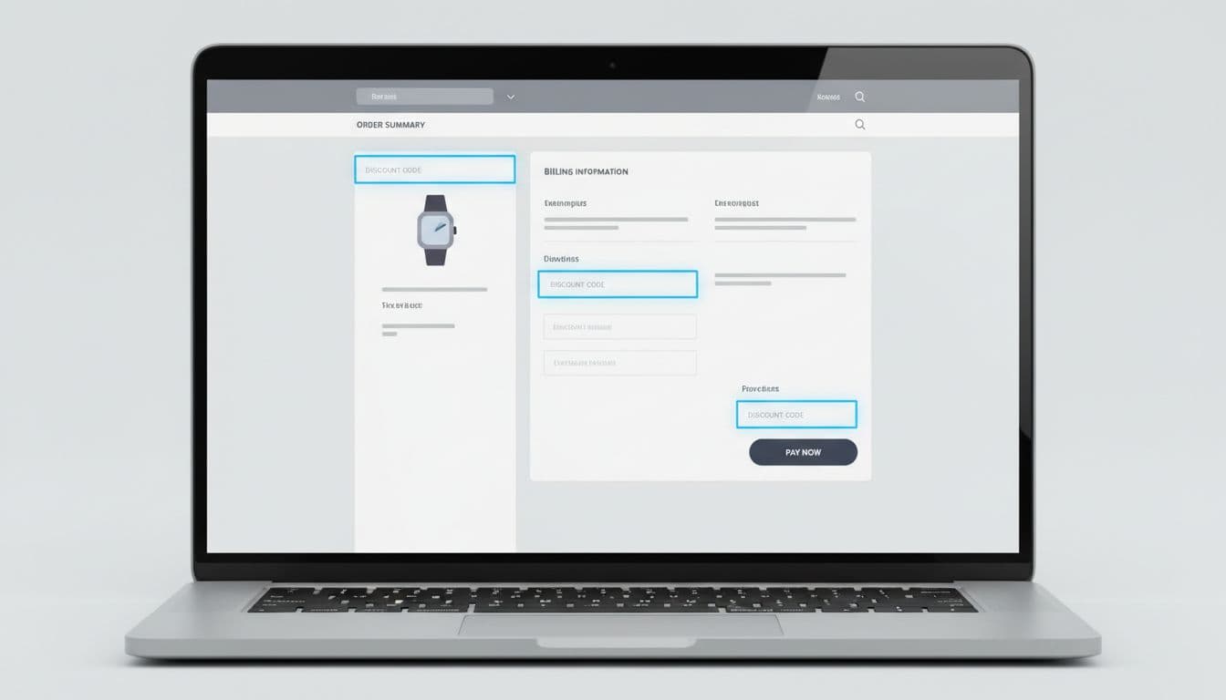
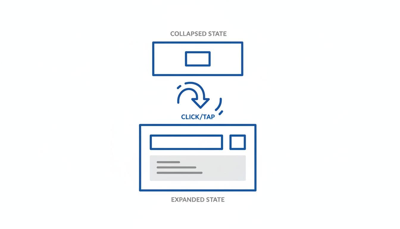
Placement and progressive disclosure that keeps momentum
Placement is more than layout; it’s psychology guided by visual hierarchy. A promo code field placed too early can interrupt flow (risking banner blindness), while a field placed too late can feel sneaky.
Use this quick comparison to decide where the field belongs for your checkout page model:
| Pattern | Best for | Watch-outs |
|---|---|---|
| In the order summary (visible) | High promo usage, heavy email campaigns | Increases “code hunting” or banner blindness if shown too early |
| Progressive disclosure (“Have a promo code?”) | Most stores, especially mobile | Must be easy to find, not buried |
| After shipping selection | Shipping-heavy shopping carts where totals change | Needs clear “total will update” messaging |
Recommended default: progressive disclosure near the order summary, with the current total visible. Treat it like an optional tool in the user journey, not a required step.
Microcopy that works well for the collapsed state:
- Button label: “Have a promo code?”
- Helper text under total: “Add it before payment.”
Implementation notes (front-end behavior):
- Auto-expand (automatic apply) when a promo parameter is present (for example,
?code=from email links or site-wide promotions) and prefill the input with the coupon code. - Keep the order summary sticky on mobile (mobile-first UX principle), so the shopper sees the total change immediately after apply.
- Preserve the entered value if the shopper navigates back a step, especially in multi-step checkout.
If you’re aligning this with broader checkout cleanup, this roundup of e-commerce UX strategies for 2026 success pairs well with promo field improvements because it focuses on friction removal across the journey.
Accessibility and mobile details that prevent drop-offs:
- Add
aria-expandedand move focus into the input on expand. - Set input to avoid auto-capitalization issues (codes often break when iOS “helps”).
- Support paste, and trim spaces on input automatically.
Validation, error states, and “proof” that the discount applied
The fastest way to lose customer trust is to accept a code, then leave the shopper unsure if anything changed before they enter payment information. The second fastest is a vague error message.
Your coupon code apply interaction should feel like turning a key: immediate feedback, clear outcome.
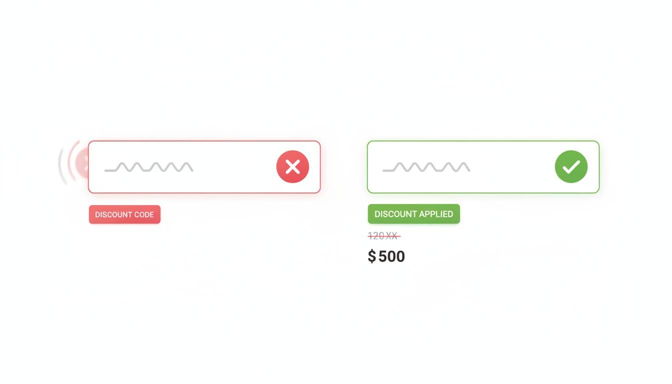
Pattern: optimistic but confirmed apply
- Disable the Apply button while validating and show an inline spinner.
- Update the order summary and order total immediately after the API confirms, not before.
- Show a line item such as “Discount” with the amount saved.
Success microcopy examples:
- “Applied. You saved $12.40.”
- “Code applied. Total updated.”
Error microcopy examples (tie the message to a fix):
- Expired: “That code’s expiration dates passed on Mar 1. Try another code.”
- Not eligible: “This code doesn’t meet eligibility rules for full-price items only.”
- Minimum spend: “Add $8 more to meet the minimum spend threshold.”
- Already used: “This code for personalized offers was already used on this email.”
- Stacking blocked: “Only one promo code can be used per order.”
Craft helpful error messages that guide users to a fix, avoiding frustration from common issues like expiration dates or personalized offers.
Gotcha: if the cart changes (quantity, variant, shipping method), re-check eligibility and explain why the discount changed. Silent removal feels like a bug.
Implementation notes and edge handling:
- Treat coupon codes as case-insensitive, and strip whitespace.
- If your system supports stacking, show applied promos as removable “chips” with a clear priority rule.
- If stacking is not allowed, don’t let users keep trying blindly. Explain the rule before they waste time.
- For guest checkout, avoid dead ends like “Sign in required” after they apply. Instead: “Member code. Sign in to use it, or continue without.”
For broader checkout friction patterns beyond promos, this guide on reducing cart abandonment with UX design is a useful reference when you’re prioritizing fixes across the funnel. If you want a recent 2026-focused checklist for checkout flow improvements, see this eCommerce checkout optimization UX guide.
Edge cases to design for, plus KPIs to prove it worked
Most coupon code UX problems on the checkout page don’t show up in happy-path testing. They show up in edge cases and metrics, especially for codes from holiday promotions or newsletter signups.
Key edge cases worth building into acceptance criteria:
- Code expires between entry and submit (show: “Expired, remove or replace.”)
- Code conflicts with an automatic promotion, cross-selling offers, or point of sale logic (show which one wins, and why)
- Shipping discounts before shipping is selected (hold the promise: “Calculated after shipping”)
- Returns to checkout from a payment information error (persist the applied code state, including automatic apply)
Track these KPIs and events so the team can tune the pattern and reduce cart abandonment:
- Checkout abandonment rate (overall, and step-level)
- Promo usage rate (applied codes per shopping cart checkout started)
- Promo error rate (invalid, expired, ineligible)
- Time to complete checkout (median, plus percentiles)
- Apply-to-purchase rate (sessions that apply a code and still buy, building customer trust)
A quick QA checklist for release day:
- Totals update in under 500 ms after API response (or show loading clearly)
- Clear success state with badge design plus a remove action
- Specific error reasons, not “invalid” only
- Works in guest checkout, after back navigation, with a progress indicator
Conclusion
A discount code field shouldn’t feel like a detour. With clear placement, progressive disclosure, and honest feedback, discount code UX becomes a seamless part of the ecommerce user experience, reducing cart abandonment without sacrificing promotions. Audit your current flow by watching replays around the coupon interaction, then test one change at a time. The best coupon code experience is the one that keeps shoppers paying, not searching.