

Logos really are the face of any brand. Consider them as the ultimate first impression for customers. A striking logo has the power to grab attention in an instant, so it’s top-tier in building brand recognition. It’s like a one-second elevator pitch without words.
Imagine flipping through a magazine or scrolling past an endless abyss of social media posts. A standout logo can make a brand memorable even in a sea of competition. Suddenly, that specific brand comes to mind when encountering something related, like seeing the iconic swoosh and instantly thinking sportswear or fitness.
Logos do more than just reflect what a company does; they connect emotionally with people. Colors, shapes, and fonts come together, crafting an instant emotional response. Whether it’s trust, excitement, or nostalgia, a smartly designed logo leaves a lasting impression and keeps brands fresh in people’s minds.
Psychologically, logos are powerful. They don’t just make a product recognizable; they create emotional connections. A well-loved logo taps into consumer loyalty. When people see that logo, they know what to expect, fostering trust. This trust is what keeps them coming back, turning casual customers into brand advocates.
In the chaotic hustle of the business world, a carefully designed logo stands as a beacon of identity. It tells the story of a brand in a matter of seconds, laying the foundation for customer loyalty and fierce brand recognition.
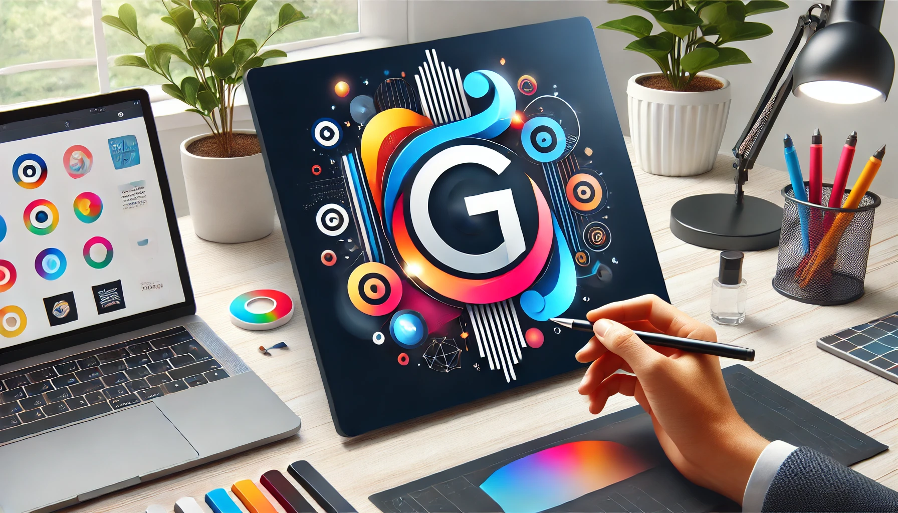
Attributes of a Memorable Logo: Design Fundamentals
What really sets a logo apart? It’s all about the basics: simplicity, versatility, and relevance. Simple logos are often the most memorable. Think about the logos you recognize instantly; they’re usually not cluttered with noise. A simple design that conveys the brand’s essence speaks volumes without excess.
Colors play a major role. They’re not random; color choices in a logo are strategic, creating emotional and associational connections. Whether it’s the calming trust of blue or the energetic vibe of red, colors complement the brand’s identity, ensuring they’re not forgotten. Understanding color psychology can turbocharge efforts in crafting an effective logo.
A strong logo also dances between creativity and functionality. While creativity pulls the audience in, functionality ensures that the logo works across various mediums and sizes, from giant billboards to tiny app icons. Having a logo that scales well while maintaining its integrity is critical for consistent brand presence.
The right fonts and shapes add another layer. They shouldn’t feel out of place or clash with the brand’s message. Every element within a logo should have a clear purpose, aligning with the company’s mission and values while also appealing to the target audience. It’s a lot to ask from a little image, but that’s the magic of great design.
Ultimately, the secret sauce of a memorable logo blends these elements, ensuring the brand stands out and leaves a permanent mark on the audience’s mind.
Crafting a Logo that Resonates with Your Target Audience
Every brand has a story, and a logo is a fast-track way to tell it. But to truly connect, it’s crucial to understand who’s on the receiving end. This is where audience research swoops in like a superhero. Knowing what your audience loves, craves, and relates to can turn a generic logo into something personal and impactful.
Now, think about integrating brand values and mission. It’s not just about selling products or services—it’s about communicating the soul of the business. A logo that mirrors the company’s core beliefs speaks directly to its audience, establishing deeper connections beyond mere transactions.
Taking a page out of successful brands’ playbooks can be enlightening. Let’s say a business endeavors to be eco-friendly. The logo flashes greens, natural shapes, and maybe an earthy font. Immediately, it resonates with audiences who value sustainability, making them more likely to trust and engage.
Statistical analysis and surveys could sound like drab, but they help refine what the audience really responds to. Through this, brands can tweak their logo designs to align with their target demographic, ensuring each brushstroke serves a purpose. It’s not about pleasing everyone; it’s about making that target audience feel like the logo was made just for them.
With these pointers in mind, you’re not just designing a logo—you’re crafting a communication tool that’s in sync with what your audience wants and needs to hear.
Ensuring Consistency Across Brand Touchpoints
A logo isn’t just seen on billboards or business cards—it’s plastered over websites, social media avatars, product packaging, and more. Consistency in how it’s presented is what keeps the brand identity rock solid. If a logo starts looking different across various platforms, it muddies the waters, causing confusion and diluting the core message.
Uniformity is not just about the logo’s color scheme or shape, it’s developing a cohesive brand visual storytelling. This means the logo needs to look and feel the same, whether it’s embroidered on a shirt or animated on a digital screen. Different sizes shouldn’t mean a compromise in visibility or interpretation—clarity is king across the board.
To keep everything in check, having brand guidelines in place is invaluable. These guidelines set out how to properly use the logo, covering color variations, clear space around the logo, minimum sizes, and incorrect usage scenarios. This way, everyone from graphic designers to marketing teams is on the same page and singing the same tune when it comes to the logo’s representation.
Digital tools can also lend a hand. Brand management platforms ensure that only approved versions of the logo get used, maintaining that sacred consistency portfolio-wide. This prevents rogue alterations and maintains the brand’s integrity, no matter how fast-paced or changing the environment might be.
Proper application of logos across all media is like a trust-builder with audiences, showing them that a brand is well-organized and professional. It’s this meticulous consistency that cements brand recognition and fosters ongoing trust. When people see the logo, no matter where they encounter it, they immediately know what to expect.
Evolving Your Logo: When and How to Refresh Your Brand’s Visual Identity
Even the most iconic logos need a little tweaking now and then to keep pace with the changing world. But knowing the right time to refresh that visual mark is key to maintaining relevance without losing the essence that people love.
Sometimes, a logo starts feeling stale or out of sync with where the brand is heading. Maybe it’s gearing up for a new audience demographic or shifting its core values. When customers no longer feel that instant connection or if competitors are rapidly outpacing with fresh looks, it might be refresh time.
Updating doesn’t mean transforming the logo beyond recognition. Successful evolutions maintain familiar elements while offering a modern twist. Think subtle font changes or adopting new colors to reflect current brand aspirations. The goal is to revitalize without leaving loyal customers feeling alienated.
Scanning the business landscape offers inspiration. Successful brand makeovers show that sometimes a logo needs just a fine-tuning rather than a complete overhaul. It’s a balancing act of preserving the brand’s heritage while embracing new trends and technologies.
A thoughtful update can breathe new life into a logo, ensuring it resonates with both longtime fans and potential newcomers. Keeping one foot in the familiar and the other stepping toward innovation makes for a dynamic and enduring brand image.
