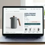

What is a CTA? A call to action is a clear prompt that tells visitors what to do next, like “Start a free trial,” “Add to cart,” or “Get a free consultation.” Buttons, links, icons, and images all serve as CTAs when they push people toward a conversion.
This guide shows practical steps for crafting CTAs that grab attention, match your marketing goals, and guide your audience. You’ll learn how contrast, whitespace, copy, and placement work together to turn visits into measurable outcomes.
We cover strategy, copy, button design, mobile tap targets, and email best practices. Real examples and testing tips explain why timing matters—complex offers need benefits shown before the first ask to avoid early drop-offs.
Quick note: prioritize clarity and benefit-first wording, use action verbs, and test continuously. Small tweaks in color, contrast, or copy often yield big gains and help you learn which things move the needle.
Key Takeaways
- CTAs must tie to your site’s primary goal and give the audience a clear next step.
- Use contrast, whitespace, and hierarchy to draw attention without clutter.
- Write concise, benefit-led copy and favor action verbs over vague phrases.
- Ensure mobile tap targets meet recommended sizing and spacing.
- Test copy, color, and placement; measure with UTMs and link monitoring.
Why CTAs Matter for Conversions and User Experience
A clear prompt on a page turns fleeting interest into measurable conversions. CTAs guide visitors from curiosity to a next step—whether that is “Learn more,” “Sign up,” or “Add to cart.” When the next move is obvious, people stay engaged and are more likely to convert.
From attention to action: moving users down the funnel
CTAs transform attention into action by removing ambiguity and friction for the user.
Proper contrast and whitespace make buttons easier to spot, especially on mobile where thumb taps dominate. WP Engine notes that without a crystal-clear directive you risk losing visitors despite strong product pages and traffic.
Aligning business goals with what people actually want
Good CTAs match company aims—sign-ups, demos, purchases—to real user value like savings, clarity, or quick solutions.
- Place CTAs where readiness peaks, not before people understand the benefit.
- Use value-led phrasing for faster decisions in crowded email and mobile feeds.
- Match CTA type to funnel stage: learn, try, or buy so people move naturally.
Designing effective calls-to-action
Start with one primary request and a straightforward benefit to guide reader choices. Define the single primary action the page should drive and state the immediate benefit close to the prompt.
Define the single primary action and its value
Pick one clear task users can complete, such as “Start free trial.” Keep the text short and benefit-led, e.g., “No credit card required.”
Use first-person phrasing when it helps: “Start my trial” can raise ownership and lift response rates.
Set a measurable goal to guide copy, design, and placement
Translate the aim into a KPI: CTR, trial starts, or demo requests. Let that metric steer your copy, button design, and placement on the page.
Test hypotheses like personalized text raising CTR by a set percent and document results so teams reuse winning patterns.
- Make the button look clickable with contrast and whitespace.
- Add microcopy like “Cancel anytime” to lower friction.
- Plan hover and focus states for clarity and accessibility.
Audience and Context: Match Message, Channel, and Stage
Audience intent and channel shape what you should ask for and when.
Segment visitors by intent and lifecycle stage. That helps you pick a prompt from low-commitment “Learn more” to high-commitment “Buy now.”
Match the message to the channel. What works on a desktop hero often needs a shorter, tap-friendly version for email or social.
Use real-world examples like Netflix and Basecamp to show benefit-first clarity: short reassurance or clear value lowers friction and builds trust.
Think in practical ways to personalize prompts. First-person phrasing or dynamic benefits based on source can lift response and feel relevant.
Make sure the landing page delivers the same promise that got the click. Consistent value prevents surprise and reduces bounce.
- Segment by intent to tailor message and CTA.
- Adapt copy and format to the channel, including email.
- Measure by segment to find the best audience-message combos.
CTA Copy That Drives Action, Not Just Clicks
Words on a CTA should promise a result, not just invite a click. Use verbs that point to a benefit so readers know the outcome before they tap.
Lead with clear, benefit-focused verbs. Prefer “Get,” “Start,” “Try,” or “Join.” Keep button text short—WP Engine recommends 2–7 words—and avoid vague prompts like “click here.”

- Match commitment to context: use “Shop now” for casual browsing and “Buy now” when intent is high.
- Use first-person cues: “Start my trial” increases ownership and raises conversion rates.
- Frame value near the button: list discounts, free shipping, or “No credit card required.”
- Create honest urgency: limited quantities or clear deadlines add lift without eroding trust.
In email, make CTA text scannable and descriptive so people know the outcome. Test variations in copy and urgency to learn what moves readers and document winning language for future ctas.
CTA Button Design Fundamentals
Make your primary prompt feel tangible: shape, spacing, and subtle depth tell users it’s interactive.
Visual cues should make the element unmistakably clickable. Use rounded corners, a clear border, and gentle shading so the button reads as a control at a glance.
On mobile, prioritize tap targets. Maintain at least a 44×44 px touch area so users avoid mis-taps and move through flows smoothly.
- Give buttons enough whitespace so they stand out and avoid accidental taps.
- Add subtle depth and state changes (hover, focus, active) for keyboard and mouse users.
- In email, use bulletproof coding so the CTA displays even when images are off.
| Attribute | Recommended value | Why it matters |
|---|---|---|
| Shape | Rounded corners (4–12px) | Feels friendly and clickable |
| Size | Min 44×44 px tap target | Reduces mis-taps on mobile |
| Spacing | Generous whitespace | Improves discoverability and accuracy |
Test corner radii, padding, and border weight to balance brand look with clarity. Small tweaks in layout often boost clicks and lower friction for the user.
Color, Contrast, and Visual Hierarchy Best Practices
A CTA’s color should cut through surrounding content so users spot the next step instantly.
High contrast matters more than the specific hue. WP Engine notes no single color always wins; what does matter is contrast with the page. Pick a vibrant, brand-fitting shade that separates the primary button from nearby elements.

High-contrast colors that fit your brand and stand out on the page
Prioritize contrast so the primary prompt captures attention within your visual hierarchy.
Use a consistent palette strategy: give main CTAs the most saturated treatment and mute secondary options. Always check that button text passes accessibility contrast guidelines for real-world lighting and screens.
What different colors can signal to users
Color carries meaning. Orange often prompts quick action, blue suggests trust and security, and red can create urgency. An Emma study found color strongly affects buying decisions, so treat that as a fact to test, not a rule.
- Test within your brand: validate associations with your audience.
- Keep hierarchy clear: the main button must be unmistakably prominent.
- Account for themes: confirm visibility in dark mode and over background images.
Whitespace, Size, and Scannability
Give primary elements room to breathe so readers find the next step without effort.
Use generous negative space to isolate a CTA from dense content on the page. WP Engine recommends breathing room around prompts to improve focus and lift conversions.
Choose button size and padding that boost prominence and legibility. Follow the minimum 44×44 px tap guideline to reduce mis-taps and help mobile users hit the right target.
- Isolate CTAs so the eye settles on the primary option instead of scanning cluttered elements.
- Structure content into short blocks with clear headings and concise labels to speed scanning.
- Repeat the main prompt at natural decision points on long pages to catch scrollers when readiness peaks.
- Email layouts need extra breathing room and spacing between links to avoid accidental taps.
A quick user review or heatmap test will validate scannability. Refine spacing and size based on what real users do, not just how the design looks on a draft.
Smart Placement: Above the Fold, Below the Fold, and Repetition
Placement of CTAs should match how much information a visitor needs before they decide. Traditional advice favors above-the-fold prompts, but context matters. Complex offers often need benefits and proof before a single ask.

When to lead with a CTA vs. when to let benefits build first
Test the page’s intent. If the offer is low-friction, a visible prompt up top can speed decisions. For high-consideration buys, let testimonials, specs, and guarantees build trust first.
Long-form pages: sprinkling CTAs where readiness peaks
On long pages, repeat the primary CTA at natural breakpoints. Place buttons near proof points so momentum flows into the next step.
- Decide whether early placement fits the offer or if readers need more time.
- Put CTAs by benefits, testimonials, or guarantees for clear paths to conversion.
- Respect the fold but don’t force commitment before readers grasp value.
- In email, repeat the main CTA to catch fast scrollers and reinforce the message.
- Use analytics and scroll maps to find where visitors linger, then test placement around those hotspots.
Measure results and iterate: small shifts in placement often change who takes action and when.
Primary vs. Secondary CTAs: Reducing Choice Overload
Too many choices freeze decisions; a clear primary prompt lets people move forward. Limit visible options so visitors spot the main path quickly and choose with confidence.
Styling hierarchy so the main action wins attention
Make the primary button visually dominant. Use the strongest color and weight for it, and give it the most space on the page. That visual priority helps people know where to click first.
When to include a gentle secondary option
Offer a muted alternative for visitors who need a softer commitment, like “Learn more.” Style those buttons with outlines or low-contrast fills so they don’t compete with the main control.
- Limit choices in a single view to reduce cognitive load.
- Avoid shaming or snarky secondary copy that harms trust.
- Keep labels concise and outcome-focused for both button types.
- Test presence and treatment of secondary CTAs in email and on the page to confirm they help the main goal.
Email CTAs: Buttons, Bulletproof Builds, and Tap Targets
Make the email experience resilient: use live HTML so the primary prompt shows even when images are off. Bulletproof builds keep the prompt readable and interactive across major clients, protecting clicks and conversions.

Bulletproof buttons for image-off reliability
Build a cta button with HTML and inline CSS so the visible label remains text, not an image. That approach renders if a client blocks images and helps screen readers parse content.
Styled text links and rollover states
Use a distinct color and underline for important text links so readers recognize them quickly. On desktop, add a rollover that changes color or underline to hint interactivity while keeping accessibility in mind.
Mobile-first spacing and repeated primary CTAs
Follow Apple’s touch guidance: keep interactive areas at least 44×44 px and add generous padding. Repeat the main prompt farther down the email to catch scanners who skip the hero.
- Track destination URLs with UTMs (utm_content=hero vs. headline) to attribute clicks.
- Keep labels brief and descriptive; reinforce value near the prompt.
- Test buttons vs. styled links and color variants to find what your audience prefers.
Landing Page Alignment: Message Match Beyond the Click
A visitor’s first seconds on a landing page decide whether the promise behind a link becomes a conversion. The destination URL must deliver the same message and value that earned the click so visitors feel confident and continue.
Echo headline, imagery, and opening content so the page reads like a natural next step from the ad or email. Clear reinforcement above the fold—benefits and trust signals—cuts friction and lowers bounce.
- Keep the primary action visible near the top and repeat it where readiness peaks.
- Match brand visuals and tone so transitions from campaign to page feel seamless to your audience.
- Personalize content when UTMs or segments allow — small relevance lifts engagement.
- Prioritize the main value first, then reveal details progressively for readers who want more.
- Capture tracking parameters and validate they flow into analytics to attribute conversions.
Finally, measure engagement and refine the landing content often. Use click and heatmap data to tighten the match between promise and experience and to reduce unnecessary steps in the path to completion.
Supportive Microcopy: Trust, Safety, and Proof
Microcopy placed by the prompt helps readers feel safer and more willing to try. Short reassurance reduces risk at the point of decision and nudges people toward the next step.
No credit card required, guarantees, and privacy notes
Use clear safety cues like “No credit card required,” “30-day money-back guarantee,” or “We never share your email.” These lines lower perceived cost and commitment without distracting from the main CTA.
Social proof and testimonials near the CTA
Place short quotes, star ratings, or trust badges next to the button to validate claims. Netflix’s “Cancel anytime” is a simple example that reassures users at the exact choice moment.
| Element | Example text | Why it helps |
|---|---|---|
| Commitment cue | No credit card required | Reduces sign-up friction |
| Guarantee | 30-day money-back guarantee | Limits purchase anxiety |
| Trust mark | Trusted by 200K companies | Provides social validation |
- Keep microcopy visible and readable at a glance; avoid burying it in dense blocks of text.
- Ensure compliance notes are accessible but visually subordinate to the primary prompt.
- In email, space microcopy away from links to prevent mis-taps on mobile.
- Test logos, short quotes, and star ratings to learn which examples lift conversions the most.
Measurement Essentials: Destination URLs, UTM Tracking, and Link Health
Track links from the start so each click maps to a specific creative and placement. Tag destination URLs with UTM parameters to attribute traffic and conversions to the right source, medium, campaign, and content.
Using UTM parameters to attribute clicks and outcomes
Append parameters like utm_source, utm_medium, utm_campaign, and utm_content. For example, tag the hero image with utm_content=hero and the headline link with utm_content=headline to see which way drives more clicks.
Monitoring broken/slow links before users encounter them
Test every link before launch and use automated link monitoring to catch broken or slow URLs. Validate that the landing page loads quickly and matches promised content to avoid drop-offs and misattribution.
- Append UTMs to every CTA destination for precise attribution.
- Standardize naming so reports stay clean and comparable.
- Monitor links and page speed to protect conversion goals.
- Map UTMs to dashboards to follow clicks to conversions.
| Item | Why it matters | Example |
|---|---|---|
| UTM tagging | Attributes clicks to placements | utm_content=hero vs utm_content=headline |
| Naming convention | Keeps reporting consistent | source=twitter, medium=social |
| Link monitoring | Prevents broken or slow experiences | Automated uptime checks |
| Landing page check | Reduces bounce and skewed data | Load time |
Testing and Optimization: Colors, Words, Placement, and Number of CTAs
Run focused experiments that change one element at a time to learn what really nudges readers. A/B test language, offer, design, placement, and the number of CTAs to find what your audience prefers.
Form clear hypotheses like “First-person copy will increase CTR.” Change only one or two things per test so you can isolate impact. Use statistically sound sample sizes and run tests long enough to account for day-to-day variation and seasonal behavior.
A/B testing hypotheses for copy, color, contrast, and size
Test wording, color, contrast, and size to refine clarity and visibility without breaking brand rules. VWO’s case studies show small copy swaps sometimes yield massive lifts—one swap produced a 620.9% CTR increase.
Testing quantity: one focused CTA vs. many options
Experiment with a single prominent option versus a curated set. Litmus recommends checking format and quantity—buttons may win in email while styled text links perform better on some landing pages.
Iterating continuously to keep performance current
Keep a changelog of tests, results, and next steps so learnings accumulate and you avoid repeating experiments. Revisit winners periodically; user preferences, competitor moves, and platform updates change over time.
- Make sense of results by tracking UTMs and segmenting by source.
- Validate button and link treatments across web and email clients.
- Balance best practices with measured ways that lift metrics—not assumptions.
Real-World Patterns and Examples to Inspire Better CTAs
Real brand examples show how small wording and placement shifts move clicks and conversions.
Low-friction “Get started free” vs. transactional “Buy now”
Match phrasing to readiness. Low-friction labels like “Get started free” reduce perceived risk. Netflix’s nearby “Cancel anytime” is a classic reassurance that lowers hesitation.
By contrast, transactional prompts such as “Buy now” work when people already value the product and see the cost as justified. Spotify’s “Get Spotify Free” shows how removing a credit-card step lifts sign-ups.
Using urgency, benefits, and clarity in ecommerce CTAs
Balance urgency with clear benefits. Shops that add gentle scarcity—limited-time offers or low-stock nudges—convert more without alienating people.
Examples: PrettyLittleThing uses FOMO phrasing and timed discounts. Sephora keeps category CTAs short and precise to send buyers directly to new product pages. Tesla pairs price clarity and delivery info near order prompts so buyers feel informed.
| Pattern | Brand example | Why it works |
|---|---|---|
| Low-friction + reassurance | Netflix: “Cancel anytime” | Reduces signup anxiety and boosts trials |
| No-card barrier | Spotify: “Get Spotify Free” | Removes payment friction for trial growth |
| Dual CTAs for intent | Apple: “Learn more” + “Buy” | Serves both browsers and buyers on one page |
| FOMO + benefits | PrettyLittleThing / Sephora | Clear benefit-led copy with soft urgency lifts conversions |
- Apply color and contrast to guide clicks—test orange for action and blue for trust with your audience.
- Place CTAs beside proof (reviews, savings, guarantees) so the page delivers the promise immediately.
- Adapt patterns for email: increase spacing, repeat the main prompt, and use bulletproof code for reliability.
Conclusion
Finish this guide with a clear, repeatable plan. Pick one primary prompt, write a short value line, and make the button obvious and accessible. Mobile tap targets should meet the 44×44 px minimum so users hit the right element.
Match message and placement to visitor readiness. Repeat prompts on long pages and in email so intent is captured where it peaks. Use bulletproof buttons, mobile-first spacing, and UTMs to track the journey.
Measure and iterate. Test words, color, contrast, size, and the number of prompts. Turn results into a playbook so teams can scale wins. Your next step: audit current CTAs, fix the highest-impact items first, and run structured tests to improve over time.
FAQ
What is the single most important goal when creating a CTA?
Focus on one primary action that delivers clear value to the user. Define that goal — sign up, start trial, buy — then shape the copy, color, size, and placement to nudge users toward that outcome.
How should I write copy that motivates clicks without sounding pushy?
Use clear, benefit-focused verbs like “get,” “start,” or “try” and pair them with the value (e.g., “Get your free demo”). Match commitment level to the ask: lower-commitment phrasing for early-stage users and direct wording for ready-to-buy audiences.
What size should CTA buttons be on mobile?
Aim for a minimum touch target of 44×44 pixels to ensure reliable tapping. Leave generous vertical spacing so thumbs can tap without hitting adjacent elements.
How do I choose CTA colors that convert while staying on brand?
Pick a high-contrast color that stands out from the page background and other UI elements. Use brand hues when possible, but prioritize contrast and visibility; test alternative accent colors to see which drives more clicks.
Where is the best place to put a CTA on a page?
Place a prominent CTA above the fold for quick conversion, and repeat it after key information or decision points. On long-form pages, sprinkle CTAs where readiness peaks — after benefits, testimonials, or pricing.
How many CTAs should a landing page have?
Limit options to reduce choice overload: one strong primary CTA and, if needed, one subtle secondary option. Make the primary visually dominant so users don’t get pulled in different directions.
What microcopy should surround a CTA to build trust?
Add short supportive notes like “No credit card required,” refund guarantees, privacy reassurances, and social proof near the button. These reduce friction and increase confidence before clicking.
How can I create urgency without harming trust?
Use honest, time-bound cues such as limited seats or a real sale end time. Avoid false scarcity. Pair urgency with clear benefits so users act for value, not fear.
How do email CTAs differ from web CTAs?
Email CTAs must work with images off and across many clients. Use bulletproof buttons or well-styled text links, ensure adequate tap targets, and repeat the primary CTA within the message for mobile readers.
What tracking should I add to CTA links?
Use destination URLs with UTM parameters to attribute clicks and outcomes in analytics. Monitor link health and page load times so users don’t encounter broken or slow destinations.
How often should I A/B test CTA elements?
Test continuously but focus on one hypothesis at a time — color, copy, placement, or quantity. Run tests long enough to reach statistical significance and iterate based on results, audience, and seasonal shifts.
Can personalization improve CTA performance?
Yes. Personalization cues like “Start my trial” or tailored offers increase relevance and conversion. Match language and offer to the user’s channel, stage in the funnel, and past behavior.
What role does whitespace play around CTAs?
Whitespace improves scannability and helps the CTA stand out. Clear margins and separation from other interactive elements reduce accidental taps and focus attention on the main action.
Should secondary CTAs be visible on mobile?
Use secondary CTAs sparingly on mobile. If included, keep them visually subtler and spaced away from the primary button to avoid mis-taps and decision friction.
What metrics matter for CTA performance?
Track click-through rate, conversion rate post-click, bounce rate on the destination, and downstream KPIs like revenue or activation. UseUTM tagging to link CTA clicks to specific campaigns and outcomes.
How do I use social proof near a CTA effectively?
Place concise proof points — logos, star ratings, or short testimonials — close to the CTA so prospects see evidence of value right before they act. Keep it credible and specific to the user’s use case.
What common design mistakes reduce CTA effectiveness?
Small text, low contrast, cluttered surroundings, too many CTAs, and poor mobile spacing all hurt performance. Also avoid vague copy like “Submit” without signaling benefit.
How can I test the quantity of CTAs on a page?
Run experiments comparing a single focused CTA versus multiple options. Measure which yields higher conversions and better user experience; many pages perform better with one clear primary action.
How should CTAs tie into landing page messaging?
Ensure message match: the CTA’s promise must reflect the ad, email, or link that brought the user. Consistent language, offer, and design reduce drop-off after the click.
What language tone works best for CTAs?
Use direct, conversational tone that communicates value quickly. Match formality to your audience: friendly for consumer apps, more straightforward for professional buyers.