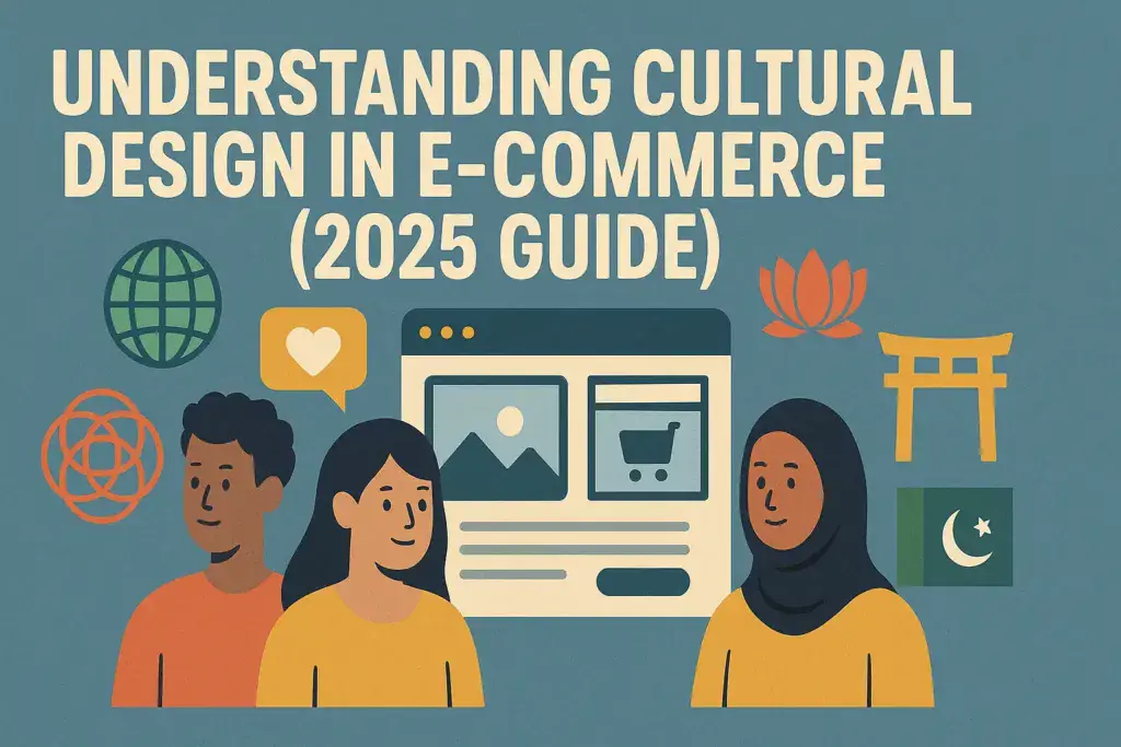

A single color can lift or sink your sales. Red can signal good fortune and urgency in China, yet feel aggressive or off in parts of Europe. Choices like this shape trust, clicks, and checkout rates. Understanding the impact of these choices is essential in the context of Cultural Design in E-commerce.
As online shopping grows across borders, design choices carry more weight. Shoppers bring different expectations for color, type, whitespace, and even emoji. The same layout that feels clean in Japan can feel empty in Brazil. Getting it right in Cultural Design in E-commerce means higher engagement, fewer returns, and stronger repeat buys.
Here’s what matters most. Colors set mood and meaning, so pick palettes that match local culture. Layouts and content density vary by region, from minimalist grids to info-rich pages. Navigation patterns, filters, and search bars need to match how people browse. Understanding Cultural Design in E-commerce ensures that symbols and photos must be clear and culturally safe.
Smart teams now mix cultural insights with data. They test regional color sets, tune copy to local tone, and adapt icons that avoid confusion. Mobile-first is non-negotiable in many markets, and AI helps personalize catalogs by language, season, and local trends. Accessibility boosts trust everywhere when considering Cultural Design in E-commerce.
Adapting Layouts and Navigation for Global Users
Site structure should match how people browse and buy in each region. Get the basics right, then tune menus, search, and checkout to local habits. You will see lower bounce rates, faster paths to products, and fewer cart drop‑offs, all vital in the scope of Cultural Design in E-commerce.
Mobile Magic in Asia
Shoppers in Southeast Asia live on their phones. Keep navigation thumb‑friendly with big tap targets, anchored bottom bars, and clear icons. Feature social hooks like chat, ratings, and short videos near the product card. Time‑boxed promos, such as flash deals and daily coins, keep users coming back.
- Keep core actions fixed at the bottom: Home, Search, Cart, Account.
- Surface quick filters above the fold for brands, price, and shipping speed.
- Use snackable UI patterns, such as story‑like banners and swipeable carousels.
Want a reference? This Shopee UX breakdown shows how mobile patterns drive repeat use: Shopee mobile shopping experience case study.
Clean Flows in Europe
Clarity beats clutter. Use logical, shallow menus and predictable labels. Be upfront about fees, delivery windows, and returns. Retailers that mirror an in‑store feel, similar to Chair King, group categories by real shopping tasks and show inventory status early. Multi‑currency should feel effortless.
- Auto‑detect country, currency, and taxes; allow easy manual change.
- Show shipping costs and delivery dates on product pages and in cart.
- Keep filters tidy with checkboxes, not walls of text.
Add a simple progress bar in checkout. It calms buyers and cuts confusion.
Respectful Paths in the Middle East
Support Arabic and English, with a full right‑to‑left layout where needed. Make trust visible. Show security badges, return terms, and contact options near key actions. Offer local payments like cash on delivery, Mada, and regional wallets.
- Mirror layout in RTL, including icons, carousels, and breadcrumbs.
- Use clear labels for modesty filters and store policies.
- Place payment logos and SSL badges near the pay button.
Keep help links easy to spot. A quick answer prevents backtracking.
Quick Wins in North America
Speed sells. Use AI recommendations to surface relevant items and bundles on PDPs and in cart. Cut steps across checkout with guest checkout, address auto‑complete, and express pay. Offer buy now, pay later for higher AOV without friction.
- Add Apple Pay, Google Pay, PayPal, and BNPL at the first step.
- Pre‑fill forms and save carts across devices.
- Trigger smart, low‑noise reminders for abandoned carts.
Track click‑to‑checkout time. Every second you remove adds up to more buys.
Using Symbols and Visuals to Connect with Shoppers
Icons and motifs do more than decorate a page. They carry meaning, set tone, and spark trust in a split second. Get them right and you lift clicks, saves, and repeat buys. In 2025, culturally sensitive personalization makes these visuals feel timely and local, from festive badges to policy icons that remove doubt.
Cultural Icons in Asia
Festive visuals drive serious engagement. Dragons, lanterns, koi, and the number 8 signal luck and prosperity during Lunar New Year and big shopping festivals. Use them in banners, limited-edition packaging, and sticker-style overlays on product cards. Tie them to social commerce so shoppers can share deals in chat and stories.
- Lucky cues work best as accents near promos and “Add to cart.”
- Avoid unlucky numbers, like 4, in coupon codes and SKU images.
- Rotate seasonal sets, such as cherry blossoms for spring, to keep feeds fresh.
Smart play: a countdown badge shaped like a lantern for a 48-hour bundle, paired with share-to-unlock perks in chat. It feels festive, not gimmicky, and nudges group buys.
Minimalist Signals in Europe
Clarity and policy-first visuals build confidence across borders. Use clean, line-based icons for shipping, returns, eco packaging, and warranty. Keep labels short and readable in multiple languages, and back icons with clear tooltips.
- Align with known marks, such as the EU “estimated” e-mark on packaging, to support expectations for accuracy.
- Offer consistent icon placement on PDPs and checkout for faster scanning.
- Use a neutral icon set with strong contrast for accessibility.
If you need a modern, readable set, this 2025 pack is a solid starting point: Free Download: 45 Responsive eCommerce Icon Set 2025.
Motifs That Matter in the Middle East
Geometric patterns, elegant calligraphy, and balanced spacing honor tradition while keeping the site modern. Pair Kufic-inspired headings with simple sans-serif body text. Let patterns frame content, not compete with it.
- Use tessellations in headers, card borders, or dividers.
- Favor modest product imagery and clear size and care icons.
- Support Arabic and English with mirrored icon directions and RTL layouts.
Subtle pattern accents around trust and payment sections make the experience feel considered, not noisy.
Brand-Driven Visuals in North America
Shoppers look for brand signals that confirm safety and speed. Payment badges, review stars, and guarantee shields should be current, high-res, and context-aware.
- Personalize trust rows by device and history, for example, show Apple Pay first on iPhone.
- Surface dynamic badges, such as “Ships today,” based on live ops data.
- Keep social proof close to the price and main CTA.
2025 tip: swap static banners for data-fed visuals that update with stock, delivery windows, and loyalty status. These small cues build habit, which builds loyalty and sales.
Real Examples and 2025 Trends for Smarter E-commerce Design
Great design adapts to culture, not the other way around. Here are proof points from real brands, plus the 2025 shifts you can put to work now.
Photo by MART PRODUCTION
Asia: Shopee’s Mobile Playbook
Shopee wins by meeting shoppers where they live, on mobile and in chat. It blends festive visuals, time-bound deals, and social proof to lift repeat buys. The brand doubles down on local seller tools and logistics that match regional habits. For a glimpse of the strategy behind this push, see the highlights from the Shopee Brands Summit 2025.
- Why it works: fast paths to purchase, trust cues near CTAs, and events tied to local holidays.
- Steal this: use story-style banners, lightning deals, and easy share-to-chat from product cards.
Europe: Magento Stores Built for Localization
Top Magento sites in Europe convert by making language, currency, and policies feel native. Clean iconography, clear shipping terms, and VAT transparency reduce friction across borders. For a practical guide, review these Magento multi-language localization practices.
- Why it works: shoppers get the right copy, price, and policy without hunting.
- Steal this: map payment methods per country, use concise tooltips, and keep filters simple.
United States: AI That Sells, Not Just Shows Off
Retailers use AI to sort catalogs, suggest bundles, and tailor search results. Dynamic copy adjusts by region and intent. Operations data powers “Ships today” and “Back by Friday” badges that boost trust at a glance.
- Why it works: relevant items, fewer clicks, and clear delivery promises.
- Steal this: roll out AI recs on PDP and cart, then extend to onsite search.
2025 Shifts You Can Act On
- Mobile optimization: hit Core Web Vitals, compress media, and trim scripts.
- Localized content: translate for meaning, not word count; match tone and symbols.
- Bold typography for Gen Z: high-contrast headings, tighter copy, and strong hierarchy.
- Streamlined checkouts: guest checkout, express pay, and fewer form fields.
How to Implement This Month
- Run A/B tests on color, badges, and mobile menus in two key markets.
- Hire a local UX writer or translator to review your top 20 PDPs.
- Set design tokens per locale for type, spacing, and icon direction.
- Add express pay in step one and measure drop in time to checkout.
- Track wins by market, then scale what works across similar regions.
Conclusion
Color, layout, symbols, and trend-aware tweaks shape trust and intent. Match palettes to local meaning, keep flows native to how people browse, and use visuals that signal safety and speed. Build on this with fast mobile pages, clear policies, and checkout that fits local payment norms. Small, precise changes compound into higher clicks, better conversion, and fewer returns.
Start with a quick audit. Scan your top markets for color fit, icon clarity, RTL support, and policy visibility. Check mobile tap targets, filter logic, and payment order. Update design tokens per locale, then test one change per market each week. Track what moves add-to-cart, time to checkout, and repeat buys.
Put what you learned to work today. Run a color and badge test on two key PDPs. Add express pay early in checkout, and mirror layouts for Arabic where needed. Refresh trust rows with current payment and shipping signals. Keep what wins, retire what stalls.
What patterns have helped your store sell across borders? Share your lessons in the comments, and tell us where you want deeper examples. If you need a hand, explore your design tools and style guides, then set a simple roadmap for the next 30 days. Build momentum, market by market.