
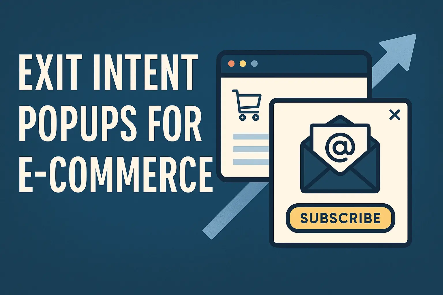
Exit intent popups are last-chance overlays that appear when a visitor moves to leave your site. They use cursor tracking on desktop and behavioral cues on mobile to catch attention at the precise moment of departure.
These popups can lift conversion by about 2–4% on average, according to OptinMonster, while some campaigns hit double-digit wins. Shockbyte’s campaign reached 13.73% and Reliablesoft saw a 300% gain from a single opt-in.
This guide will surface top software, high-performing offers, and templates to future-proof your site. You’ll learn why timing, sensitivity controls, and targeting matter for catching abandoning visitors.
Expect clear, actionable steps for desktop and mobile behavior detection, offer selection, design, urgency tactics, and measurement. The right offer plus smart targeting can reduce abandonment, capture email, and recover revenue without harming user experience.
Key Takeaways
- Exit intent overlays act as a final chance to convert leaving visitors.
- Average uplift is 2–4%, with case studies showing much higher gains.
- Match offers (discounts, lead magnets) to user intent for best results.
- Use tools with tracking and sensitivity controls for precise timing.
- Focus on speed, personalization, and measurement to future-proof tactics.
Why exit intent popups matter for future-ready conversion growth
Catching a visitor at the exact moment they decide to leave turns lost traffic into measurable value. Intercepting departing visitors preserves demand you already earned on the site, so teams compound conversion without buying more sessions.
These overlays drive clear business outcomes: incremental conversion lift, higher email capture rates, and net new customers from the same pages. Tools consistently show better performance for exit messaging when the value is obvious and tied to the page content.
Speed matters. Fast-loading, responsive messages ensure the offer renders before the page leaves view. That prevents missed impressions and protects the user experience.
“Make the value proposition immediate and relevant to the page — that’s the difference between a dismissal and a signup.”
- Segment offers by journey stage — inform readers, incentivize cart shoppers.
- Use lead magnets, quizzes, or recommendations beyond simple discounts.
- Measure conversion changes to prove value and guide ongoing testing.
Captured emails compound over time through lifecycle campaigns and retargeting, increasing LTV for both ecommerce and publishers. When teams treat this channel as dynamic, they can test quickly and adapt offers as seasons or content shift.
How exit intent triggers work on desktop and mobile
Modern triggers read micro-movements and navigation patterns to catch visitors before they leave. Detection relies on device-specific cues so teams can tailor offers and timing for better results.
Desktop signals: cursor tracking and tab-close intent
On desktop, detection watches cursor velocity and direction toward the browser chrome. A sudden move up the screen or toward the tabs often signals a user will close the page.
Sensitivity settings matter: tune how aggressive the trigger is based on content type and traffic. Too aggressive flags false positives; too lax misses conversions.
Mobile cues: back button, upward scroll, and tab switching
Mobile lacks a cursor, so reliable proxies include the back button tap, an upward scroll that hints at navigation away, or quick tab switching. Platforms like OptiMonk and ConvertFlow map these behaviors into rules that run per device.
- Test timing across OS and browsers — some fire faster than others.
- Enable different layouts and larger action buttons on phones for easy tapping.
- Log trigger types (desktop vs. mobile) to compare performance by traffic mix.
Keep overlays fast to render; if a popup appears too late, the visitor has already left the website. Use safe defaults: moderate sensitivity, a clear close button, and unobtrusive design that respects attention.
“Pair more sensitive triggers on checkout pages and gentler rules on long-form content to balance recovery with experience.”
Exit intent popups: the definitive list of top picks
The right software turns near-misses on your site into measurable wins. Start with platforms that pair large template libraries and simple triggers so teams can launch fast without design bottlenecks.
Best-in-class software and templates to launch fast
OptinMonster offers 700+ templates and patented technology with proven case studies like Shockbyte’s 13.73% campaign and Reliablesoft’s 300% gain.
ConvertFlow and OptiMonk provide responsive templates, mobile/desktop controls, and simple exit-intent rules for quick setup.
High-performing campaign styles for ecommerce and publishers
Proven examples include spin-to-win games, seasonal themes, free-gift incentives, quizzes, and editorial newsletter signups with social proof.
For ecommerce, use cart-aware discounts, product suggestion overlays, and shipping incentives to keep shoppers on the page.
Future-focused features to prioritize
- Targeting: device, geolocation, referrer, and page-level logic for relevance.
- Speed: fast load and responsive rendering across breakpoints.
- Governance & analytics: standardized templates, approvals, and integrated measurement for A/B testing and scale.
“Pick tools that make testing seasonal creative simple and let analytics decide which example campaigns scale.”
Standout software capabilities to look for in your popup tool
Choose a tool that maps visitor behavior to relevant messages so your offers land at the right moment.

Behavioral targeting: page-level, referrer, and geolocation
Page-level rules let you match offers to topic or category for higher relevance. A tailored popup on a product page converts differently than one on a blog post.
Referrer-aware overlays change messaging for traffic from social, partners, or ads. That keeps expectations aligned and raises trust.
Geolocation localizes currency, shipping promises, or regional promos. Skates.co.uk used geolocation to promise fast shipping in France and saw up to 39% conversion on geotargeted visitors and recovered 10.97% of abandoning visitors.
On-site retargeting and follow-up sequences
On-site retargeting suppresses prompts for subscribers and shows a next-step offer, like a webinar or demo. This prevents repeated messages to the same audience.
Follow-up sequences nurture captured visitors across visits. They increase conversion efficiency by moving subscribers through a clear funnel.
- Backup CTA logic: fire a high-performing exit enrollment when a page-specific CTA isn’t available.
- Modular rule libraries: save and reuse conditions across pages to scale faster.
- Device and page specificity: keep overlays precise and fast on every website screen.
“Pick tools that respect prior actions and deliver the next logical step — not the same ask twice.”
High-converting offer ideas that stop cart abandonment
When shoppers hesitate at checkout, the right last-second offer can turn hesitation into a sale. The goal is to present value that feels immediate and low-friction.
Discounts, free shipping, and time-limited coupons
Present a discount as an instant win—show savings and how the code applies. Use countdown coupons and auto-apply codes to cut friction and speed checkout.
Free shipping removes a top driver of abandonment. Offer thresholds to nudge average order value while protecting margin.
Free gifts, trials, and sample boxes that add value
Free gifts or sample boxes let visitors try products without full risk. Pair trials with onboarding email sequences to convert experience into paid purchases.
Giveaways, spin-to-win, and micro-conversions
Gamified offers and giveaways increase engagement and list growth with low friction. Keep forms to email only when possible to preserve conversion rates.
- Promote related or “most wanted” products when initial items miss the mark.
- Alternate discounts, shipping perks, and gifts to protect margins.
- Use dynamic copy tied to the product page for higher relevance.
| Offer Type | Best Use Case | Key Benefit |
|---|---|---|
| Discount code | Price-sensitive carts | Immediate conversion & email capture |
| Free shipping | Low-ticket or cross-border orders | Reduces abandonment, raises AOV |
| Sample / trial | New product categories | Builds trust, boosts lifetime value |
| Spin-to-win / giveaway | List growth and engagement | Fun, low-friction acquisition |
“Discounts and free shipping reduce abandonment; content upgrades can drive huge lifts.” — OptinMonster case studies and RazorSocial results
From browse to buy: cart abandonment rescue playbook
A focused cart rescue flow turns casual browsing into completed purchases without heavy discounting.

Step 1: detect cart state on exit and show a reminder popup with product images and price. Keep the message short and visual.
Step 2: offer a save-for-later path tied to an email capture so visitors can restore the cart later. This enables follow-up remarketing.
- Use a clear button that returns customers to checkout in one click.
- Test free shipping or small discounts only at high purchase intent to protect margin.
- Highlight fast checkout options like Shop Pay and PayPal to reduce friction.
Layer urgency with a short timer and gentle scarcity for low-stock items. Add trust signals—security badges and guarantees—to reduce hesitation.
“Save the cart and collect an email — then let smart reminders do the rest.” — OptinMonster guidance
| Action | Why it works | Metric to track |
|---|---|---|
| Save-for-later + email | Enables cart restore and remarketing | Recovered orders |
| One-click return button | Reduces steps and decision fatigue | Purchase rate after popup |
| Timer + small perk | Boosts urgency at high intent | Incremental revenue |
B2B-friendly exit popup plays that build qualified email lists
A well-timed resource can turn a curious visitor into a qualified lead without discounting.
Offer gated assets tied to the page topic. Use checklists, templates, or growth packs that map to what the reader consumed. ConvertFlow notes B2B audiences prefer cheat sheets and focused downloads over coupons.
Lean on proof and soft asks. Show subscriber counts or short testimonials—ConvertFlow’s “join 20,000+” example drives trust. Offer an email series or curated roundup when buyers are early in research.
- Tailor lead magnets by role or industry to raise perceived value.
- Keep the form minimal; use progressive profiling on return visits.
- Deploy referrer-aware variations so message match holds for paid or partner traffic.
Use the thank-you page to set expectations. Deliver the asset, outline next steps, and link to the next resource so lifecycle marketing can nurture leads toward webinars, demos, or trials.
“Peak Freelance’s cheatsheet matched a reader pain point and converted high-quality subscribers.”
| Play | Why it works | Measure |
|---|---|---|
| Gated checklist | Topical value | Qualified leads |
| Proof-driven overlay | Builds trust | Pipeline contribution |
| Soft ask (email series) | Lower friction for early visitors | Engagement rate |
Targeting and personalization that match visitor intent
Personalized targeting helps your offers feel less like interruptions and more like helpful nudges. Use stage-aware rules so each page delivers the right ask for the moment.

Segment by stage: new visitors, subscribers, and active cart users
Define segments for new visitors, subscribers, and cart users. Give new visitors educational value and subscribers a next-step offer.
Cart users get incentives or a one-click recovery path. Match the CTA to the stage—“Get the guide,” or “Continue checkout.”
Dynamic content with smart tags and location-aware messages
Implement Smart Tags for first-name inserts and regional details. Geolocation tailors shipping estimates, currency, and local perks.
Skates.co.uk used location-based messaging to raise conversion for targeted cohorts.
Referrer-aware messaging that aligns with traffic sources
Adapt copy to the referrer so the message continues the ad or partner promise. Suppress repeat popup prompts for users who already submitted an email.
“Keep personalization fast — slow dynamic elements cost impressions and harm experience.”
- Use page-level rules to align assets with topic and increase perceived value.
- Test recommendations that reflect the current page and browsing history.
- Audit rules regularly to avoid collisions and keep experiences clean across the site.
Design and UX principles that keep visitors engaged
Good design turns a last-second message from a nuisance into a helpful prompt that respects the visitor’s time. Keep visuals simple and the copy scannable so the benefit is obvious at a glance.
Fast render, responsive layouts, and clear value
Prioritize instant render so the overlay appears before the exit completes. Compress images and simplify layout to protect page load and perceived speed.
Design responsive elements that scale typography, spacing, and action areas. Make the primary button large enough to tap on phones and visible on all pages.
Lead with a concise value statement; avoid dense copy. Visual hierarchy should move the eye: headline, subhead, image, then the main button.
- Keep the form minimal: ask only for what you need.
- Delay the close “X” briefly: a short pause can win attention and raise conversions.
- Offer a tactful opt-out link: framed benefit language nudges choice without pressure.
Maintain accessibility with high contrast, legible fonts, and keyboard support. Use subtle motion; avoid heavy animation that slows the site.
“Optimized overlays can improve experienced load time and feel native across a website.” — OptiMonk and ConvertFlow findings
Copy that converts: headlines, CTAs, and objection handling
A sharp headline can stop a scrolling reader and turn curiosity into a clear action. Lead with a benefit-first line. Use attention hooks like “Wait” followed by a concise value statement and urgency.
Write CTAs that state the desired outcome. Use phrases like “Unlock 15% off”, “Save my cart”, or “Get the cheatsheet” so the visitor knows what happens next.
Handle objections in the body. Address price with payment plans or long-term savings. Remove risk with trials or money-back guarantees. Add security badges for trust.
Use social proof to speed decisions. Simple lines like “Join 20,000+ subscribers” or a short testimonial validate the ask fast. Keep microcopy near the form transparent about delivery and privacy.
“Clear benefit + specific CTA beats vague requests every time.”
| Element | Best practice | Quick example |
|---|---|---|
| Headline | Benefit-first, attention hook | Wait — Save 15% on your first order |
| CTA | Outcome-oriented, action verb | Get my discount |
| Objection handling | Price, risk, security | Try free 14 days • Money-back • Secure checkout |
| Microcopy | Transparent next steps | Email delivery • No spam • Unsubscribe anytime |
Build urgency the right way: timers, scarcity, and social proof
A short, honest countdown can turn hesitation into action without harming trust. Use a visible clock when you offer real value like a discount or free shipping. OptiMonk reports countdown timers can drive strong uplifts, and SwissWatchExpo saw a 25% rise with a 15-minute code.
Keep timers short and accurate. A clear clock that matches delivery expectations feels fair to customers and reduces churn from abandonment.
- Pair the countdown with meaningful perks: discounts, free shipping, or a gift so urgency is justified.
- Use real scarcity cues: limited stock or current viewer counts instead of manufactured claims.
- Place the primary button near the timer to make the next step obvious and reduce friction.
Layer social proof — best-seller badges or short ratings reassure shoppers while the clock runs. Test durations (10 vs. 20 minutes) and track completion rates.
“Wait” headlines can pause an exit long enough for the value to land.
Finally, monitor long-term effects so urgency tactics don’t train visitors to wait for deals. Combine timers with quick objection handling and cart-aware offers to protect margin and keep ecommerce health strong.
Seasonal and event-based exit popups that feel timely
Align creative with the calendar so a holiday or sale feels like a natural reason to act. ConvertFlow’s Proozy example used a Halloween overlay to capture retail urgency, and OptiMonk shows similar wins with timed discounts and product drops.

Refresh themes quarterly to re-engage returning visitors. Rotate designs and offers so repeat traffic sees something new, not the same example again.
Make the offer tied to the moment. Use limited-edition products, event bundles, or themed discounts. State clear deadlines like “Ends Monday at midnight” to remove doubt and speed decisions.
- Match imagery and color palettes to wider campaigns for consistent messaging.
- Add gift-focused copy during holidays so visitors shop for recipients, not only prices.
- Create category-specific seasonal variants for pages with peak demand (apparel, gifts, back-to-school).
“Timely creative helps recapture visitors who ignored prior offers and keeps your experience feeling fresh.”
| Season | Best example | Suggested offer |
|---|---|---|
| Holiday | Proozy Halloween-style overlay | Themed bundle & gift messaging |
| Black Friday | Limited-time sitewide discount example | Short clocked discount & product drops |
| Back-to-school | Category-specific popup example | Bundle deals for targeted products |
Measurement that matters: conversion lifts, list growth, and revenue impact
Measure the real impact of layered overlays by tracking both immediate signups and later purchases. A clear plan separates short-term wins from sustained revenue so teams know what to scale.
Start with core KPIs: incremental conversion lift, captured emails, recovered carts, and revenue tied to exit interactions. Use these to judge whether a popup adds net new customers or just shifts timing.
Attribution, micro vs. macro conversions, and cohort tracking
Track micro conversions like form submits and CTRs separately from macro outcomes such as completed purchase. That reveals funnel health and where drop-off occurs.
Use attribution models that credit the final page interaction while also tagging follow-up email-driven purchases. Some sales close days later, so assign partial credit to on-site prompts and to lifecycle messages.
- Analyze by page type and device to see where overlays lift performance most.
- Monitor cart metrics: recovery rate, average order value, and time-to-purchase after an interaction.
- Build cohorts for subscribers acquired via a popup to measure downstream purchase and LTV.
Don’t ignore qualitative signals. Dismissal rates, user feedback, and session recordings help balance aggressive tactics with experience quality.
| What to track | Why it matters | Example metric |
|---|---|---|
| Micro conversions | Immediate engagement and list growth | Form submits per 1,000 visits |
| Macro conversions | Revenue impact and purchase behavior | Completed purchases attributed |
| Cohort performance | Long-term value from captured email lists | Repeat purchase rate over 90 days |
Benchmark season vs. evergreen to guide budget and creative rhythm. Build dashboards that compare with/without scenarios to isolate true incremental impact and share findings regularly with stakeholders.
“Good measurement ties a last-second message to lasting value — not just a temporary spike.”
Optimize continuously: A/B testing and iterative improvements
Small, frequent experiments reveal which messages actually move visitors to act. Build a steady cycle: hypothesize, test, measure, and then scale winners. This reduces guesswork and improves conversion across pages.
OptiMonk underscores testing value: headlines, offers, timers, and the “Wait” hook can change results materially. Simple changes—delaying the close “X,” adding an opt-out link, or adjusting sensitivity—have lifted conversions 20–40% in case examples.
What to test next: triggers, offers, layouts, and sensitivity
Prioritize high-impact experiments first so you learn quickly. Start with headline phrasing, value framing, and CTA copy that asks for clear action. Then layer device rules and trigger sensitivity to balance impressions with quality interactions.
- Compare a discount, free shipping, and gift to measure margin and conversion.
- Test button size, color, and placement for mobile tapping ease.
- Iterate layouts: minimalist vs. image-led designs and short forms vs. progressive profiling.
- Prototype cart-aware variants that adapt by product or basket value.
- Validate email capture flows: single-step vs. multi-step and follow-up sequences.
“Document wins and losses; build a playbook of proven patterns for reuse across pages.”
- Run one variable at a time and collect enough samples by device.
- Track immediate metrics (form submits) and downstream revenue from email sequences.
- Promote clear winners into templates and suppress experiments for returning visitors.
Keep tests small and repeatable. Over time, a library of validated examples will speed launches and protect user experience while you scale better-performing popups across the site.
Conclusion
When a visitor is ready to go, a targeted message with a simple action can save the sale or capture an email. A focused popup that matches product context and audience needs reclaims value without harming the site experience.
Use compelling offers — a small discount, a shipping perk, or a free gift — and lead with one clear action. Keep copy tight, buttons large, and the form minimal so people convert fast.
Measure and test triggers, layouts, and offers. Start on one key page, prove gains in email and purchase metrics, then scale across pages with smart targeting and analytics.
FAQ
What are the primary signals used to detect exit behavior on desktop and mobile?
On desktop, common signals include cursor movement toward the browser chrome, rapid mouse movements, and tab-close or window-blur events. On mobile, tools rely on back-button presses, upward scroll gestures, tab switching, and time-on-page patterns to infer leaving intent. Combining multiple cues improves accuracy and reduces false triggers.
How can these triggers reduce cart abandonment for ecommerce sites?
Timely offers such as limited-time discounts, free shipping, or a small bonus item presented when a shopper shows leaving behavior can recover otherwise lost purchases. Triggering a targeted message on cart pages or checkout steps helps convert hesitant buyers and capture emails for follow-up campaigns.
What software features should marketers prioritize when choosing a popup tool?
Look for fast load times, responsive templates, behavioral targeting (page-level, referrer, geolocation), and on-site retargeting with follow-up sequences. Integration with email platforms, A/B testing, and analytics for conversion lift and revenue impact are essential for long-term optimization.
Which campaign styles perform best for ecommerce versus publishers?
Ecommerce often wins with transactional offers: discounts, free shipping, or time-limited coupons and free samples. Publishers typically benefit from content upgrades, newsletter incentives, or gated premium content. Use different creative styles and CTAs aligned to each audience’s value drivers.
How do you personalize messages for different visitor segments?
Segment by behavior and stage—new visitors, returning subscribers, and active cart users. Use dynamic content with smart tags (product names, cart value), geolocation, and referrer-aware messaging to match the user’s entry point and intent. Personalization increases relevance and conversion.
What offer ideas reliably increase conversions without hurting margins?
Try tiered discounts (e.g., 10% off vs. free shipping over a cart threshold), time-limited coupons, low-cost add-ons or samples, and micro-conversions like signing up for a discount code. Track margin impact and use testing to find the most profitable combinations.
How should brands build urgency without alienating visitors?
Use real scarcity and short timers tied to inventory or limited promos. Combine urgency with social proof—recent purchases, low-stock badges, or subscriber counts—to boost credibility. Avoid fake countdowns; transparency preserves trust and long-term value.
What design and UX rules keep these messages effective and unobtrusive?
Prioritize fast-loading, mobile-responsive layouts with clear value propositions and a single, prominent CTA. Keep copy concise, use accessible fonts and contrast, and ensure the close action is obvious. Respect frequency limits to avoid annoying repeat visitors.
How do you measure the true impact of on-site messages on revenue?
Track both micro and macro conversions: list growth, coupon redemptions, recovered orders, and incremental revenue. Use attribution models, cohort tracking, and lift tests (holdout groups) to isolate the tool’s effect on conversion and lifetime value.
What A/B tests deliver the fastest learnings for optimization?
Start with trigger sensitivity (when the message appears), offer type (discount vs. free shipping vs. gift), headline variants, CTA wording, and layout. Run tests long enough for statistical significance and iterate based on conversion lift and downstream purchase behavior.
Are there B2B-friendly approaches to capture higher-quality leads?
For B2B, replace discounts with gated resources: white papers, demo sign-ups, trial access, or product comparison guides. Use qualification fields sparingly, integrate with CRM systems, and follow up with automated nurture sequences to convert leads to opportunities.
How can seasonal or event-based messages be used effectively?
Align offers with relevant holidays, product launches, or industry events. Use themed creative and limited windows to create topical relevance. Segment traffic sources and tailor copy for campaign-specific landing pages to maximize engagement and revenue.
What privacy and user-experience considerations should teams keep in mind?
Ensure compliance with cookie and data laws by disclosing tracking and offering opt-outs. Respect user preferences by honoring do-not-disturb lists and limiting message frequency. Use non-intrusive formats to balance conversion goals with site experience.
How do referral sources affect message strategy?
Tailor messaging to the traffic source: paid ads may need stronger incentives, organic search visitors often respond to content or value-based offers, and affiliate traffic may prefer exclusive discounts. Referrer-aware messaging increases relevance and conversion rates.
What follow-up sequences work best after capturing an email from a leaving visitor?
Send an immediate confirmation with the promised offer, followed by a short nurture series: reminder about the cart or offer, social proof or reviews, and a final incentive if needed. Use behavioral triggers to adapt messaging based on engagement and purchase actions.
