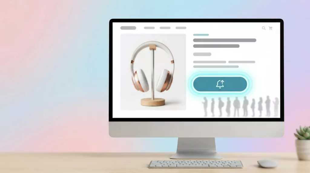
Back In Stock Alert UX That Turns Waitlists Into Orders
A stockout feels like a dead end, but it often marks the highest-intent moment on the page. Shoppers who join...
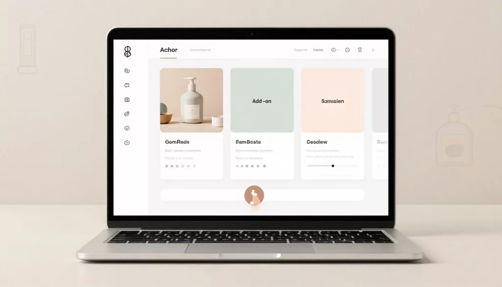
Bundle Builder UX That Increases AOV Without Shopper Confusion
A bundle should feel like help, not homework. When shoppers see clear steps, honest pricing, and fewer chances to make...
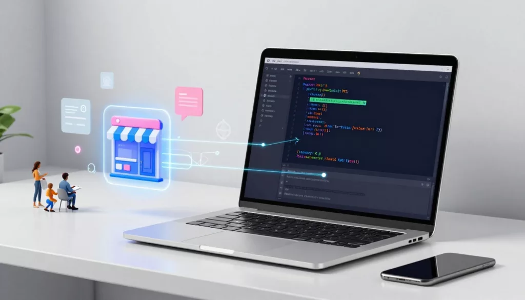
Headless Commerce UX Guide for Small Teams (2026): When It’s Worth It and How Workflows Change
Headless sounds like freedom: design what you want, ship faster, and stop fighting a rigid theme. Then reality hits. A...
Discount Code Field UX Patterns That Reduce Checkout Abandonment
The discount code box can feel like a trap door on the checkout page. Shoppers spot it, think “Maybe I...
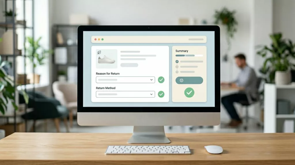
Returns and Exchanges Page UX That Cuts Refund Requests
Refund requests in ecommerce returns don’t start at the warehouse. They start when a customer feels stuck, unsure, or suspicious....
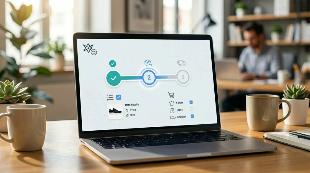
Returns and Exchanges Portal UX That Builds Brand Trust and Cuts Support Tickets
Ecommerce returns in a branded returns portal are where customer trust gets tested. When the portal feels vague, shoppers don’t...

Passwordless Login UX for Ecommerce: Magic Links and OTP
Passwords are like a spare key hidden under the doormat, easy to use, but also easy to misuse. For online...
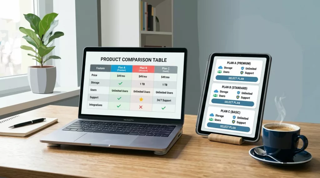
Product Comparison UX: How to Design “Compare” Tables People Actually Use
A comparison table should feel like a helpful salesperson aiding decision making, not a math test. Yet many “compare” tables...
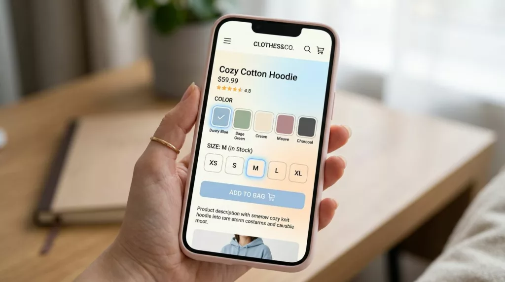
Variant Picker UX Patterns That Reduce Option Confusion On Mobile
Picking a size and color on a phone should feel like ordering coffee: quick, familiar, and hard to mess up....
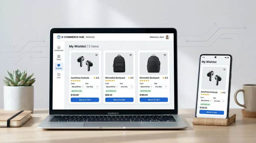
Wishlist UX Patterns That Increase Return Visits and AOV
A wishlist is more than a “save for later” button. It’s a shopper’s external memory, and it’s often where purchase...