3 Homepage Mistakes That Are Killing Your E-Commerce Sales

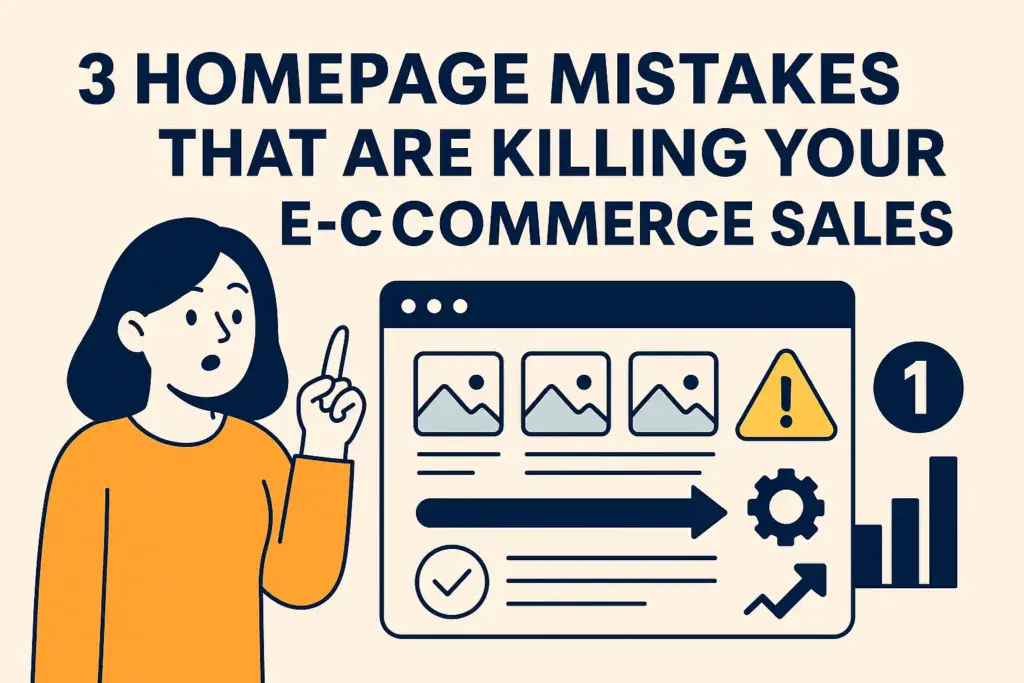
"Flat-style infographic with the title '3 Homepage Mistakes That Are Killing Your E-Commerce Sales' in bold navy text. A woman in an orange shirt points at a browser window displaying product images and a warning icon, symbolizing poor homepage design. Elements are styled in beige, navy blue, yellow, and white for clear visual hierarchy.

Your homepage is like the face of your store online. It’s how customers decide if they want to stick around or bounce faster than you can say “missed opportunity.” In the crazy competitive world of e-commerce, it’s not just about looking good; it’s about performing like a pro. A killer homepage reels users in with … Read more

Simplifying Navigation For Better User Experience

Illustration of a woman sitting at a laptop pointing to a simplified website navigation menu with directional icons and a 'Home' label, representing improved user experience through intuitive navigation design. Bold text on an orange background reads 'Simplifying Navigation For Better User Experience' with the author and date below

The foundation of any great user experience begins with solid, straightforward navigation. When users visit a website or open an app, they don’t want to get lost in a maze. What they need is a clear path to their destination, almost like having a reliable map that guides them effortlessly. This is user-centered design at … Read more