Top 10 Color Contrast Best Practices to Boost Accessibility in Your Online Store

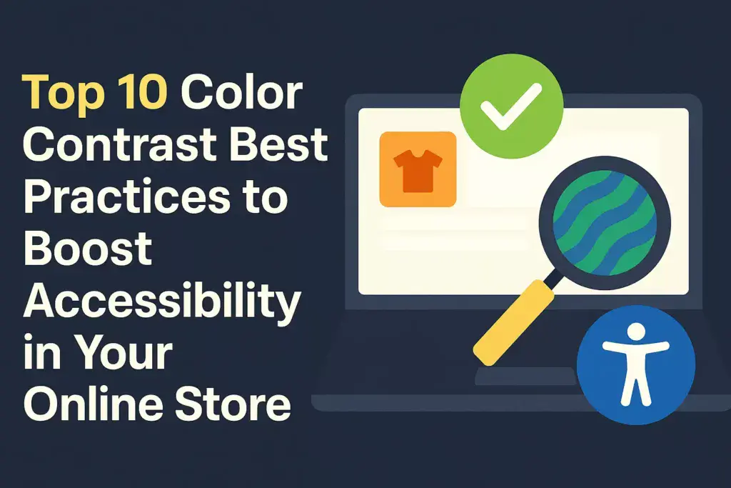
E-commerce color contrast best practices illustrated with a bold, accessible digital interface design.

Introduction When it comes to building a successful e-commerce site, design is about more than looks — it’s about creating an experience that every visitor can use with ease. One of the most overlooked aspects of user experience (UX) is color contrast. The difference in lightness or darkness between text and its background may seem … Read more

Simplifying Navigation For Better User Experience

Illustration of a woman sitting at a laptop pointing to a simplified website navigation menu with directional icons and a 'Home' label, representing improved user experience through intuitive navigation design. Bold text on an orange background reads 'Simplifying Navigation For Better User Experience' with the author and date below

The foundation of any great user experience begins with solid, straightforward navigation. When users visit a website or open an app, they don’t want to get lost in a maze. What they need is a clear path to their destination, almost like having a reliable map that guides them effortlessly. This is user-centered design at … Read more

Top 10 E-commerce Website Design Trends For 2024

Creating a seamless and intuitive navigation experience is at the core of user-friendly e-commerce websites. Users should feel like they know where to go and how to find what they’re looking for without second-guessing. No one wants to play hide-and-seek when trying to make a purchase, right? Prioritize designing straightforward pathways that guide users naturally … Read more